Apple Music: Share and Share Alike
After waiting the requisite number of hours to update to a new iOS release, I started poking around with Apple Music, and I’ve been particularly interested in how it has functioned offline in comparison to its predecessor. Like, 1 in 5 buttons in the main interface show you a white screen with gray text saying that you are, in fact, offline. It’s a barrel of fun, turn on Airplane Mode and give it a whirl.
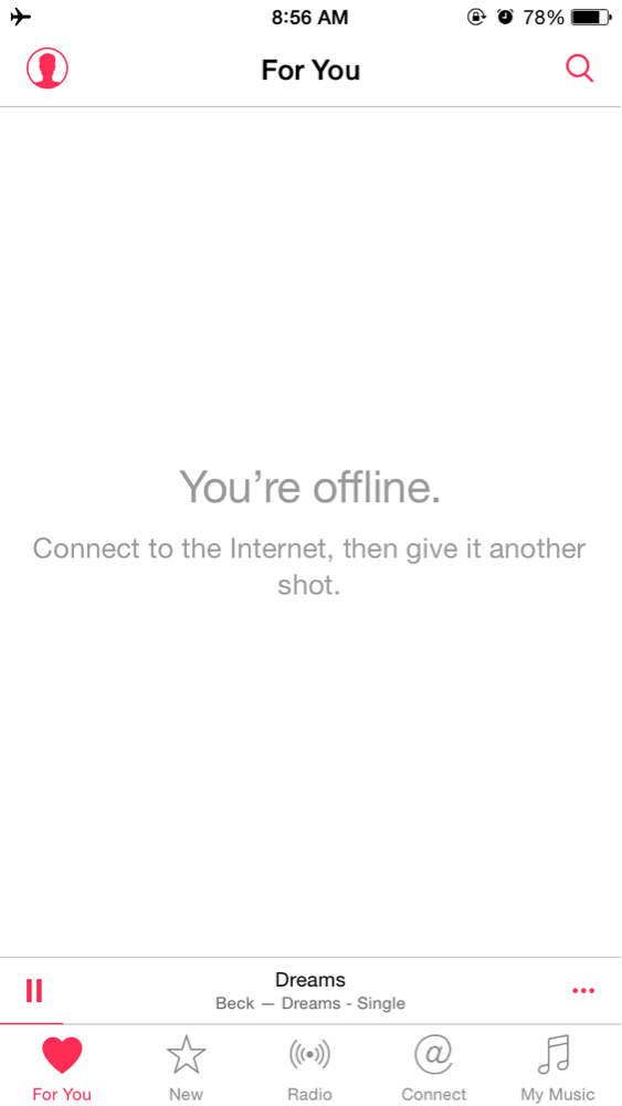
Fortunately, you can make tracks, and albums, available for offline listening, but there’s no genius playlist functionality. Finding it in an ellipsis menu (not all ellipsis menus offer the function) yields a modal dialog that you need to be connected to cellular or WiFi to create a genius playlist.
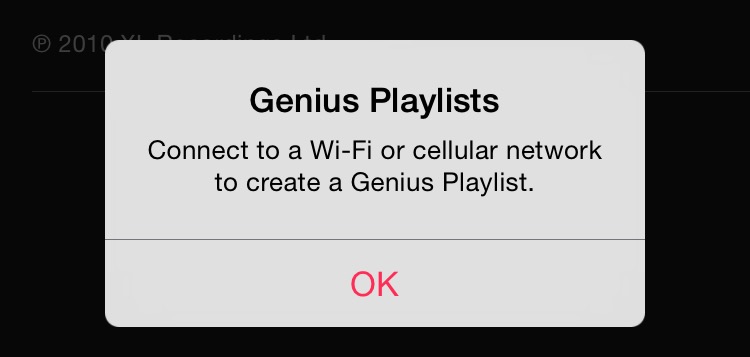
This was not a problem in the previous iteration of the app, because the genius data was updated when you synced your phone, and available offline.
I’m not sure a lot of thought went into something which matters so little in 2015, but hey, I thought I’d mention it.
Something more relevant is the all-encompassing, unexpected junk-drawer of the ellipsis button. The button is seemingly attached to every part of the interface, and they don’t mean you’ll see the same items when you click on each of them.
The closest, existing analog for this is the share button. A box with an arrow pointing out of the top would either bring up the system share sheet, or a custom menu with share options, depending on the application.
The ellipsis does not improve on this button, because now the share functions are occasionally in the ellipsis menu, or in a share button. Sharing a song you are currently listening to now requires, 1-3 modal menus, depending on where you are in the app, and which button you clicked on. If you are viewing an album, there’s a share button that immediately brings up a share sheet. Curiously, the same share button feature is present in the ellipsis button next to the share sheet button. This is an odd redundancy.
As for tracks: If you are viewing a track of the album, and it’s taking up the full screen, the share button brings up a menu asking if you want to share the song, then the share sheet.
If the track is not taking up the full screen then you’ll have the ellipsis to use for access to the menu with share options.
This makes the ellipsis buttons, that have share features notched in to their many-tiered, ever-changing menu of options, the most reliable way to share albums and music. The text buttons have no share sheet iconography. They spell out what they do in centered text alongside all the other options for building playlists, etc. Like a menu in OS X, or Mac OS, the text items that bring up other modal sheets/menus present ellipsis next to them. Menus with stuff, and more menus with more stuff. It’s ellipsis’ all the way down.
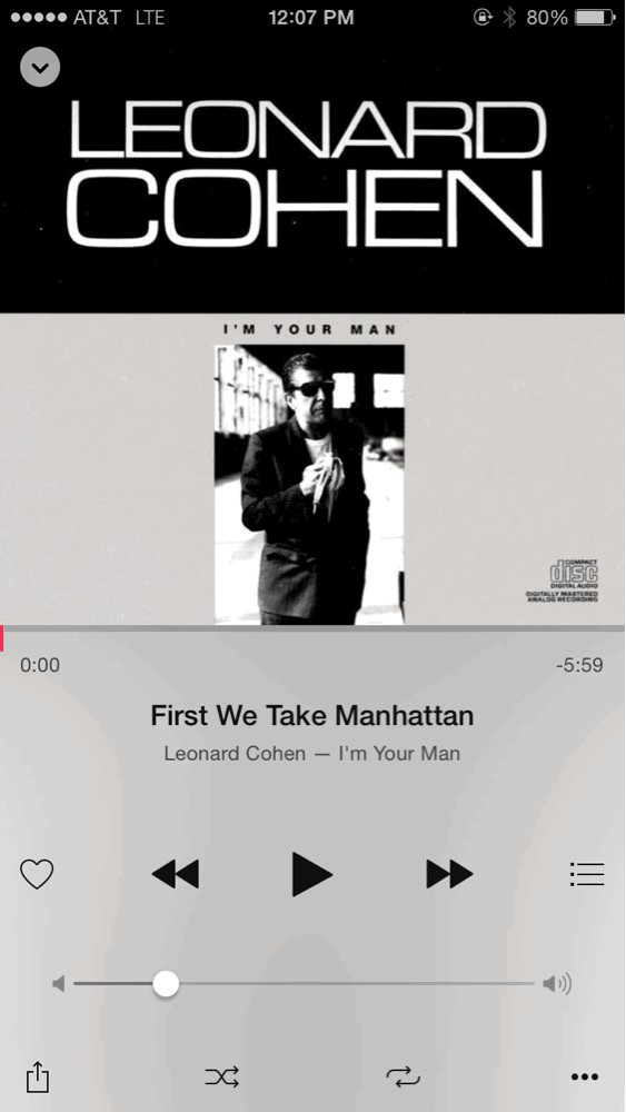
There’s also the rather unexpected behavior of what happens when you try to share something in your library that is not in Apple Music. In the above image, that Leonard Cohen track, from that specific album, is not available to share. However, it still presents you with the menu items to share it, and opens a share sheet. If you click “copy link” nothing is copied to the clipboard buffer. If you try to tweet it, a blank sheet unfurls for you to send out a completely empty tweet. In a rather perplexing move, the same song, on a different Leonard Cohen album, is available to share. No error pops up, and no option to refer people to the other, available track, is presented. As far as I know, the track in my local library is just like everything else … only it isn’t. Surely this came up in testing? Are there no Leonard Cohen fans at Apple?
A big part of the business proposition of Apple Music is discovering new music. Word of mouth plays a huge part in spreading music around. Apple knows this, because the app basically wants you to have access to a menu item to share things. Apple just has a lot of slack they can tighten up here. This was a ground-up overhaul of this app, and it seems they could not come up with any elegant solutions for this all-new first impression of the app, other than putting “…” everywhere. It feels like Microsoft Office.
Which takes me to the new Clippy, “For You” …
Category: text