Full On Monet

The one thing I’ve repeated over and over again since Phil Schiller previewed the “Portrait Mode” feature at the iPhone 7 event is that I have no philosophical issue with it. I don’t care that it is the phoniest of phony bolognas. That is absolutely fine with me because I work in visual effects and I do phony bologna things all day long. I don’t even care that it’s computer-driven, and not artist-driven. I feel I need to repeatedly stress this because there are people that do take issue with it because they need to protect Photography from those that would inflict harm upon it.
Having said all that, there are still some drawbacks about the current implementation of “Portrait Mode” (or fauxkeh) that should be discussed. It isn’t magic, but it is the intersection of art and science which produces fascinating work. Here’s a device that’s in the household budget for many (but not all) people that can fit in a pocket, and use software to generate a depth map, and use sophisticated image recognition, to do a realtime effect that simulates an element of photography that most people enjoy seeing but have difficulty producing themselves. It also works much better than I had expected in some areas, and about what I had expected in others. Last week, my cohost Dan Sturm and I discussed the iPhone 7 on our film and VFX podcast because he deals with shooting things on set with a camera, and I deal with measuring depth, and phony bologna stuff, in VFX.
“Portrait Mode” seems to work best when you are using it to shoot portraits — shocking, I know. Specifically, shots of people that frame the shoulders and head have behaved the most like they ought to. This is good news for the department in charge of naming things at Apple. Nailed it.
It starts to unravel a bit when shots are framed for most of the body (and the subject is farther away from the camera). Then it seems slightly more prone to error. This is just conjecture, but I assume this is because there’s better stereo separation when the iPhone is closer to the subject, and there’s less the further away you get from the subject. The iPhone 7 Plus does not have a tremendously large interaxial distance (distance between camera lenses), and the lenses themselves are different so even if the software is taking the differences between the two lenses into account (perspective and lens warp, it’s not just a crop), it’s not like it’s identical. I’m also assuming that luminance plays a large role just because I’ve also used luminance for fake-depth effects before. How that gets taken in to account, I couldn’t say, but it does seem that some of the artifacts in images that I have seen seem to be related to brighter pixels being sent to the far BG, but that could also be an issue with the detail of the generated depth map. It would seem natural to me to filter the depth map to remove small, sharp spikes in depth as they would likely be errors, so that could be why some white dog whiskers are on the background in some dog photos.
Dog photos! Cat photos! Dog photos and cat photos living together. Mass hysteria. No matter which pet species you follow on Instagram, you’re going to see a large number of shots with shallow depth of field. Thanks in no small part to Apple. The shots of animals are more error-prone than shots of humans though. DJ Jenkins, who follows me on Twitter, sent me this shot of his dog:
@joesteel Here's my dog. I'm impressed pic.twitter.com/0ZNZSymxdS
— DJ Jenkins (@DJJenkins) September 21, 2016
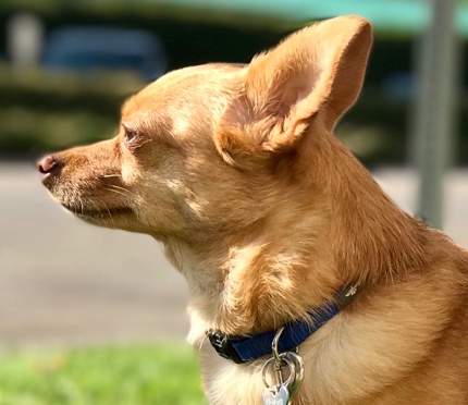
A close up view on the dog’s head shows a lot of smearing, and pinching around the edge of the pooch. Apple’s system prioritized the detail of the dog over the BG holding up. I’m guessing the system is trying to fill in for pixels that would be behind the dog, so you don’t see a blurry dog edge with a sharp dog inside of it. The highlight on the dog’s nose seems to have fallen between the BG and the FG too.
If anyone’s grumbling that animal portraiture is not what the feature was intended for, I have some bad news about the fact that people are going to shoot a lot of non-human, non-portrait shots with “Portrait Mode”.
Sharp Foregrounds
Some images have a touch of defocus effect applied to the foreground, but usually I only see that when there is an error. The images almost universally seem to favor a sharp foreground. This breaks the illusion right away. An image with a sharp foreground, subject, and totally out of focus background can still look pleasant, but I would prefer it if that was a conscious choice, rather than a shortcoming of the process.
Reflections and Refractions
Right after I saw, and read, Matthew Panzarino’s piece on TechCrunch about “Portrait Mode” in the beta, I wanted to see all the cases where it did not work. I had speculated that reflections on surfaces, and light refracted through water, or glass, would really mess it up, since those are things that are issues in stereoscopic VFX work. Sure enough, Matt sent me this image of a wine glass on Twitter:
@joesteel but here ;) (it has trouble) pic.twitter.com/IsxwSW9ZNS
— Matthew Panzarino (@panzer) September 21, 2016
Borked. Interesting, but borked.
Then Myke Hurley from Relay FM started posting shots he was taking in less than ideal lighting conditions, and of non-portrait subject matter. He was very happy with how the photos turned out and they were pleasing to his eye. They are quite helpful in illustrating issues with the Portrait Mode beta.
Blur Blur 8
— Myke Hurley (@imyke) September 21, 2016
1) Taken with portrait mode in the 10.1 Beta
2) Original pic.twitter.com/NEoq8bAOOm
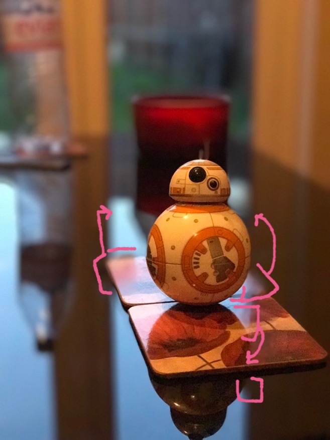
I scribbled around some of the obvious problems with the reflection of the light through the door on the coasters and table. The edge of the coasters is going in and out of focus based on how much of the bright reflection is on the coaster. That’s why there’s a very sharp increase in the defocus of the coaster edge. Not because the coaster is far away, but because it’s being defocused as if it was at the depth of the door reflection, which is the depth of the door. Here’s the difference between what Myke uploaded to Twitter as the original, and the “Portrait Mode” one (Twitter compression could cause slight variances on top of whatever was originally in the shots, but that’s not the point).
This illustrates the regions being altered by Apple between the composite image they produce, and the image that is exclusively from their “56mm” lens. The width of the altered regions on the coasters is the same as that of the width of the door. The system is also trying to blur out some of the coaster details that are immediately in front of BB8 but part of the reflection.
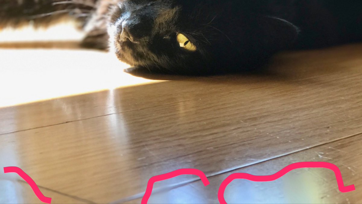
Jason Snell tweeted an image of his cat that has blurred out reflections on the floor as well. These stick out because they’re totally feature-less holes in an otherwise textured floor. (Also the floor in the foreground would be out of focus anyway, but my issue is with the holes.)
Make Some Noise
There’s also another thing that Myke’s photos were very helpful with and that was in illustrating how Apple was going to handle sensor noise.
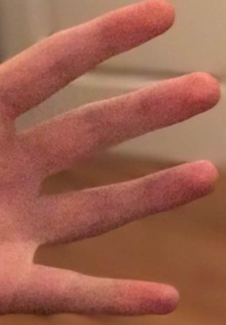
In addition to some edge smearing and pinching in this hand shot Myke took, you can see a very visible difference in the sensor noise in the image between the “in focus” and “out of focus” regions. There is some noise in the “out of focus” area, but it seems as if it was designed for use only in more desirable lighting conditions. It doesn’t emulate the sensor noise present here at all. You could argue that no one should be taking photos under those lighting conditions, but so what? People are going to do it anyway.
Some folks might be confused about why you would want to add noise to something, but it is essential for making it look like it’s a cohesive image. The alternative — more aggressive noise reduction than Apple already does (and it is quite aggressive) would be undesirable because then you’re going to further mush what should be the sharp, foreground object.
I hope that as Apple progresses with their beta, they can fine tune the noise they’re adding to the blurred regions to produce a more integrated image under all lighting conditions.
Defocus
When Matthew Panzarino’s TechCrunch article went up, he had been told by Apple that the blur was a “gaussian blur”. That ruffled a lot of feathers because gaussian blur has nothing to do with simulating how light focuses, but it’s faster than any defocus method. Indeed, there’s a pervasive mushiness where everything softly blends together with very few exceptions. There isn’t the texture I would expect to see. Panzarino received clarification from Apple that the images in the Camera Roll are not using gaussian blur, but rather a “custom disc blur”. Using a disc means they’re convolving the pixels – the simplest way to describe it is that each pixel expands out into a circle. Really hot pixels produce very clearly defined circular patterns with sharp edges. If you’ve ever seen out-of-focus christmas lights at night, the sharp circles over a dark background are very pronounced. You can still perceive these details in situations with less contrast though. I don’t see anything approaching that in the images I’ve seen Portrait Mode produce. The closest are some highlights that seem to be convolving to cotton-ball shapes.
The iPhone’s camera, without assistance from Portrait Mode, even has some more texture in highlights so it doesn’t seem they are modeling their treatment of the image off of any specific characteristics, but rather attempting to create an inoffensive, soft effect.
It could also be that they’re applying their focus effects to clamped pixel values. For example: If you use a defocus treatment on a JPEG, vs. a RAW file, you’ll see that the JPEG doesn’t have high-high pixel values in the highlights because that data was cut off at a certain point after it hit “white”. However, that’s pretty unlikely because I’m sure Apple’s engineers are also aware of that, and that the softness in the highlights is an intentional choice they’re making.
Another Tool
I’m still where I was at the start of this post. I have no problem with the feature existing, or people loving the images they are producing with the feature right now in the beta. You do you. I do hope that Apple can improve some aspects of Portrait Mode to make it even better for people who are happy with the current results, and to make me less twitchy when I scroll through Twitter and see gapping holes and pinched edges.
Category: text