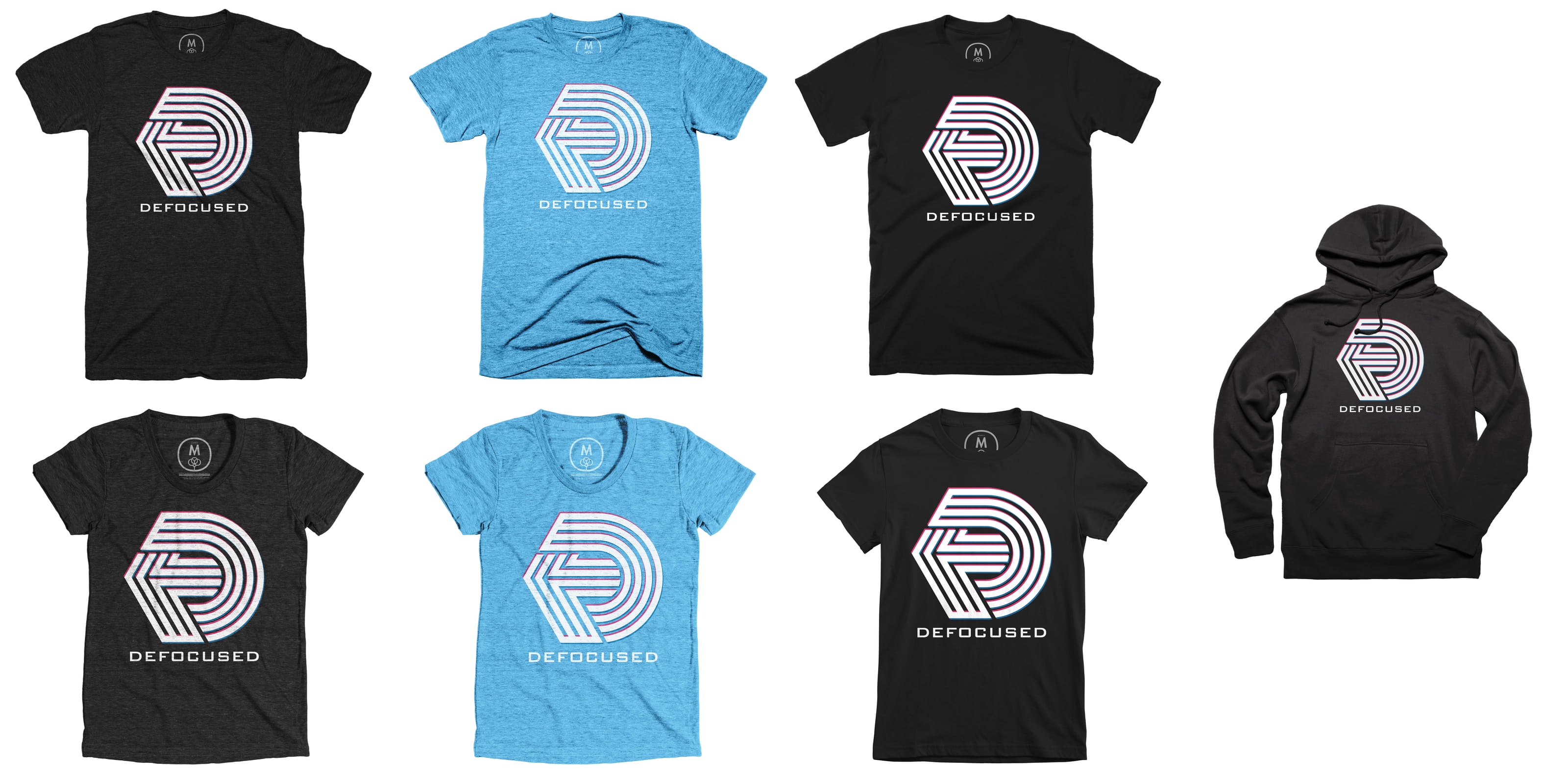
Defocused Shirts
Dan and I are pleased to announce that we’re selling shirts, and a hooded sweatshirt, on Cotton Bureau to support our podcast, Defocused on The Incomparable Network. The shirts are on sale until January 24th, so if you’re considering buying one, I would recommend acting on that impulse sooner rather than later so you don’t miss the window.
There’s a brief discussion of the shirt launch that we added to the first few minutes of episode 130.
We enjoy a little retro flavor for the shirts, so we kicked around some ideas. Palm trees, that sunset circle with the lines through it — all the great 80’s things. Eventually this lead us to defunct production company logos. We were certainly influenced by the logo for The Cannon Group. They were a pretty bonkers production company. Dan mocked up different ways of interconnecting letters, and aspects of the lines in black and white. To add a little color, there’s a sort of fake chromatic aberration effect but with magenta and cyan. Because of the way Cotton Bureau prints, solid colors are preferred.
Having said that, I did a weird gradient test to mimic some aspects of Cannon’s logo, and Dan polished it. We liked that a lot and it became the new podcast logo this year. Naturally, that meant we had to do this:

Category: text
