Apps Are Now Flops, Tabs Are Now Sidebars
Look, I don’t want to be a jerk, but I am going to be a little spirited in my criticism of the new Apple TV app. I don’t want to hurt the feelings of anyone working on the new app, but I doubt they read what I write about Apple TV. If they did, they wouldn’t be shipping this.
The issues that I have suggested Apple should resolve:
- Unify media and apps into one interface, with the ability to pin favorite apps.
- Reduce the amount of Apple TV+ promotion in the interface, particularly for non-subscribers.
- Properly personalized recommendations based on viewing habits.
- Handle live TV through a unified programming guide, like Amazon does, instead of pretending the only live TV is live sports.
The new interface miraculously resolves none of these things.
Upon upgrading to 17.2, and opening the TV app for the first time, you’re still treated to the same behavior I’ve bemoaned in the past where the TV defaults to showing the Apple TV+ view asking me to”Come back for new Apple Originals” with Jason Sudekis’ mustachioed face right next to it. There’s no more Ted Lasso, fellas. Let it go.
The slide carousel thing quickly flips through the veritable cornucopia of Apple TV+ originals. Under it is the Up Next on Apple TV+ with the last show I was in the process of watching before I let the subscription lapse. That’s all that’s visible there, so you might be forgiven for not knowing that you can swipe/tap down in the interface for it to reveal more pages of round rect tiles.
Apple should do what it does elsewhere and show the cropped off top edges of those round rects so people know they can scroll down. This is not just for Apple TV+ but applies to other Channels & Apps which share this same styling.
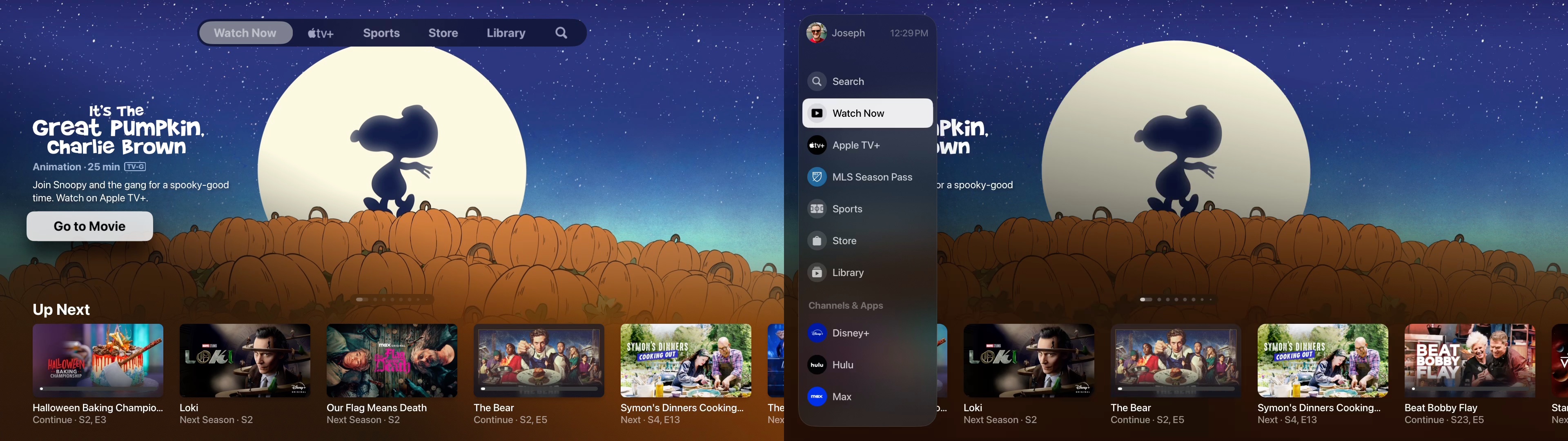
The Side Bar
After being accosted by Apple TV+, you can get to the side bar either by tapping the “<” or “Menu” button, or by swiping all the way to the left. The bar shows the current user profile, but it can’t be changed there, that needs to be done in Control Center.
The side bar’s main contents are:
- Search
- Watch Now
- Apple TV+
- MLS Season Pass
- Sports
- Store
- Library
It’s all pretty self explanatory and are analogous to what we’re used to from before 17.2, but in a vertical, auto-hiding bar instead of a horizontal pill thing. The big exception being the carve out for MLS Season Pass, which didn’t have it’s own spot, but because Apple would like people to pay them money they elevated it. A cynical person might suspect that a primary motivation for the vertical sidebar is to add more top-level Apple content than what would fit in the horizontal pill-thing.
None of those elements can be hidden, moved, or otherwise edited.
The lower portion of the bar was very interesting, when I first saw the screenshot posted by Sigmund Judge, but then I saw it in action, and said, “Oh no.”
Apple had a problem with overlap between Channels and Apps for many years. Mostly, the TV app interface had a row of Channels that were promoted that would contain things you were subscribed to as apps, like Paramount+ and the rest. Other anomalies too because the ones that had Channels often had apps that integrated with the TV app. That seems to be consolidated now. The Channels and Apps for me shows the apps I subscribe to that integrate video on demand offerings with the TV app. For me, that happens to be:
- Disney+
- Hulu
- Max
- Paramount+
- PBS Video
- Prime Video
This is not a comprehensive list of the apps and services that I use, of course, because Apple is still insisting on TV app integration. Even apps that integrate with the Apple TV app for Up Next (DirecTV) don’t appear here.
The side bar should work as a launcher for any app that doesn’t integrate with TV app, and this punitive measure of sending people to the Home Screen is not going to result in Netflix budging, or ever make any sense for YouTube. Particularly when developers, and users find out how limited this integration is.
It will also get less useful in my household as several of those supported channels will have their subscriptions lapse next month. Your mileage may vary depending on what your subscribed to.
If there is a Channels & Apps element that you don’t want to see, you can long-press on it to hide the element, a courtesy we don’t get for MLS Season Pass.
There is also no way to organize Channels & Apps in the side bar. Hopefully the services that you subscribe to are of alphabetical importance to you.
I’ll discuss my thoughts on Channels and Apps a little more, and then we’ll pivot back to “Up Next”.
Channels & Apps
Let’s kick it off with Prime Video, specifically, because a lot of people have it. I would venture that a lot of people are also pretty unhappy with the Prime Video app’s interface. What if I told you that the C&A view of Prime Video didn’t really help a lot?
There’s the Carousel of promoted stuff, and then under it the Up Next row that is specific to the last titles the Apple TV app is aware that I watched in Prime Video (this is important if you watch Prime Video on non-Apple hardware, like an Amazon Fire TV device, or browser.) If there’s nothing in Up Next, it’ll show you the next row under it, Amazon Originals: Highlights. Then several rows of Originals for Movies, Series, Kids, before getting to “Movies” with licensed content, etc. The bottom is “Sports” with those tiles for live games.
Curiously, the popularity-based rows are missing, and if you’re at all familiar with the Prime Video app this will seem positively spartan.
None of this is personalized for me in any way like it is in the Amazon app. These rows are for some generic human that could be anyone else using the service in the United States.
Similar de-personalized blocks of round rects can be found under the other Channels & Apps, but some do have the popularity rows and some don’t. They’re all very utilitarian, and depersonalized.
Since all of the companies with a presence in C&A also build their own apps, and all of those apps are much more personally relevant to users, and also more relevant to the companies’ own interests, I fail to see how a spreadsheet of general audience promos is going to steer consumer behavior, or budge any corporation into putting in effort here.
While a lot of people decry the buggy, laggy third party apps, and their un-Apple-like interfaces, this the total opposite, shoehorning generic stuff into generic rows of generic boxes. In the abstract it sounds simpler, but it’s also at the expense of usefulness.
Something like this interface is quietly buried in the current version of the TV app. On the Watch Now page scroll all the way down to “Streaming Apps” and click on any of those app tiles for an app you have installed, like Prime Video, and you’ll see what I’m talking about without having to install a beta.
Watch Now
The Watch Now interface is largely unchanged in the current dev beta from what’s shipping. That’s not encouraging, because Watch Now is so overrun with Apple TV+ promotion that it is virtually useless to someone that isn’t an active Apple TV+ subscriber. The most useful part of the whole interface is the Up Next row, which still shows you what you were in the process of watching, and displaying new episodes of a series you were watching.
Other than checking in on the TV app to see if Apple’s changed anything, I haven’t used the TV app much at all over the last year. Instead, I’ve optimized things so I can get to Up Next when I want to without having to open the app at all. Fortunately, those settings still work just fine in the developer beta. The settings for anyone interested:
- Move the TV app to the Top Shelf (top row) of the Home Screen interface, if it isn’t there already.
- Settings -> Apps -> App Settings -> TV -> Up Next Display -> Poster Art (helps to avoid spoilers in preview images)
- Settings -> Apps -> App Settings -> TV -> Top Shelf -> Up Next (What to Watch is just a video billboard for Apple TV+)
- Back on the home screen, when hovering over the TV app icon in the Top Shelf, you’ll now have direct access to your Up Next shows.
To remove auto-playing videos as well, you have to go to Settings -> Accessibility -> Motion -> Auto-Play Video Previews.
I suppose I should thank someone on the TV dev team for leaving these workarounds in place, but I’m frustrated that I still feel compelled to use them. That What to Watch is so optimized to juice conversions, and boost hours in Apple TV+ undercuts it being used for anything else.
It’s great if there’s someone that only wants to watch exactly what’s in that carousel, but even those people probably don’t want to see the same shows repeatedly advertised to them because there’s no personalization in what’s recommended.
Recommendations still live 20,000 leagues under the Apple TV+ shows. Long-pressing for options still only reveals “Go to Show” and “Add to Up Next” with no option to mark a show, or movie, as watched, or to tell Apple that you never want Real Time With Bill Maher recommended to you.
Frankly, given the lack of personalization everywhere else in this interface it’s baffling to take what little of it there is and hide it waaaaaaay down here. Especially if Apple ever does anything with the user profiles where content recommendations could be seen to visibly change based on the profile being used. No one has any hope of knowing something way down there changed when the profile was toggled. Is someone supposed to use this or not?
Does Anyone At Apple Use the Apple TV?
I know Apple has a research team, and they’ve surely conducted focus groups, and surveys about the Apple TV, and the Apple TV app. I also know that I’m not the only person complaining about this stuff. I might be pickier than most, but I don’t hear people clamoring for more carousels of generic feature films and TV shows.
As much as I would like Apple to unify this interface I’m content to leave it separate, because I’d rather hopscotch around all my streaming apps then go bobbing in and out of the TV app for some things, and the Home Screen for other things. It is preposterous that Apple thinks this problem was solved by switching from a horizontal pill, to a vertical sidebar so they could show the barest handful of apps, with the barest handful of those apps films and shows, not directed at the user in any kind of way at all.
Apple can’t ignore Netflix. It is not going anywhere. It can’t ignore YouTube, or non-sports live TV. It can’t pretend that the universe revolves around Apple TV+ and consider all other streamers as ancillary add-ons. These were problems before the app was redesigned, and they all remain problems in this developer beta. What are we trying to fix here?
Category: text