Apple Music Replay’s Broken Record

If there’s one thing about Apple Music I’ll never understand it’s Apple Music Replay. It is once again time for the annual user-experience tire-fire. In the Apple Music app, you scroll all the way down to the bottom of the Listen Now screen, or you find it in your top row somewhere. I guess Apple might still be sending push notifications about it, but I turned that trash off awhile ago.
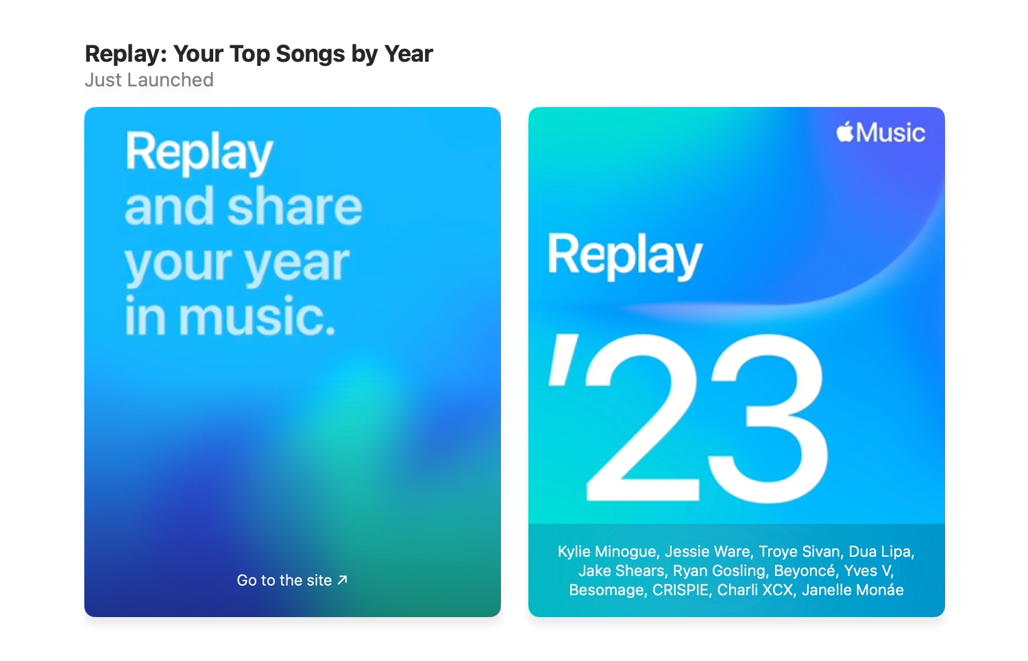
The tile implores you to “Replay and share your year in music.” In tiny text, seemingly indicating shame or remorse, it says “Go to site”.
You see, the Apple Music app - and iTunes before it - are largely glorified markup viewers, but for whatever reason, the Music app still can’t display Apple Replay in the Apple Music app. Instead the user is shunted off to the web version of the Music app.
Not a big deal, right? Except you have to log in with your Apple ID in your web browser to see the web version of the app you were just in so you can look at text and images with CSS animation. Does the Music app not pass Acid3? For all the crap Apple, and its fans, level at Electron based apps we’re left with this native app’s sweet solution.
What are we doing here, again, where I have to sign in to a second location to participate in what is essentially web marketing?
It is also incredibly fragile web marketing, because if you click, or tap, on that little hamburger menu in the Replay page it will show you “Select a year to see your listening[sic]”. The “‘22” doesn’t work. The text “This is your Replay.” strobes on an endless loop and nothing happens because no one at Apple thought that the page from last November should still work.
Highlights Magazine
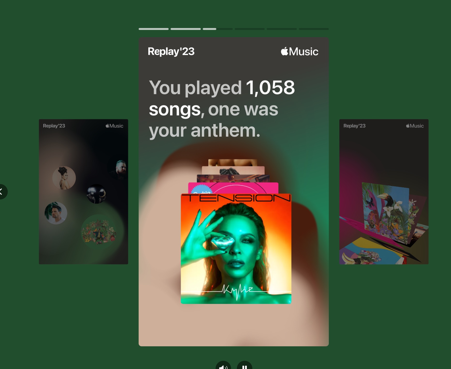
Once the user is logged in, they can play a highlight reel, based off of Snapchat, and Instagram Stories vertical “video” format — which looks great on my MacBook, BTW. The thing is just a carousel of animated stuff.

It seems to be like something one could upload to a Stories, or other vertical video product to share, but there are no sharing controls in a desktop web browser at all, so you have to go to the site in Safari on iOS, to get a share icon to save a static PNG to send somewhere else. There’s something poetic about failing to do something social well and using the format pronounced “ping”.
It’s like when your parents would buy you those electronic toys that weren’t real video game consoles or computers — Tiger Electronics shit — and you were just supposed to pretend it was a GameGear.
You can’t even share this with the people in your Apple Music social graph. I guess all anyone really needs from their friends is the dreaded Friends Mix, eh, Apple? I mean why would the people I’m following, and who follow me, on Apple Music want to know anything about my Apple Music if I chose to share it? Why not just keep shoving random shit I’ve listened to at them?
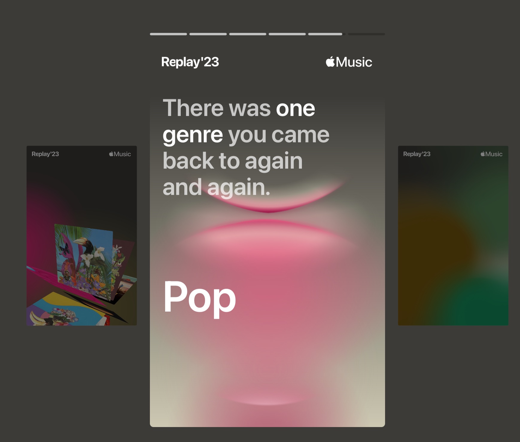
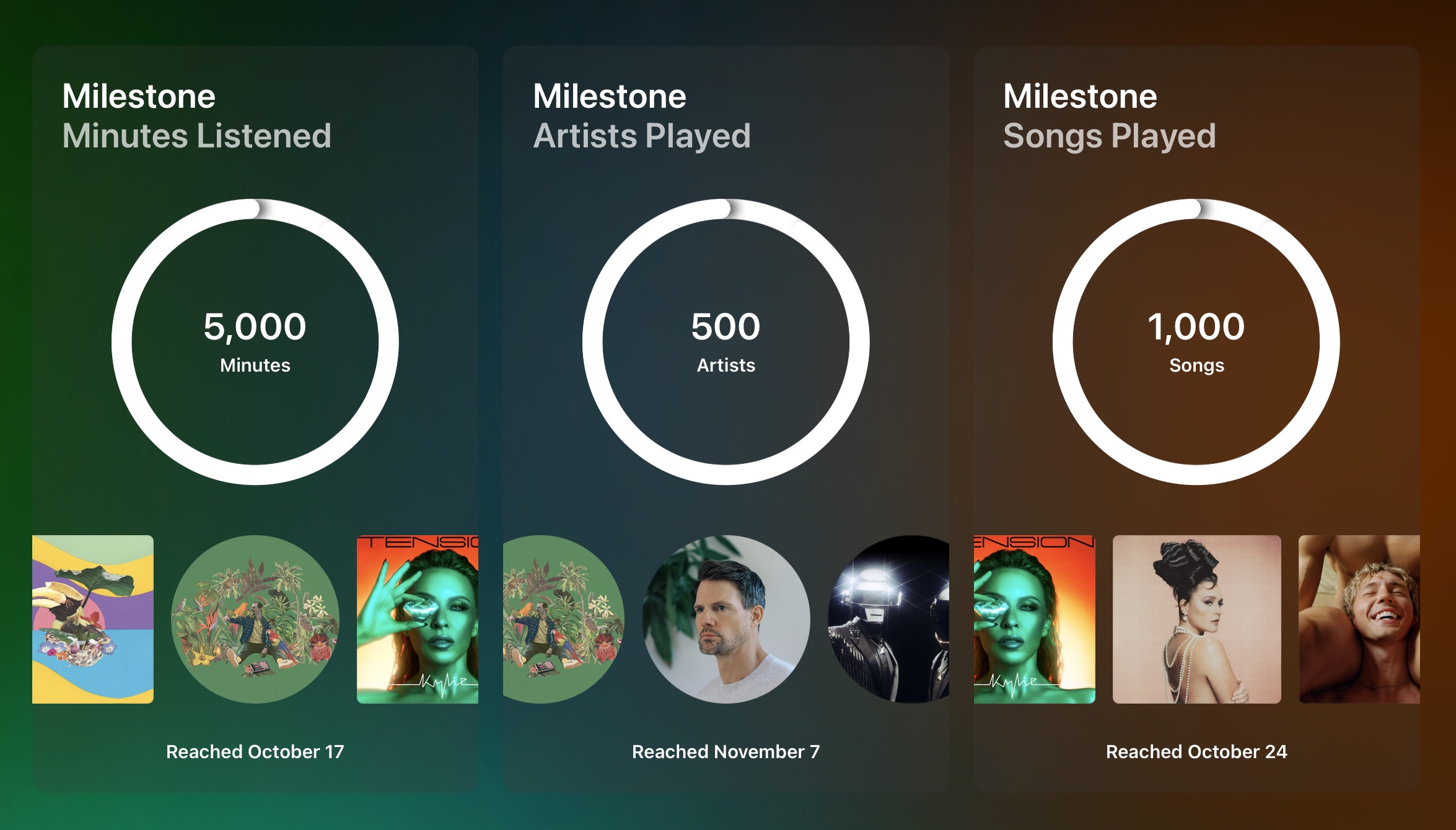
Back to the content of this not-social social media reel, which is also underwhelming. This is like a form letter from an actuary. The number of minutes of music I listened to? Wow, insightful. The genre I played the most being “Pop”? No way! I bet no one else has that!

Also whoever was setting this year’s mail merge left the rank number on the “Top” slides. The slides only have one thing on them, and already say “Top” so the enormous “1” in the lower right hand corner adds nothing.

This whole thing feels like someone was very excited to animate things, move album artwork around, and transform data, but no one really gave much thought to what this whole thing is supposed to mean to someone. How it makes someone feel.
Lists Go Sideways
There is actual information once you get out of the Highlights Reel and scroll down, unfortunately it’s in sideways carousels.
That’s how we all like to read lists, right?
For Mac users you can top the “>” and waiting for an animation to slide the four items across the screen. Then tapping “>” again for the next four items. Hopefully you don’t want to go back in the list because then you need to move over to the other side of the carousel and tap “<”. Don’t worry though, you can scroll the list sideways without having to tap, but the page doesn’t load more than four-to-six pieces of album art or auto-playing artist portraits so you need to stop scrolling and wait for the list to finish loading.
On iOS, it’s a slide carousel, with five items listed vertically and you swipe horizontally. You have the share icon, which you do not get on the Mac, but it only saves a PNG of the five currently displayed items, and not the whole list of 15.
This is using the same accursed design metaphors in the Listen Now page in the Apple Music app, here in the web browser, where a list could be anything, even something readable, but it’s not.
I should mention that even though this is all designed to look like Apple Music’s Listen Now interface, you can’t listen now to anything that’s on this page. This is not interactive. (Rubs temples.)
Wrapped
Spotify Wrapped absolutely trounces Apple Music every year when it’s released. In a few days social media will be flooded with happy Spotify customers sharing their Spotify Wrapped with everyone else. It’s a great advertisement for Spotify, and the attention is well-deserved, because Spotify puts far more effort into crafting Wrapped than Apple puts into Replay.
Who knows what new ways Spotify will come up with to absolutely embarrass Apple Music subscribers this year? Even if it was just what they did two, or three years ago, it would be more than Apple’s done this year, or is likely to do in the future.
UPDATE: A day later and Spotify Unwrapped is released, and as expected, it trounces Replay. The Verge’s Emma Roth theorizes it’s too popular right now because some users are hitting server errors. That’s good bad-press to have if you can get it.
Throw money at this problem, Apple. Consider using that Apple Music price-hike to fund it.
Category: text