Give Me Back the Watch Control Center
When Apple announced that swiping up in watchOS would bring up a new Smart Stack interface instead of the Control Center, I shrugged. I really didn’t think it would be a big deal. People complained about it in the beta, and it just seemed like the kind of thing that requires a certain period to adjust to and then we’d forget it used to be different. Boy was I ever wrong about that.
The hold-down-to-change-watch-faces thing lasted from September 10th to November 15th, so clearly that one didn’t go over well. Moving the Control Center to the side button persisted, without any preference or option to revert. Maybe fewer people were pissed off about it? Maybe management just believed in the usefulness of Smart Stack so much that they were unwilling to give up as easily?
However, last night, when I was on a plane flying to California from Florida, everything went into Sleep mode because the time was EDT, not PDT that we were barreling towards. My Face-ID-With-Mask-With-Watch-Assist stopped working and the phone told me that I would need to take the Watch out of Sleep mode. I did the thing that I have done for years, and years, and swiped up to … oh right, this is the Smart Stack.
Then there’s the delay to dismiss it, then hit the button, which requires the application of force, not just a swipe, and is more comfortable to do with thumb and index finger.
I was agitated by something that was arbitrarily made worse. I didn’t feel like a fool for doing the wrong thing, or blame myself in any way, because even if I pushed the button first I still would have been irked.
The Not-So-Smart Stack
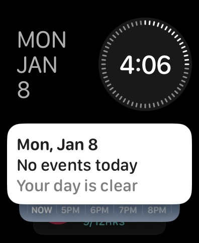
Perhaps, what’s so frustrating to me is that the Smart Stack is so useless to me, specifically. I can’t speak for everyone else, but all of the times I’ve accidentally opened this treasure trove of irrelevance it’s displayed the day of the week, the month, the date, the goddamn time, and then a card that’s either a snippet of my almost entirely empty calendar, or the weather. All of this information (except my mostly empty calendar) is better laid out in my Modular watch face, using complications.
I can add and remove the widgets/cards from the Smart Stack, just like the significantly more useful Smart Stack in iOS, but I can’t replace the useless date and time stuff. Also another thing that makes it’s iOS counterpart more useful is that it doesn’t reshuffle the cards, so I can remember which way to swipe on an iOS Smart Stack to get to other widgets.
Most importantly the widgets in the Smart Stack on my iOS Home Screen display ambient information akin to Watch complications display of ambient information. It’s in the interface I’m glancing at, not some other destination.
Naturally, this means I have no reason to open the thing. Ever. Under any circumstances. And yet, I somehow get both the swipe up, and the upwards swipe on the Digital Crown to get to it? It deserves two special gestures? Is it that beloved and adored?
I’m sure some people do find this useful if they prefer to use one of the watch faces with fewer complications, or smaller complications. It’s a computer watch but if you want it to feel like a Swatch Watch, go for it. The stuff in the Smart Stack will always be reorganized in some baffling way when you want to get to it, but you do you.
Having said that, give me the swipe back.
We did it for Natural Scrolling, we can do it for this.
Or hell, go ahead and make us sorry we wished for it back by making a Smart Stack widget that opens the Control Center. Make single serving Smart Stack widgets for Wi-Fi, Airplane Mode, Sleep — really make us sorry we complained!
I just don’t want to need to do something, and either accidentally swipe, or remember to press the button. Even a successful interaction is as annoying as a failure.
Category: text