Apple News You Can’t Use

I received an email survey last week for Apple News+ and decided to throw Apple a bone by filling out the survey as best I could. Apple wanted my opinion, as a former Apple News+ subscriber, but I’m uncertain how receptive Apple is to the complaints that I have, as I have filled out similar surveys before. Also, the survey was weirdly focused on making sure I knew about audio versions of articles, and asking why wasn’t I using audio versions of articles? The answer, was that I have no personal interest in such a thing. I don’t begrudge anyone that, especially for increased accessibility, but I would appreciate more care in the news reading portion of the news reading app. Beware if you’re deeply invested in them because the whole survey might just be a pretense to scale back on them rather than actually fix anything.
I might as well repurpose my essay to the void on my essay-to-the-void blog, and include some of the screenshots I’ve collected.
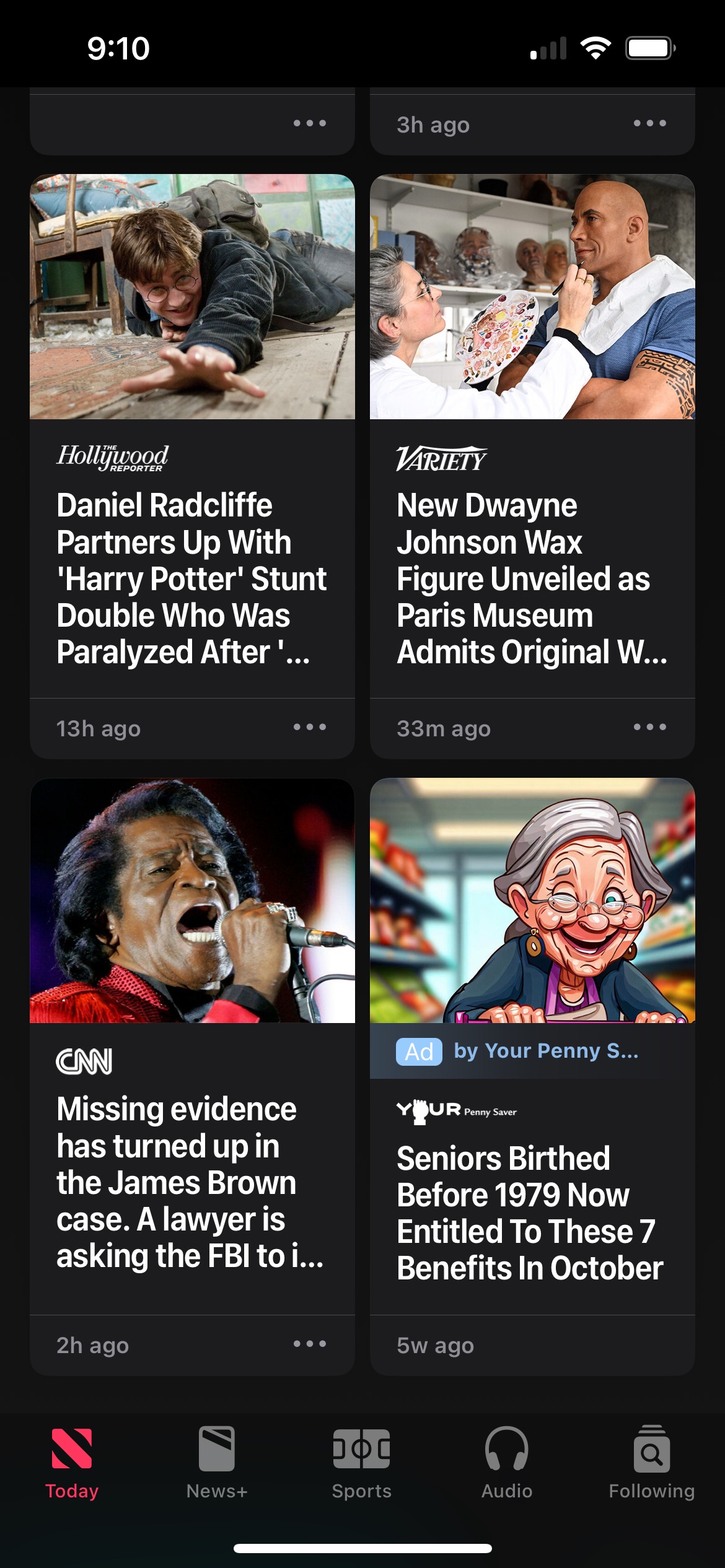
Apple News+’s problems start with Apple News as an app. The page layout is both cramped, and light on all the relevant details. Headlines get awkwardly cropped, and the first impression of the app is always the front page of a newspaper where an editorial team has selected relevant stories for a mass market from a range of national publications. Severing the pieces from any wider context from those publications, but placing them next to each other to show Apple News is impartial.
This pseudo-objective viewpoint includes articles from outlets that I have blocked because I don’t consider the outlet impartial or worthy of my time or monetized clicks. The gray round rect telling me I blocked something, but still spelling out the headline, is entirely irrelevant to me, as an individual. That the round rect exists as a placeholder to satisfy the human doing the layout is utterly irrelevant and personally insulting.
I know that it’s possible to live in an information bubble from only consuming news from sources that I tend to ideologically agree with, but there isn’t a pretend middle ground where I am going to read Fox News. This is not a show me less, thumbs down, or sad face emoji this is blocking. If I banish something, never show it to me.
This happens in all the editorial, human-curated sections. Apple News, and thus News+’s, inability to properly surface things of interest to me, or speak with a genuine editorial voice (like my local newspaper) makes for a pretty shitty browsing experience. The LA Times in the LA Times app is better than the LA Times in Apple News, and anyone who thinks they’re getting the fullness of a publication from their single Apple News+ subscription is absolutely not. That includes things like layouts, special reporting, recipes, etc.
Additionally, ads are also part of the Apple News app layout, and the quality of the advertising is lowest common denominator bullshit that might as well be Taboola ads.


There’s a magazine reading experience buried in here, from the origins of Apple News+, that isn’t bad, but the app does so little to surface anything buried in those periodicals. I know because my most recent dalliance with Apple News+ was to subscribe for one month to read Tim Alberta let Chris Licht destroy himself. It was worth every penny, but then there was no foothold from that article to anything else, despite my best efforts to sift through the round rects.
The main interface relies on the internet-published articles from these magazines, which are more about securing clicks than actually being as interesting as the published magazine pieces.

There are no real sections to navigate (other than “Sports” because just like an underfunded public high school, or anything else in American life, we always need to highlight sports first and foremost). You can just scroll forever in the app until maybe you wind up in a pool of articles that might be grouped together a certain way. I can choose to follow those sections by hitting “+”, but have no ability to navigate quickly to them, unlike a real newspaper, or my local newspaper’s app. The exception being favorites, which typically show up toward the top. In the “Following” tab you can find any of those sections you hit “+” on, but they’re separate from the favorites.
There’s no RSS support to follow topics from writers with blogs that I appreciate to allow me to aggregate what I want to read. Apple made a terrible tool for importing RSS feeds - I know, I used it for this very blog! And it is marvelously unloved by the Apple News team. Their preference is for a totally different markup that someone with a blog really isn’t going to spend time supporting.
That includes things like small-scale subscriber oriented publications that would never be included in News+ like Six Colors, which I contribute to, or to the wave of newsletters that have proliferated in last few years.
Perversely, those larger publications with staff to make the effort to be in News, and News+ seem to spend less effort on their articles. Apple News doesn’t appear to expend effort to suppress listicles, and other lazy writing. Publishers are seemingly rewarded for it based on the sheer volume of it in the interface. Take Merlin Mann’s struggle to find quality fashion articles.
If the thumbs up/down attached to articles does anything it is completely opaque to me. If the solution to me seeing too much lazy writing is to vote and see less of it, then consider showing me less of it! Someone should make sure those buttons are actually connected to something.
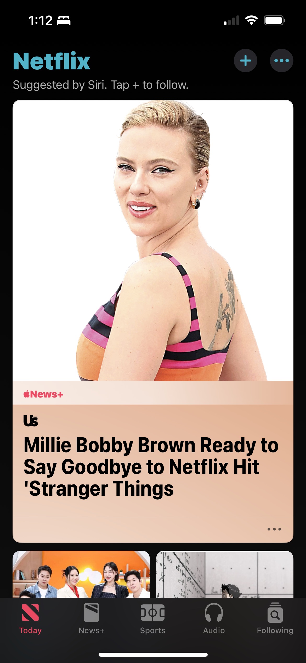
Occasionally, the entire interface is eclipsed by a single suggested article that’s nominally for you and you’ll wonder what miscommunication occurred to invite this into your life. Sometimes the suggestions are even from Siri, but not always, which raises questions around how the suggestions are derived, and why it’s necessary to occasionally brand them.


Assuming I survive running the gauntlet that is the Apple News app and I want to share an article quickly, and easily with other people, I can’t even do that. Apple wants to hijack that relationship and would prefer I send News/News+ links. For Apple, the important thing is to grow the number of people in the News app, and grow News+ subscribers, but for me the important thing is that someone can read what I sent them to read.
The only real “advantage” of subscribing to News+ is that Apple stops bothering me to subscribe to News+. Suppressing solicitation is not a selling point.
Category: text