What Is Going On With Next-Generation Apple CarPlay?
I’m still working through WWDC videos. A lot of interesting stuff is in them, even if you aren’t a developer actively plying your craft you can see Apple’s design and engineering ideas.
The CarPlay videos are kind of wild for that reason. I’m not picking on Ben Crick, or Tarnya Kanacheva who present in both the videos. They present as well as any Apple WWDC video host.
Next-Gen CarPlay was announced WWDC 2022, then Porsche and Aston Martin had teaser gauge clusters at the end of 2023 that isn’t shipping in anything, even their brand-new cars that have been released this year.
The two 2024 videos are basically sales pitches and explainers for the vague 2022 announcement. A lot of extra work has happened in two years, but … will anything ever ship with what they keep teasing?
Design Is How It Looks
The first video, Say hello to the next generation of CarPlay design system, is a sales pitch about how a car company’s brand will only be mildly diluted into a cobranded experience. From Ben Crick, “It empowers you in partnership with our team here, to develop a beautiful cobranded experience that celebrates both brands.”
This is … weird. Ironically car makers are teased with a level of customization that has never appeared on an Apple product in this century, but it’s when working in conjunction with Apple designers, and you apparently have to use the San Francisco family of typefaces? Wild proposition.
Android Automotive uses Roboto, but Roboto doesn’t leave the car when a phone does because it is the car. There isn’t a separate interface system, with typefaces, that needs to exist in the absence of a phone, or the use of a different phone.
This is an odd negotiation in public, since this is a business-to-business video dropped in with all the other publicly accessible videos. A declaration that they’re willing to give up a little control, but definitely not all of it, when in fact they have no control as leverage at all.
I’m not outraged, or disappointed, I’m just confused. Allaying fears that an automaker’s dashboard will look bland and generic aren’t a real concern of automakers who simply won’t adopt the system.
The automakers already have to design a system for when an iPhone isn’t connected. They have to incorporate animations, design gauges, select gradients, use 3D and 2D assets, etc. If they do all that work, and then contact Apple to apply to create a cobranded experience the best they can do is get something that’s close to the work they’re already doing.
Our Audi uses a few typefaces, one that I like on the speedometer and the heads-up display is either Microgamma, or something that’s damn similar. I like it just fine, and I’m sure Audi likes it too. However, the best Audi can do is to work with a designer at Apple to alter the variable properties of San Francisco to get it close enough. How does that help Audi, and why would Audi’s customers want the fonts and gauges to change depending on whether or not their phone is connected?
Architecture Is How It Works
The next video on the architecture is also mystifying. It starts as a pitch to automakers that it’s not THAT much more complicated than CarPlay, and so customizable.
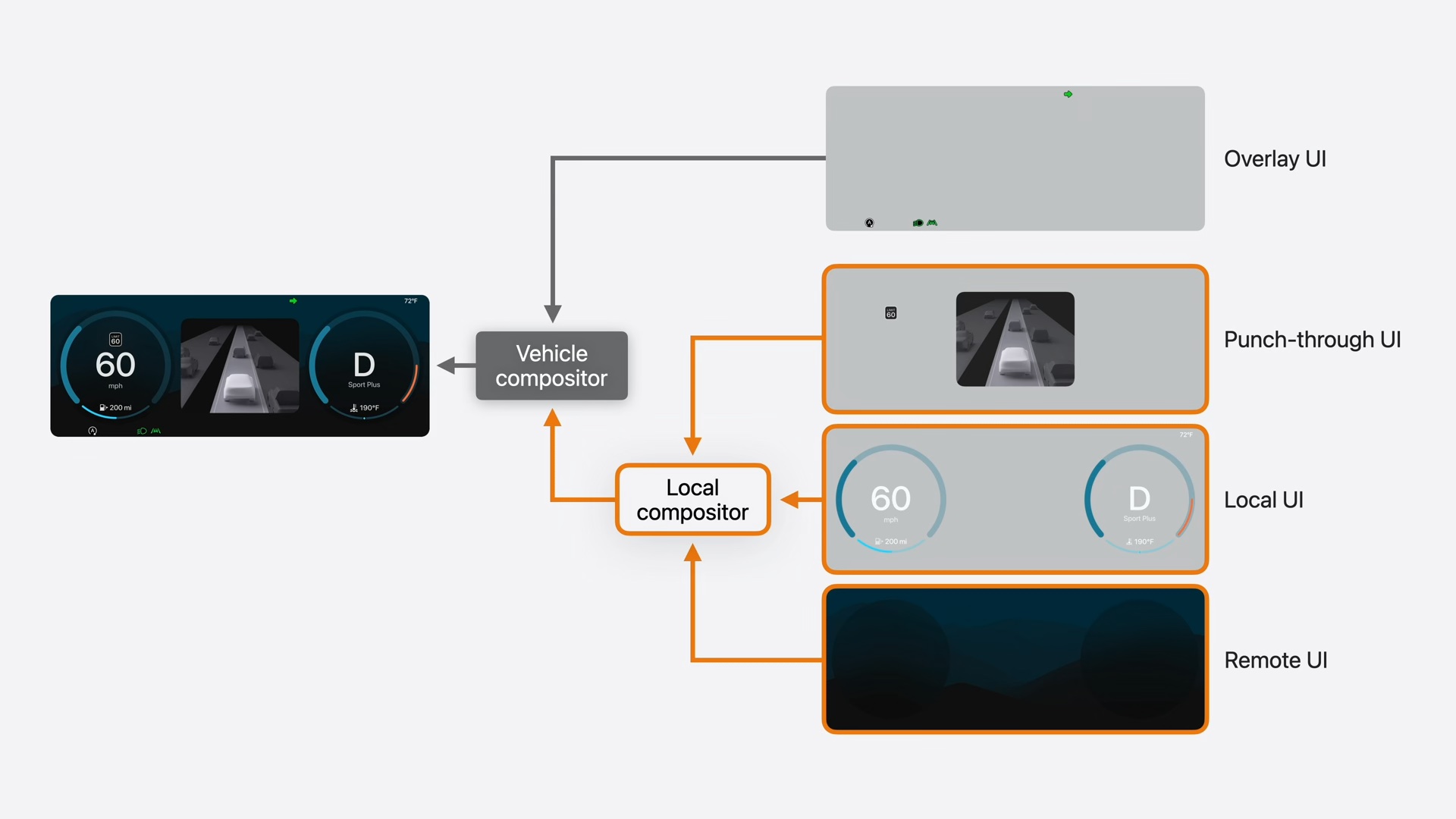
Then you get into how it works, which is also surprisingly high-level in the video compared to other Apple WWDC videos. There are four composited layers, where you have the top level of the stack being an overlay of vehicle telltales and warning lights. Then you have locally rendered elements from an asset package, loaded by and updated by iPhones when they connect to the vehicle. It renders real time stuff like speedometers, because it needs to be able to do that without lag or connectivity issues. Then there’s the remote UI which is all the stuff rendered by the phone for maps, and media. The optional fourth element is a punch-through to views rendered natively by the vehicle, for things like cameras, and advanced driver assistance systems (ADAS).

The compositing pipelines are also separate for each display in the car. There are time codes that are supposed to keep things in sync for buffered output.
This multi-layered approach where things are being rendered and dispatched by different systems perplexes me. Also, not for nothing Apple, but people are pretty familiar with compositing and UI errors on Apple system software. I don’t know how much faith I have in a real-time, multi-layered, multi-source compositing solution.
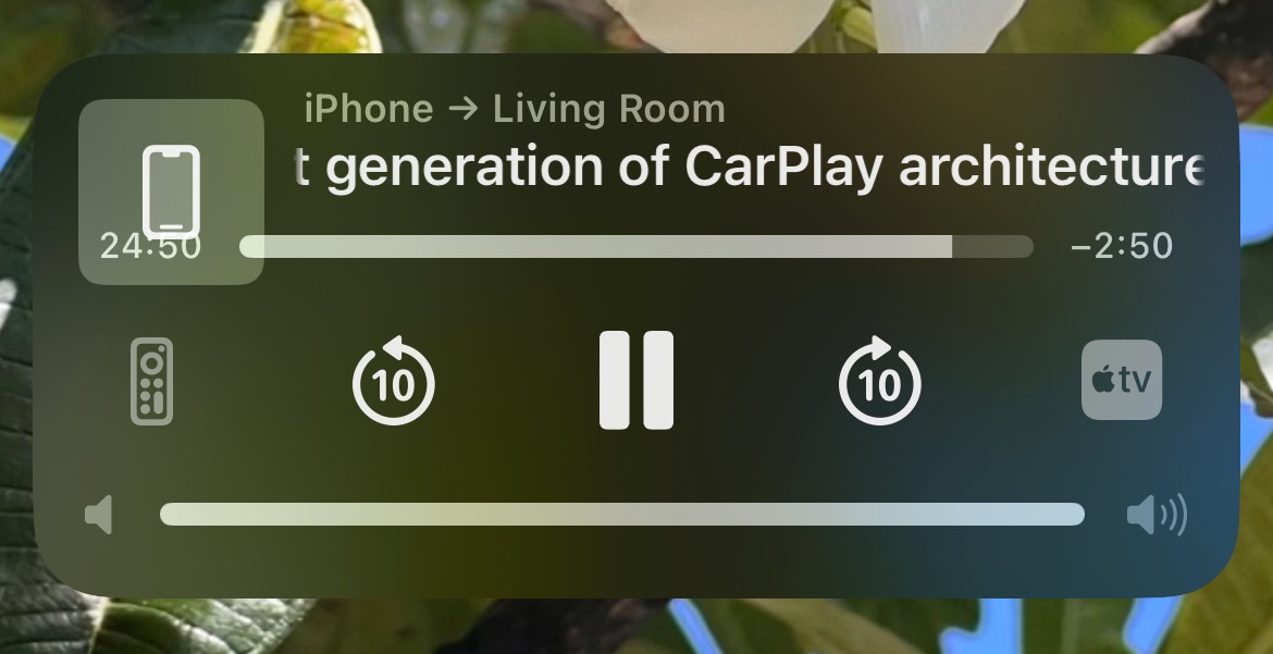
Not that this is the same problem set, but this was my lockscreen when I AirPlayed the video about how easy it is to composite the custom UI layers in real-time:

This is a lot of work to do to reskin an interface. Apple doesn’t supply a theme for the vehicle, and it doesn’t take over everything, it does something between the two extremes.
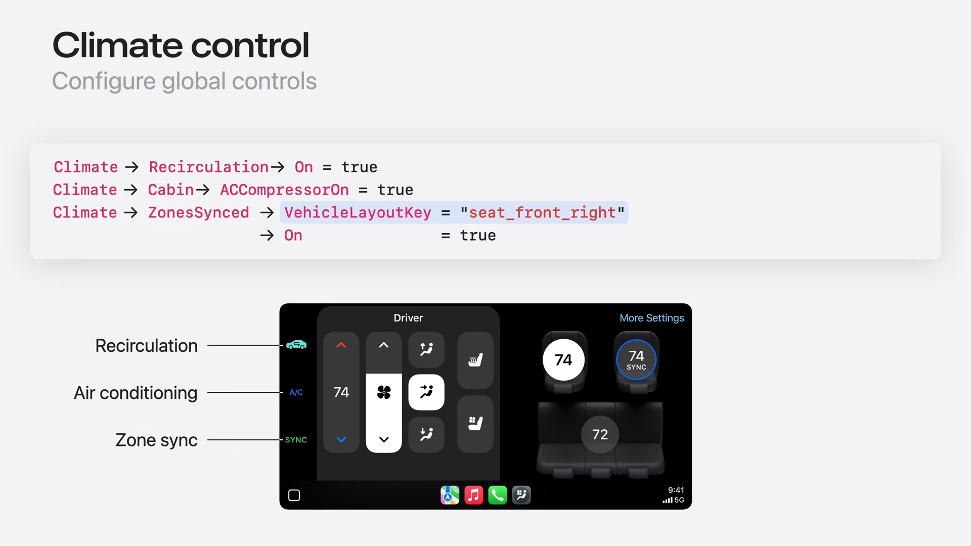
That means that the mix of elements requires a mix of logic and system status updates. The speedometer is already implemented in the vehicle, but now automakers can reimplement a similar speedometer. The climate controls are implemented in the vehicle, but now they can relay status updates and display UI elements that look like Control Center to reimplement all their climate control logic as close as they can get it.

Setting aside the highly polarizing topic of what should be a physical button, and what should be on a screen, there’s no reason to do all the screen work twice. Especially not if it adds to customer confusion over their vehicle controls when their phone isn’t connected to the vehicle.
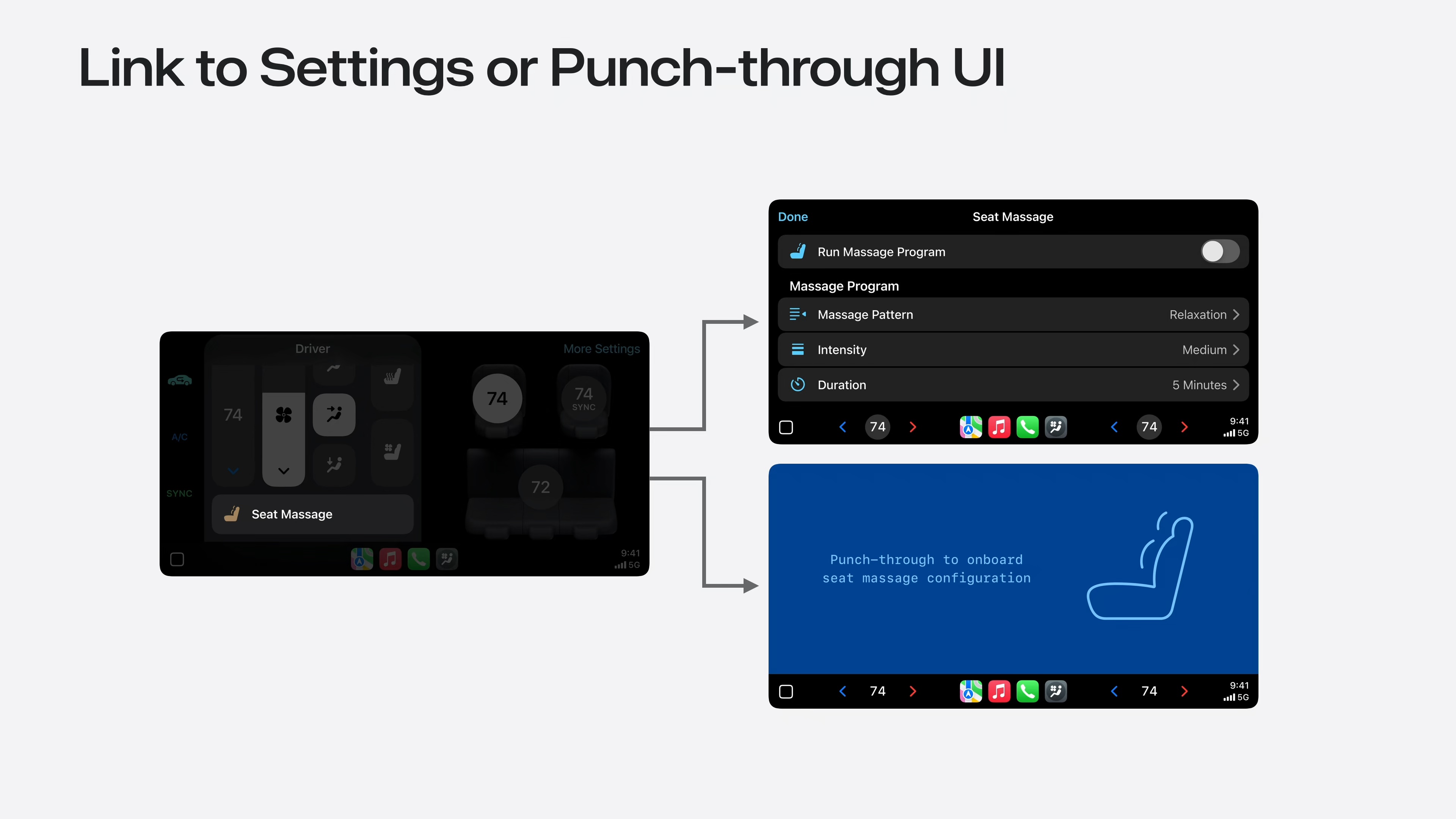
Lastly, the example is given for car settings that are usually in menus, and guess what? Automakers can reimplement all their vehicle controls just for Next-Gen CarPlay. The automaker can also decide to punch through to their own native UI for the settings rather than rebuild it, but that linkage still needs to be made to get people there.

The work to do these things is depicted as being easy, trivial even, but someone has to keep every vehicle setting in sync between the car’s native system and Next-Gen CarPlay. Even if the individual tasks are easy, doing all the tasks twice for everything in the vehicle and making sure they work when a component of the system (the asset package loaded from the phone) isn’t easy or trivial.
Consumer Demand
I’m not a car enthusiast, but I am a CarPlay enthusiast. CarPlay was a requirement the last time I shopped for a vehicle, and I’d never buy another vehicle that didn’t have CarPlay support.
My boyfriend was skeptical of CarPlay, but after a few rental cars with CarPlay he very quickly got it. It’s great. However, Next-Gen CarPlay isn’t that and it’s hard to see customers lobbying for it because Next-Gen CarPlay will be different in every vehicle.
Apple assumes that all automakers make bad choices in interface design, and that Apple makes better choices. That’s not universally true.
I’d posit that a reason why people love CarPlay so much is because the media, communication, and navigation experiences have traditionally been pretty poor. CarPlay supplants those, and it does so with aplomb because people use those same media, communication, and navigation features that are personalized to them with their phones when they’re not in their cars.
No one is walking around with a speedometer and a tachometer on their iPhone that need to have a familiar look and feel, rendered exclusively in San Francisco.
As long as automakers supply the existing level of CarPlay support, which isn’t a given, then customers like us would be content with the status quo, or even a slight improvement.
How would users vote with their wallets for Next-Gen CarPlay experience when the benefits to the customer seem non-existent?
While Apple has been dreaming of controlling car interfaces, Google has actually been doing it with Android Automotive. Android Automotive stays with the vehicle, so there is no twined interface design step or synchronized phone compositing. It is the vehicle. If an automaker adopts Android Automotive they would rightly ask, why they would do the extra work for Next-Gen CarPlay? Android Automotive supports existing CarPlay, as a windowed media experience, and that’s enough for Google to Trojan Horse their way into every car.
In my humble opinion, Next-Gen CarPlay is dead on arrival. Too late, too complicated, and it doesn’t solve the needs of automakers or customers.
Instead of letting the vehicle’s interface peak through, Apple should consider letting CarPlay peak through for the non-critical systems people prefer to use with CarPlay.
One of the drawbacks of existing CarPlay is that your navigation app can only display in the center console, and can’t provide directions in the instrument cluster in front of the driver, like built-in systems can. Design a CarPlay that can output multiple display streams (which Apple already over-designed) and display that in the cluster. Integrate with the existing controls for managing the interfaces in the vehicle. When the phone isn’t there, the vehicle will still be the same vehicle. When the phone is there, it’s got Apple Maps right in the cluster how you like it without changing the gauges, or the climate controls, or where the seat massage button is.
Offer automakers the ability to add navigation waypoints for things like charging stations that are relevant to the vehicle you’re in. Like you have free or discounted charging, or certain fast-charging partnerships, tell the phone it can display, or emphasize that charging network.
The everyday irritations people have are mundane, practical, and are not related to how Apple-like their car displays can look.
If Next-Gen CarPlay doesn’t actually ship in something, or only ships in a Porsche, and Android Automotive takes over nearly every new car, the opportunity for Apple to mould anything about the car experience dwindles. The time for B2B videos about how easy it is to do work no one wants to do, or anyone benefits from, has passed.
Category: text