WWDC 2025 Keynote
I wasn’t satisfied with Apple, and Tim Cook, going into WWDC this year, and I remain dissatisfied after the fact. I don’t have the warm fuzzies when I see Craig on screen. There’s a distinct lack of new ideas in how the event is put together, and in many things in the event itself, despite all prior criticism about these very tame presentations lacking an air of sincerity and feeling incredibly “produced”. At least Apple didn’t fall into the same trap they did last year by promising us a magical AI assistant that didn’t exist. Everything they demoed feels within the range of their power, which is also why much of it doesn’t feel powerful.
F1 and Apple TV+
The skits they do are more for them than they are for me, that’s for sure. I would argue that these sorts of skits work better when it’s reminding us of an Apple TV+ show we’ve already seen and liked, rather than forward promotion. F1: The Movie would make more sense at a later event —if the movie’s good and does well. It just feels indulgent here and doesn’t connect.
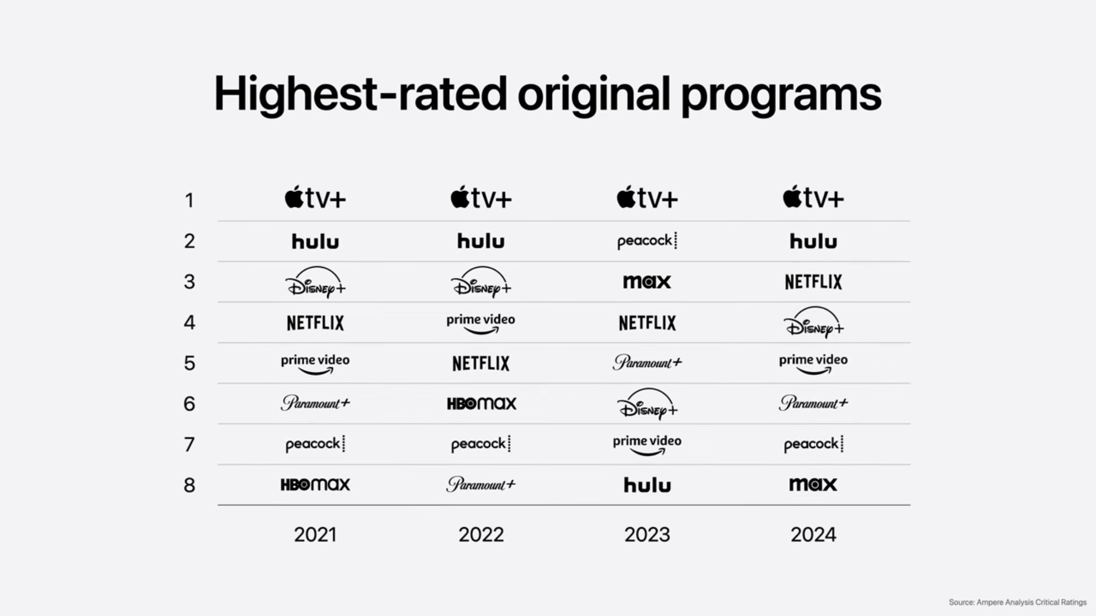
Then Tim Cook proceeds to talk about how great Apple TV+ quality (subjective) according to Ampere. You really can’t argue with it, except to point out that talking about how your shows at good at your software event isn’t going to do move the needle. I know that the general press is there, and they might write a sentence about it, but buy some commercials, fellas. Pay for air time with CBS to show Shrinking. The F1 sketch, and Ampere chart about your quality isn’t converting people.
Apple Intelligence
This isn’t much of a mea culpa. In fact, it largely consisted of Craig Federighi talking about all the great stuff they did ship, which is basically a lie if you’ve used the features in their shipped state. He even highlighted the notorious notification summaries, a feature where they had to add a carve out for news and entertainment apps.
Liquid Glass
Unfortunately, I strongly disagree with the design choices that Alan Dye, and his team, have made with Liquid Glass. Some of it is the material quality of the elements, but a large part of my disagreement is the construction and arrangement of the elements themselves.
If you follow me on Mastodon you’ll notice I didn’t say anything about the rumors for the redesign, or any theoretical renderings. There’s no point in saying anything about a design until you can see it. I don’t need to be pre-mad about anything.
Material quality is mostly fine with a glossy bevel around certain buttons. However, there is an intense refraction effect that occurs where something with a the bevel of a glass slide somehow has the light-bending abilities of a Coca-Cola bottle. Whatever you scroll, or whatever video is playing back, behind these elements causes huge variations in the refracted image passed through the button or toolbar element. Bright things get diffused and seemingly brighter (scattered light should reduce the intensity) but none of this is physically accurate, it’s about the slick appearance of something.
I happen to like transparency and translucency. The Beats Studio Buds+ were purchased specifically for their translucent plastic. I wouldn’t want to make all the UI elements see-through. There’s a time and a place.
In terms of the design language, I don’t like how everything needs to float above the content as discreet elements which all require padding and all have their own distinct shading effects. The top nav bar is gone in apps and replaced by 2-3 circular objects floating at the top of the screen, and 2-3 circular or pill-shaped objects floating at the bottom of the screen. They take up more space because they’re set farther from the edge, and from each other, creating areas of the screen where you see things behind that are not what you’re interacting with.
This means information density is seriously reduced. Here’s an example from Casey Liss running his Callsheet app in the beta. Above the keyboard, he has the floating search bar, and it’s applying a progressive blur to everything underneath. This means there is a single row of movies that are visible in the app. It’s not exclusive to his app.
There’s less room for what’s in the app because so much space needs to be taken up by things floating over the app. These are very similar problems to the much maligned Safari redesign a few years ago. They also applied this design to Safari and made it worse, again, too.
The appeal of the design choice is that things feel light, and your content feels like it expands beyond the borders, but its a useless feeling.
It’s certainly possible that the design will be reigned in before it ships, but the degree to which it will be reigned in is dependent on feedback, so … don’t be timid.
Of course it’s possible that none of this will matter because everyone will keep making web view apps and react apps. lol.
iOS
Other than the design issues, the thing that stuck out the most for me was the Camera app. Apple has never done more to sell third party camera apps. The current Camera app does have a lot of complex interactions, but this doesn’t resolve them. It just hides more things. I’ll have to see how it feels to use —and if they did anything with Camera Settings that mitigates or alters these UI changes.
At a surface level, the phone features, if not the interface, sound like improvements. Messages seems like even more of an interface mess now that there are ugly backgrounds, but people love that shit. Weird that Apple is so set against people personalizing their devices but adopting the most hideous WhatsApp feature that exists.
Image Playgrounds continues to be an abomination. It’s whole sales pitch was that it was safe and private — even if it sucked — and now they’re like, “sure whatever send your loved ones to ChatGPT and make slop of them there”. I don’t respect the decision at all, even if I do understand it. Apple has put “or ChatGPT” in a lot of places where Apple’s models are failures, but “or ChatGPT” is not a success either because what’s the incentive to go into one of these apps and use one of these features that’s just middleware for another service that has its own app? Apple’s incredibly weak and unconvincing here.
If Apple wanted to lean into IP safe image generation they could work with Adobe which has their Firefly model, but that would probably cost money, and ChatGPT doesn’t cost them any money.
Live translation feels like it’s more than a step behind Google here as well. The examples had a lot of lag and the results felt clumsy — but it’s better than nothing.
Maps learning your common routes is good, but Maps has “learned” my patterns for years and is actually very bad at it. For example, I just moved recently, and I changed my address in Contacts, and edited Home in Maps (why are these separate?) and the Maps widget is still recommending that I drive to the old address every day because I had spent so much time there. It’s things like this that don’t give me much confidence in Maps learning anything.
Visual Intelligence is a middleware wrapper on a screenshot utility. It can do some OCR and use data detectors to figure out if there’s an event in a screenshot, or an address, or now pass images on to other apps that can do image-based searches. This is incredibly weak, and still requires multiple steps. It also sends your whole screen, Messages conversations and all. There’s no smart selection, or magic wand. This has all the whimsy of command+shift+3.
CarPlay
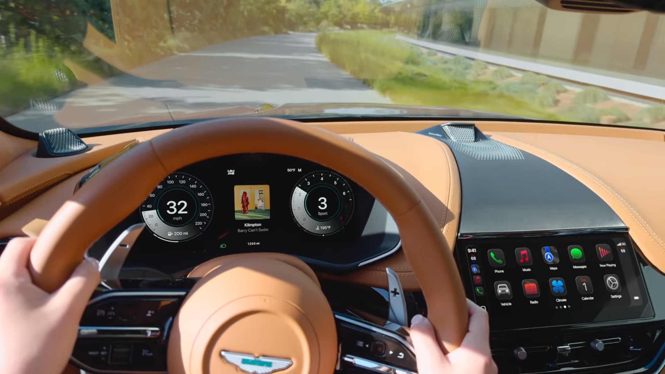
I don’t understand why they went through all the trouble of launching CarPlay Ultra last month when they had an updated design and widgets to unveil for CarPlay this month. The instrument cluster in the Aston Martin didn’t have the liquid glass design language, just the center stack, so it felt a little strange. We know Liquid Glass requires a lot of Metal 4 rendering magic, so is part of the reason for this because of the car’s local OpenGL rendering? If so … why the hell did we design a system like that?
The Tapbacks feel unsafe. I’m pretty puzzled by their inclusion. There should be a better way to communicate Tapbacks with, oh I don’t know, a voice assistant maybe?
watchOS
And Alexander wept, seeing as he had no more worlds to conquer.
If you ask me, and you are because you’re still reading, the software features of watchOS peaked a few years ago. That’s great because they can polish what’s there. The wrist flick is probably going to be pretty good —until I accidentally flick something away and it disappears because there’s no concept of a dismissed notifications folder.
I am the singular person that dislikes the Smart Stack. It gets in the way of my complications. I’ll live with them continuing to push it.
Workout Buddy is a robot voice that tells you several numbers are good numbers and you’re doing great with numbers. I would never in a million years find such a feature appealing. If people want encouragement from a chat assistant, they probably expect a chatbot that they can converse with and develop one of those incredibly problematic social relationships with. Workout Buddy is Clippy for workouts.
tvOS
What tvOS needs is a comprehensive overhaul of the concept of the home screen. For years there have been two competing home screens: the original app-based home screen, and the newer Apple TV+ content-based TV app. Real nerds, like me, know the TV app sucks and use the app-based home screen. The TV app has not been improved in terms of personalization or customization at all.
The sign-on feature once again requires adoption by streaming apps in order to work, and it’s tied to your Apple ID. Good luck with that getting widely adopted over QR codes and authorization URLs.
The user profile picker that’s presented at start-up is also another miss. As I’ve written about before, profiles are an imperfect mechanism for viewing behavior for several reasons, including the fact that most households share services, and those services have profiles, and those profiles aren’t using Apple’s system but their own cross-platform profile systems.
Of all the features to focus on for tvOS — like where the hell is a live TV guide — Apple’s going to bug people about user profiles and talk about yet another sign-in method? What the hell?
For some reason Apple decided to buck industry trends and all the show art tiles are movie posters now. I get it, it seems cinematic to evoke movie posters, but the interface is on a 16:9 screen. Use your noodles. This means that you get to see one row clearly. To make up for that, the show text is overlaid on top of the poster art with stylized fonts, like Photos Memories, making the shows harder to read. This change needs to be reverted.
I have nothing to say about the karaoke, which apparently requires the latest Apple TV 4K, and all your friends to have iPhones. I apologize in advance that I will quickly forget this exists.
The only positive thing I can say about how tvOS is being managed is that they still support the 2015 Apple TV 4th generation a.k.a. the Apple TV HD. It’s too underpowered for liquid glass shaders that refract the video you’re watching through the thin playback timeline bar, but something tells me that’s not a major concern Apple TV HD users have in 2025. Kudos for not dropping them.
macOS
Bill Atkinson, who invented the menu bar, died this weekend, so it just happens to be especially poor timing to try and kill the menu bar again. Apple has tried to reduce the menu bar before and walked it back so I hope there’s some way to do that here. This is not a matter of tradition, but usability. Having places on the screen where things go, and are styled in particular ways, to having meaning is important.
I understand the desire to reduce the heaviness of the menu bar, especially on MacBooks where the menu bar has grown to match the notch — but that’s a notch problem, not an ‘eliminate the concept of the menu bar’ problem.
The Finder window decorations are a real travesty. A bunch of lumpy circles and drop shadows with strange tangents. The Finder windows feel like less of a window and more of a second grader’s button and glue collage.
Shortcuts and Spotlight
This isn’t the time and place for another rant on how editing and creating Shortcuts is bad, but it remains bad. The automation triggers seem like a theoretical good thing, as does access to various models, but Apple still isn’t providing any assistance on the composition and creation of those automations.
The changes to Spotlight are great. RIP Alfred. I’m disappointed that the actions aren’t natural language actions, because the syntax of things seems clumsy. This is in essence what I was complaining about in this Six Colors post but that was Spotlight for iOS.
visionOS
Well, it looks like people are still working hard. So… uh… keep going for another decade and I’ll check back.
iPadOS
This might be the best part of the keynote. Apple delivered on longstanding gripes that iPad power users have had about the platform when it comes to window management, background processes, menu bar (lol), and audio routing. I wonder how well it all works in practice, but on the surface it seems like someone at Apple was finally receptive to years and years of complaints.
It was absolutely hilarious that after all that fuss, and all the failures of trying to rethink windowing, they just did it the Mac way, tiny traffic lights and all.
Unfortunately, there’s still a Files app, and despite the announcements I don’t consider it an improvement. I look forward to WWDC 2035 where iPadOS 36 gets the Finder, which by then will be a mobile of buttons suspended by invisible physics.
Not Six Out of Five Stars
Ending with a song about an app store review felt pretty tone deaf (ha) because of the antagonistic relationship Apple has developed with app developers over the App Store. There was no contrition in the keynote itself over their policies and the things that have come out of court proceedings, it was all, “look at what our greatness provides”.
This WWDC definitely felt more grounded by what was possible, but like I said earlier, that’s also why much of it just met expectations. Hopefully people press Apple on the wild design choices and Apple reels them back in, but I don’t expect Apple to do the reeling all by itself. Try not to shush critics on behalf of Apple.
Category: text