Underbaked tvOS 17.2
In a rush to get everything done before the holidays tvOS 17.2 was pulled out of the oven too early. I have strong opinions about tvOS, and obviously hold it to a high standard, but I don’t see how delivering something by this arbitrary deadline qualifies as progress when the thing being delivered is so incomplete, and buggy.
Everything I said about the revised TV app is still true.
The issues that I have suggested Apple should resolve:
- Unify media and apps into one interface, with the ability to pin favorite apps.
- Reduce the amount of Apple TV+ promotion in the interface, particularly for non-subscribers.
- Properly personalized recommendations based on viewing habits.
- Handle live TV through a unified programming guide, like Amazon does, instead of pretending the only live TV is live sports.
The new interface miraculously resolves none of these things.
A brief recap of that post: Instead of a horizontal row of pill-shaped buttons in the TV app, it’s a vertical sidebar that auto-hides. The experience still centers Apple TV+, and now MLS Season Pass. None of the core functions can be moved around or hidden. I hope you like those things because they live there forever, above anything else.
It sucked in the beta, and it still sucks now, because nothing was improved at all about it since its introduction in October. Except for some reason “Watch Now” has been renamed “Home” in the TV app. So now you have an Apple TV with a Home Screen that has a TV app that has a Home Screen. Deep, sharp inhale. Long, slow exhale.
There is a new Newsroom write-up about it how great the TV app improvements are!
“The redesigned Apple TV app makes it easier than ever for users to watch the shows, movies, and sports they love through an intuitive interface that brings content to the forefront,” said Eddy Cue, Apple’s senior vice president of Services. “With so much available to watch, our aim is to ensure users always have their favorites at their fingertips.”
No it isn’t. What’s at my fingertips are shows that I don’t subscribe to. Regardless of the quality or award-winning nature of those shows, I do not have an active subscription, and shoving them under my fingertips does me no favors, because what I want to do is not at the forefront as long as it’s taking up that space.
The new sidebar navigation also introduces Home, a unified guide for all the shows, movies, and sports viewers love. Within Home, the Channels & Apps section allows users to browse each of their subscribed channels or connected apps in depth. And collections — including New Shows & Movies, Top Charts, Trending, and For You — bring forward the best recommendations for viewers to enjoy across what’s new, popular, and tailored just for them.
This is absolutely not how this works in practice. I invite anyone in tvOS 17.2 to scroll down the sidebar to Amazon, Disney+, Max, or another major streamer. You’ll see a very sparse, depersonalized interface that shows you very little media at all, let alone media that’s relevant to you, specifically. This is in stark contrast to the media displayed inside of those apps. This is utterly barren in comparison.
It utterly fails at being a replacement for even the worst, buggiest, third party app I have, and I’d rather use the treacherous Prime Video app than deal with what the TV app thinks is on Prime Video, because the TV app doesn’t really know.
On living room devices, the sidebar will also feature profiles, allowing households to quickly switch between users for better personalization in Up Next and content recommendations across the app.
This still doesn’t work in practice. Third parties really haven’t bought in to Apple’s user profiles. People also don’t always watch movies and TV shows in their own profile (Apple or otherwise). Also the only thing in the interface that shows personalized recommendations is waaaaaaaaaaaaaaaaaaay down at the bottom of the TV app’s Home Screen. It currently takes me 16 swipes down to get to that personalized “For You” row, and 23 swipes to get to “We Think You’ll Love These Action-Adventures”.
Right under those fingertips!
Do the people working on this product not know what personalization is? It’s an interface where I can’t move anything, to even narrow down my interests, or even the Apps and Channels that matter to me more than the others. Charting, promotions, editorial content all buries personalized recommendations, and there’s no consideration for what mood I might be in. Compare this to any major streaming app at all and you’d see how weak and pallid this personalization is because it can’t match, let alone extend it, and they own this whole platform, not just a singular app.
R.I.P. iTunes Store
I don’t have a lot of love for the remnants of the iTunes Store inside of tvOS. The Movies and TV Shows apps never had good navigation, and felt entirely alien to the way other, modern media apps felt.
I’m not really won over by its replacement in the TV app, or the execution of the transition. Someone at Apple must have, wisely, figured that a lot of users probably had TV Shows and Movies somewhere in their Home Screen, and because the Home Screen is a left-aligned mess, removing two apps was sure to cause a lot of app reshuffling and confusion after upgrading (just as the sixth column did a few months ago). Those apps now just serve as splash screens with redirects to the TV app Store and Library views.
They didn’t do anything to spruce up the experience of navigating your library. It’s a sea of 16:9 tiles that can be filtered by genre, but the genres are still bad. Animation has a cute little Mike from Monsters Inc. style icon, but all my Pixar movies are in “Kids & Family” - whoopsie!
Also a lot of my Library is incompletely categorized. “TV Shows” contains only Battlestar Galactica episodes that I’ve purchased. Tapping on it reveals all the seasons as rows, with each row having all the episodes horizontally tiled across, instead of something sane or practical like a season navigation element and an episode list. Also if you bought a few episodes here or there, and not the complete season, the interface doesn’t show you the missing episodes or how to get to them in the store. The episode consists of a thumbnail that will play the episode, and a truncated text description under it that can be expanded into the exact same amount of text.
Also BSG is my only “TV Shows” show, all the other TV shows I’ve purchased are strewn about in the genres. “Comedy” has shows like 30 Rock and “Drama” has shows like Mad Men.
The Store fares a bit better, but only because it has rows based on ratings, popularity, sales, and genres, and they all have much more information when you drill down into them because it’s showing you the information you see when you ask Siri for a show (more on that later).
Unfortunately, there’s no cute iconography here, and the genres are these over-sized 16:9 icons that are just a color gradient overlayed with something from a stock photo library. Not really a step backwards for the iTunes Store at all, but not really moving anything forward.
While the TV app’s Home Screen (grumble) has two rows of lightly personalized media recommendations, there’s no personalization in the Store view at all. Nothing based on your purchase history, library, or streaming habits. Everything displayed here is the same as it is for everyone else in your region. An editorial, TV-Guide-magazine-like approach that isn’t modern and doesn’t meet user expectations from the other streaming apps they use.
Do You Want to Search or Search?
A huge change that I didn’t write up (well, I started to last week, but then the OS needed to ship so here we are!) is the change to the Siri button in tvOS 17.2 because that was shoved in to the last two release candidate betas.
Like you pulled the underbaked cake out of the oven and sprinkled sugar over the top because you forgot to add it earlier.
Tapping the Siri button in compatible apps will bring up a search box element at the top of the screen where you then need to hold down the Siri button to dictate a search. It will then whisk you away to the Search app, which will conduct the search and display the results there. OR, if you’re in the TV app it will do the search inside of the Search view of the TV app, which will show the same results as the Search app, but doesn’t have the same filtering. Tap and hold inside of the Music app gets you a Search inside of that app (except on my 4th gen Apple TV).
Holding down the Siri button will still, eventually, bring up that spinning orb and you can do all the same Siri stuff you’re used to with the orb. It will display it’s search results in the same ephemeral overlay as before.
So why did I say “compatible” earlier? Well, right now you can only tap to dictate a search in the Home Screen, the TV app, or the Music app.
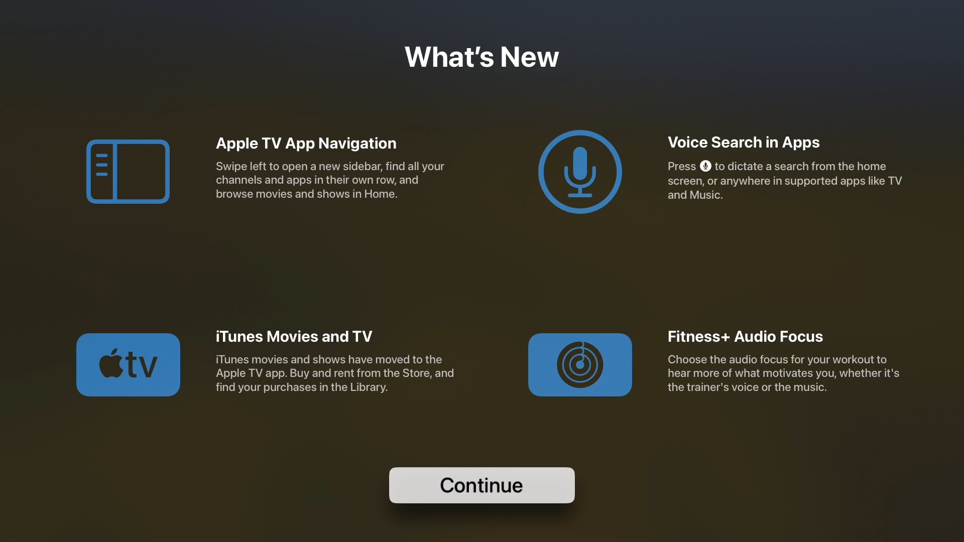
The wording in the “What’s New” splash screen — “Press [Siri button] to dictate a search from the home screen, or anywhere in supported apps like TV and Music” — hints at future third-party integration, but do you know what I don’t want to have to ever guess at? Which third party apps will and won’t work when I tap-and-hold. I also have no idea how Apple expects to entice third parties to adopt it since they have been unable to get any of them to adopt the default player to support timeline scrubbing, or unified menus.
Apple also only shipped support for TV and Music, not Apple’s other first-party apps like the App Store, or Podcasts.
If you’re in the Amazon app and you want to use the new tap-then-hold dictation search then you need to navigate out of the application you’re in to the Home Screen, or TV app (or really the Search app, but that’s even more taps!) You can still hold to ask Siri to search for something though while you’re in an app that’s not compatible without needing to navigate anywhere.
If Amazon adopts the tap-and-hold to bring up their own Search view inside of the Prime Video app and only search Prime Video then that’s even more confusing.
It’s good that instead of an ephemeral search overlay you can drill down and refine your search results in the Search app, but the execution of this is obviously incomplete.
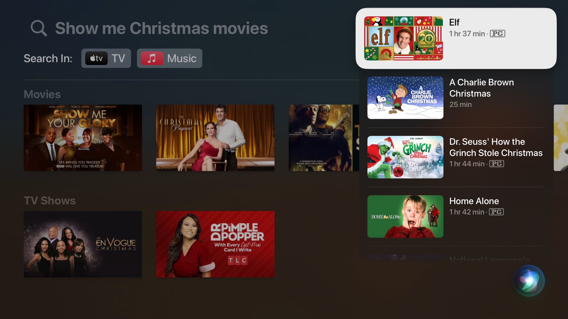
That’s not quite all there is to it though, because tap-and-hold searches aren’t just different implementations, they also show different results. Tap-and-hold is taking the words you speak and putting them in the Search app’s search box for you. Hold-down for the Siri orb searches some other, unknowable way. If you’re searching for a movie title you’ll mostly get expected results because both are being very literal with the title. If you use any of those genre searches with Siri they don’t work in the search app.
For instance, “Show me Christmas movies” will yield wildly different results because the Search app tries to search for every word of that like you’re using a search engine in 1998. The first result is a movie called Show Me Your Glory because the first part of my search was “show me”. Deep exhale.
Siri hold-for-orb will show you a vertical overlay with very common Christmas movies. Utterly, and perfectly, unoriginal Christmas classics. Exactly what’s expected.
To recap:
- Tap, then hold Siri button on the Home Screen, in the TV app, or in the Music app and get your dictated search term piped to the Search app which can be navigated in, and out of. It can’t understand expected natural language requests that Siri understands, or any command that you would give to Siri. It won’t fall back to Siri, or even understand that you tried to ask it to do a command. It’s just a very literal search box.
- Hold the Siri button everywhere and get ephemeral search results that will not be in the Search app, and will disappear when you navigate away, just like it’s always done. This is the only way to do natural language searches or issue commands.
So now this one button does two things, and does them differently, and you need to decide what kind of thing you want to do.
This is like taking two half-baked things and putting them together to make one whole-baked thing. That’s not how that works.
Ideally, you would not have tap-and-hold at all. Just hold. You would ask Siri something that was recognized as a search, as it does now, and the search would be displayed in the Search app, using all the same natural language searching that Siri already does, but the functional filtering and navigation that the Search app has and the ephemeral overlays don’t.
Unless You Have a Bug
My test Apple TV hardware for tvOS betas is an Apple TV 4th generation, renamed to the Apple TV HD, and introduced in 2015. Apple sold these until 2022. They’re not going anywhere, and they get tvOS 17.2 just like every other Apple TV. My living room Apple TV is a 2nd generation 4K introduced in 2021. It doesn’t go on the betas because that’s the one my boyfriend uses and I don’t want to hear about it if the beta breaks something.
The beta broke something. When tap-and-hold Siri buttons shenanigans happened the other week my Siri orb search overlays stopped working correctly. I filed a Feedback (FB13456609) last week when the release second candidate appeared, and it was still broken, but I heard from other people that it worked fine for them.
I recorded a video today, with the Apple TV running the official tvOS 17.2 release if you really want to see it. Now that it’s official, I installed it on the Apple TV 4K in the living room and that one does not have the bug. Near as I can tell the only thing different between the two is the model. Same user account, same network, same everything.
But it can’t be some widespread issue affecting the 4th generation Apple TV because that would be silly — beyond ridiculous. Maybe it’s some bit of cruft left from a beta install that’ll just disappear in a January point release, but it doesn’t fill me with confidence that I participate in the Apple TV beta process, file a feedback, and the thing still ships anyway. Why waste my time writing up bugs? The Feedback site even stripped all the new lines out of what I wrote.
Do I bother writing up the Music search bug and generating a sysdiagnose again on my 4th gen Apple TV, or should I just cross my fingers?
Bake It Again
I hope that 2024 gives Apple employees more time to refine what they shipped here in 2023, but I don’t feel like it’s helpful to ship tvOS 17.2 in this state. Breaking the Siri button into two functions definitely didn’t need to be published before everyone went to this year’s holiday party. I don’t understand the motivations at play unless it’s about looking good in a demo to person higher-up the ladder.
As I’ve repeatedly said, there’s plenty of work to do in tvOS, and the TV app. It’s not like I object to people working on it, like it’s some perfect thing, but I don’t want to have to explain to my boyfriend that he’s using the Siri button wrong.
I really do want a unified, pragmatic approach to home media. Searching, browsing, live TV guides, unified profiles — everything. Not just a selection of Apple’s interests shoved in front of what I want to do, and certainly not in a haphazard, impersonal way.
People often reply to my critiques of tvOS to say that at least it’s not Fire TV, or Roku. That Apple cares about the user experience. While Apple is nowhere near as bad as Amazon at monetizing those eyeballs, that doesn’t mean Apple is shipping a product that’s beyond reproach. Even if Apple TV+ shows and movies are critical darlings, that’s no justification for degrading the user experience, and it has nothing to do with how Siri and Search work.
Whether the next bake is 17.3, or 18.0, I hope the people at Apple get the resources and time they need, and they’re not just pulling it out of the oven because they’re out of time.
Category: text