Fixing Apple News
A little while ago I wrote about why Apple News, and Apple News+ suck. I’m very confident that I’m not in the minority with my opinion that it sucks. I would like to detail some things that I think would help to make the News app and News+ service more appealing.
Personalized Top Stories
Abandon the misguided concept that the Apple News team can present an immutable layout of general interest stories with a centrist, non-partisan viewpoint. If a news outlet has risen to the level of ire where it’s been blocked then omit it. Don’t have that gray box, with this condescending text:
Blocking isn’t supported in Top Stories and other groups curated by the Apple News editors. [Publication] is blocked in the rest of your feed.
That dialog shouldn’t exist in the interface. The curation of the editors is not sacrosanct over my value as a reader. There’s no editorial board that can be written to, or people working at Apple News that do any writing. This is simply a highfalutin aggregator!
The editors can weight stories that are of interest to surface in that region, but those weights should be overridden by any blocking, or content filtration, that a user wants to employ. Surface something else to fill the area, if that’s the main concern. It’s not like Fox News articles offer structural support or tie the whole interface together. This space is an inbox, not publication in and of itself.
Also allow the user to weight what’s important to them. The editors select for breaking national, and world news, with one little round rect for local news at the bottom of Top Stories. It is very rarely, if ever, a top story in local news.
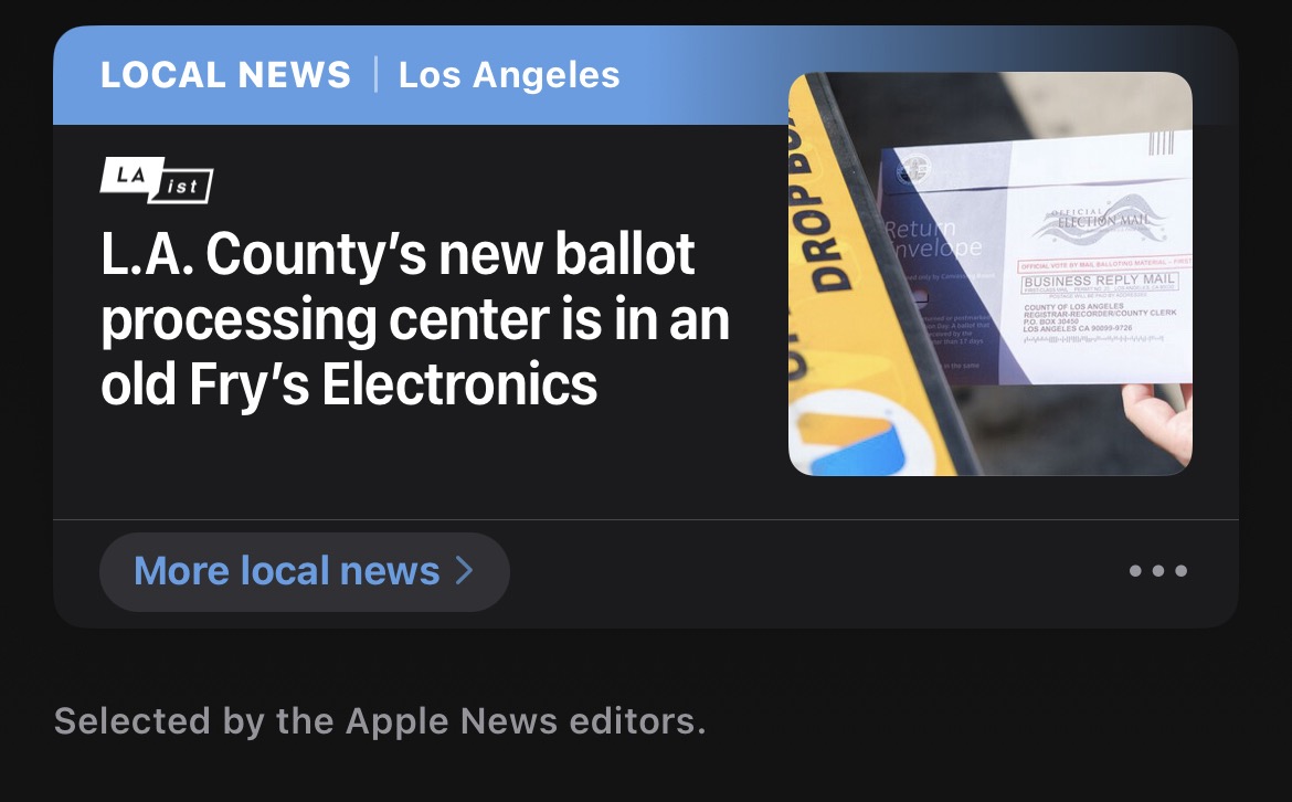
I can tap the “More local news” and I’m taken to a Los Angeles “topic” which aggregates any publication that has something to do with Los Angeles, that includes the LA Times, LAist, Hollywood Reporter, Variety, NBC4, ABC7, Infatuation, Eater Los Angeles, etc. However, those publications are not always writing about Los Angeles so you get state, national, world, general entertainment news, and celebrity gossip. It doesn’t present anything as coherent as the LA Times front page, or the LA Times app.
It does have its own menu for sections, like a newspaper, but it’s still in the purview of the Apple News editors so I can’t suppress the content mill firehose of The Infatuation. It gets the same blocked channel treatment as Top Stories so I get clumps of gray boxes. Again, suggest less doesn’t do anything.
The editors do a good job of mixing in sources that are not exclusively for Apple News+ subscribers in the Top Stories section, but that also means it might be from a lower-quality source, or one that I could access more easily from the web, or social media.
People might not remember this feature, but if you have a subscription for a publication outside of the Apple News app - like my subscription for the LA Times - I can authenticate my subscription and see all the LA Times stories in the app, but it doesn’t remove the “Apple News+” banner from the story headers to distinguish it from the stories I can’t read from Apple News+. Because I can read the LA Times, I would like to weight it higher than other lower-quality, free publications.
Filters
Instead of voting on individual stories with thumbs that don’t seem to mean a goddamn thing, or blocking an entire news outlet, what if we could filter by words, or phrases. You know, like in ye olden days? I can filter email, surely I can filter news, which we’ve already established is an inbox.
Apple could even jazz it up for 2024 with some ✨machine learning✨ to understand when we don’t want to hear about specific people who always seem to worm their way into the news. Not everyone wants to block specific people, and it hardly seems like it would topple any particular personal brand, but it could pacify some cantankerous people (like myself).
Throw some ML filters at stories that amount to little more than a collection of Amazon affiliate links. Let people who want to see deals-deals-deals see them, and maybe corral them into a specific section. Let the rest of us be blissfully unaware.
That also goes for filtering news stories that do little else than gnaw on a fragment of an interview, or bulk up one quote, into some big reaction.
Surely a network can be trained to identify what percentage of a story is out of context crap from the original source, because I can do it. It usually involves skipping anything from ScreenRant or Inverse! If anything, use those stories to weight the importance of the original news item, and then shove these bottom feeders under it, where those publications can look for their crumbs of attention.
None of this seems like impossible Jetsons technology. Artifact was doing stuff in this space with rewriting headlines. Jay Peters, writing last June for The Verge:
Clickbait headlines aren’t just annoying for Artifact users, though: they can also mess things up for Artifact’s recommendation systems. Sometimes, clickbait headlines can tell the systems that “you’re interested in things you may not actually be interested in because you’ve clicked to find out some key bit of information that was left out of the title,” Systrom says.
Systrom showed me a demo of the AI-driven rewriting process. When a user marks something as a “clickbait title” (you can find the option by long-pressing the article in your feed), they’ll see a little loading animation show up where the offending headline used to be, and then the new headline will appear. Next to the headline, there’s a little star indicating that it’s not the original title. Artifact isn’t able to rewrite headlines in articles themselves; it can only rewrite them from the feed.
Artifact failed because they couldn’t grow, and didn’t have a clear way to make money. Apple doesn’t have the same financial concerns Artifact had, obviously, but Apple would be concerned with profitability. Which is why the personalized filters could be for News+ subscribers. Some degree of server side quality filtration would be beneficial to even non-subscribers (as it would be very difficult to pitch someone to spend more if the base experience was as poor as it is right now).
Newsletters
Apple will send out email newsletter digests curated by the same people who curate your Top Stories. I’m sure someone turned that feature on on purpose, and didn’t turn it off.
People love newsletters! Apparently! They can catch up on stuff anywhere they can read their email, and they can organize it with the same tools they’re used to for their day to day life.
There are also people who have begrudingly picked up an assortment of newsletters over the last few years of the newsletter expansion who don’t relish reading their newsletters interspersed with their other email. I’m in this latter group.
I already use iCloud Hide My Email addresses to subscribe to newsletters for some layer of privacy, how nice would it be to have an iCloud email address that ingested newsletters into Apple News? Not to be interspersed with Stuff Magazine, and all that garbage, but in a newsletter section.
What if we did the exact same thing for RSS feeds?
We all have sites we value reading more than some of the detritus floating in Apple News. If Apple wants us to spend more time in the app put the stuff we value reading in the app. We’re not always on a quest to browse for just whatever happens to be there. We all already have our own sources and habits.
Create a home for those. In Safari’s Reader View, add a button to bring something into News, by finding the feed tag and importing it, or just that one-off item instead of leaving news items stranded in the browser. That publication might even already have that article in Apple News and then News could reduce the friction of getting to it.
Instead of someone feeling trapped under 100 pounds of sweltering JavaScript and boiled alive in autoplaying video ads, they could see a better reading experience, and those publications could see conversions to Apple News, and they could figure out if they wanted to be in Apple News+.
Gift Links
It’s very difficult to get people to want to open Apple News, which means it’s more difficult to convert them to News+ subscribers inside there. The publications in News+ aren’t especially interested in promoting News+ because they benefit more from your direct interaction on their site, or subscribed to their newsletter. They want to convert you into a subscriber for themselves. One of the ways that publications have had success with this is with gift links. Where a story can be shared with a filthy non-subscriber.
Apple News+ should have gift links. Instead of wincing when someone sends me a News link, I could be interested because it’s a gift link to read a story I otherwise would not. I could then experience the new and improved News app (seriously, Apple can’t skip the rest of what I’m saying and just slap gift links on the existing app, that won’t do anything).
It’s not rocket science. No one wants to share links to Apple News because the app sucks and it hijacks links and traffic. What if it the app was good and the link made you happy and grateful? What a comeback.
Better Layout
Flat out we need to get rid of the round rectangles that are too small to show an entire headline. That can’t be a thing. I don’t care if you need to do a brick layout, or shrink the image that accompanies most stories, but I’m not tapping on some mystery-meat headline that’s cut off with an ellipsis. We certainly don’t need towering images that take the entire screen up at the expense of clarity. If Apple wants to evoke print publications with those “spreads” in here, they should also evoke print publications in having the entire headline.
The News app, and News+, operate from the assumption that you’re just going to start at Top Stories and scroll down forever. When you drill into an article or publication, it’s not like macOS column view, or iPod navigation, where there’s some logical breadcrumb trail, because you might have picked a “section” from a menu.
The sections that are crammed vertically on top of each other are not ordered by you, or set based on your preferences. The “For You” section is stocked with stuff that’s never been for me. A parade of suggested topics and sections shuffle up and down and can only be dismissed outright.
Do I want to follow “Technology”? Uh… I mean… I guess that seems like something I would like to follow, but it seems very broad, and a lot of it seems poorly written? I can’t increase that section’s size, or decrease it, but I can leave the infinitely chopped up vertical to drill down into the topic, and be presented with the “For You” for each topic.
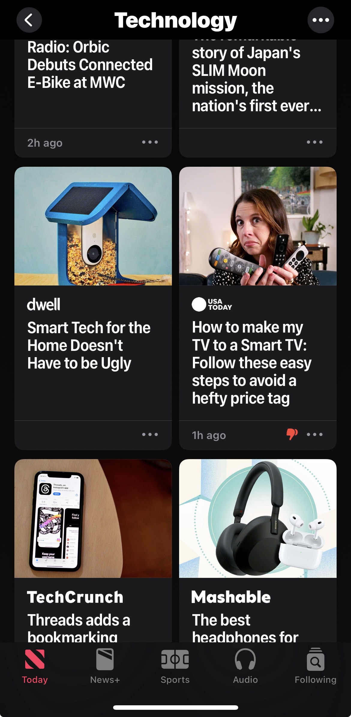
Which in “Technology” is still overly broad. Assuming I liked any of what I’m seeing here, I can’t rearrange the “Today” view to include more of it, and I can’t navigate to this topic on the “Today” view because it has no sections menu, like the publications and topics like “Local news” do. I can’t just see an outline of the whole shebang.
If you want to jump directly to anything that may or may not be on this page you have to go to the “Following” tab in the interface which shows you Special Coverage, Favorites, Local News, Channels & Topics, Suggested by Siri, and a grab bag of everything else that isn’t Sports.
What if I could collapse and expand sections? Maybe a mini-map of all the sections? Reorder and scale them like widgets on the home screen? You can reorder the publications under the Channels & Topics section but… it doesn’t do anything other than move them in this list, not your “Today” view.
Imagine if the order of the page changed based on time of day and I could choose to see important breaking news in the morning, topic-based writing during the day, and more thoughtful, ruminative pieces in the evening.
What if I could change the button for “Sports” and “Audio” to literally any other topic? Ivory, Tapbots’ Mastodon client, has an innovative feature to long-press on one of those bottom tab buttons, and swap it to something else so you can see mentions, faves, bookmarks, etc.
Eddy Cue could have like twice as many sports crammed into that “Sports” at the bottom as long as I could pick something else, like take me directly to the LA Times, or that baffling “Technology” topic.
Pushing users entirely to an uncontrollable, vertical scroll in “Today”, or making them dig in “Following” isn’t providing those readers with an experience that’s an improvement over other news sources. Despite the worst ad-tech out there, it’s often more likely I’m going to run into something I want to read on a site junked up with ad-tech, not in the difficult to peruse, or personalize abyss of News. It certainly doesn’t sell people on News+, despite the high percentage of the interface dedicated to teasing News+ articles.
Simply Fix Journalism
I know that I’m pitching changes with that “just do this” attitude that people love to be on the receiving end of, but someone’s gotta change something in that app. It doesn’t have to be any of the stuff I’ve said, but these areas I’m hitting on need some kind of work. There are financial ramifications to any kind of change, and the folks in charge of Apple News and Apple News+ might value getting new publications onboard more than improving the app. However, improving the app improves all the good publications, and shows people that they’re worth paying for.
Instead of chasing old ambitions around editors and institutions, I would like to see an approach that takes the reader into account.
Category: text