The truth is that I use several different monospace fonts, and display styles, that are app specific. I’m not someone that sets the same thing everywhere. That can seem strange but I find that some fonts seem to look better in certain apps, or that some fonts work better for me when I’m doing a particular task and it sets a context for my brain.
As for theming, everything is white on black, except BBEdit and Terminal. BBEdit is just the standard Light Theme with its white, blues, and purples. My Terminal is “Homebrew” which is green text on a very slightly transparent black background. I’m also a cyberspace cowboy.
I don’t mess with fonts on iOS, so that version of Drafts just coasts on system defaults and it’s fine for a smaller screen.
I used to use Sublime Text, with Solarized Light and Dark themes, and when I worked on a Windows machine at work I had Solarized Dark in Notepad++, but unless Solarized is built in I don’t fiddle around with settings at that level because it takes too much time and I never get it quite right.
There are no wrong answers, of course, since it’s just whatever gets stuff out of your brain and makes you productive. So don’t waste too much time tweaking everything. Get it to where you can work on whatever it is you’re doing, and you can tell when you’ve reached that point because you stop opening the app’s settings. You can always change it later, it’s not like you’re declaring yourself to be a sports team fan and making it your identity when you pick this crap.
Something I’ve been thinking about since Apple released Submerged for the Apple Vision Pro the other week is that almost no one is going to get to experience Submerged. I would like to see it, certainly, but I’m not buying a $3500 headset to see a single short film. Certainly, the pace at which Apple releases Vision Pro specific experiences doesn’t warrant such a thing.
Apple should sell tickets to go sit and experience these special Vision Pro events. At first, I was thinking of it more like movie theater tickets available throughout the day. You buy a ticket to sit in an Apple Store with one of the demo headsets that sees very little use, and watch the movie. However, the Vision Pro doesn’t block out the bustling store. It’s not supposed to. So we’re probably looking at an event on certain evenings where they can have a more controlled atmosphere in the store. You pay your $20 to sit with a dozen other people in the dark and experience a flooding submarine.
You experience Marvel’s What If. You experience whatever very, very, very old sports event they just released.
You’re not renting a unit, or dealing with any kind of ownership. It’s like a pair of 3D glasses at a theater, or boarding the Star Tours ride.
If people start to feel like there’s enough reason to own one, then obviously they can buy one, but otherwise Apple can try to make some money off of short experiences that are completely inaccessible in any other scenario.
I was not wowed by my demo of the Vision Pro, and I see absolutely no reason to book another demo —none!— but I would pay to see Submerged at 9 PM on a Thursday or something. Then pay to see whatever blip of media appears on the Vision Pro radar three months after that.
This just seems a lot more viable to me than trying to sell a $3500 headset that really doesn’t suit most people. It’s even the kind of thing they could test once, at select stores, and decide if it’s worthwhile to Apple. It may not sell hardware, but it might get people more than zero percent interested in the possibility of what a platform like Vision Pro can do.
First reported by Juli Clover at MacRumors based on Reddit posts, and confirmed by Jay Peters at The Verge, Disney+ and Hulu have gone the way of Netflix and you won’t be able to subscribe to the services through Apple any longer. This is way bigger news than when people freaked out about Apple TV+ being a Channel on Amazon Prime Video. Apple is giving Amazon some kind of cut of their subscription revenue of Apple TV+ subscribers, but whatever that is, it’s a percentage of $10. Amazon offers a lot in exchange for that in terms of marketing and featured placement of Apple TV+ shows, and the service itself, inside of Amazon’s interface.
Contrast that with what Apple provides to Disney and it’s a lot less bang for the buck. Apple largely promotes its own Apple TV+ service in Apple’s interfaces meaning Apple provides almost no marketing advantage. (Let’s not forget that Disney is a marketing juggernaut, so tossing them a tile buried 10 rows down in the interface is meaningless.)
More importantly, Disney is increasingly concerned with flexible tiers and bundles so that they can charge more. Especially when Disney launches their ESPN service later, which is almost guaranteed to be incredibly expensive. Disney will try to offset that with bundles. I’m sure Disney might even want to toy around with locking people into yearly subscriptions paid on a monthly basis, à la cable TV.
Despite Apple being Disney’s BFF, Disney needs to have infrastructure to handle all these bundles and tiers, which will be very expensive, so why involve Apple acting as a glorified payment processor?
People are very willing to give their money to Disney, with or without Apple as a middle-man. Just like they are with Netflix.
It seems to me that this high profile departure is just the start of streaming services reconsidering how essential Apple’s subscription infrastructure is to them. What exactly do they get from Apple, and how do they limit themselves?
Certainly, as customers, it’s nice to subscribe through Apple’s in-app-purchase system and manage the subscriptions where you can just cancel without being shoved into a customer retention pipeline. However, it’s not so nice that people are going to eschew services that don’t use that system. We already don’t skip those services.
Apple is too comfortable with just sitting around while money comes in, and they really need to figure out how they can be a valuable partner instead of an overpriced payment processor.
Look, the titles can’t all be fun ones, sometimes I need to just cut to the chase. For a more complete overview of the iPhone 16, check out Jason Snell at Six Colors, or Nilay Patel and Vjern Pavic talking about the camera-related changes for The Verge. That level of detail is beyond the scope of this essay from some guy with a blog.
For a variety of reasons I don’t upgrade my iPhone very often, including the reason that no one would ever send me hardware to review, and I don’t make income from reviewing hardware so I wouldn’t buy one myself “for my work”.
Usually the release date coincides with poor timing to schedule a delivery, or there’s a global pandemic and there’s no reason to go outside, or it’s just not a financially sound thing for me to do that year.
That’s fine to skip three years! I no longer have FOMO because the iPhone really doesn’t change drastically year over year, and the performance of iPhones really doesn’t degrade as rapidly as they used to.
My iPhone 13 Pro and my new iPhone 16 Pro were together on my desk, trying their best to set my wooden desk on fire, but never quite getting hot enough for ignition. One phone was easily mistakable for the other. I don’t think there’s anything wrong with that. I’m not looking for a boomerang shaped iPhone, or any exotic changes. It’s perfect that it fits in my life exactly where the last one did. It’s an appliance.
It also makes the differences feel like more of a full upgrade. Every year has a banner feature of some sort, and taken on their own they’re good, but not mind-blowing.
I’ve got a Dynamic Island now! I have an always on Pro Motion screen! There’s an action button that I guess I’ll maybe use for something some day if I ever think of anything? I get that not-that-good-in-low-light 5x pentaprism “telephoto” and the 48 MP sensors! I get another 48 MP sensor! I have ProRAW and Log video along with all kinds of treats and goodies!
That really makes me feel significantly better about forking over the money for the phone. I know I certainly seem jaded, but I can, and do, appreciate the cumulative upgrades over my old phone. I could have probably done another year on the 13 Pro without any real hardship, but it’s the right balance to make me a happy customer.
They have really nailed iPhone setup now. This used to be a big pain when I was on the iPhone Upgrade Program. It’s not seamless yet, but nearly everything important was ready to go. The only thing that should copy over, but didn’t, was offline map data in Apple Maps. That is a pain because you have to redraw your little bounding boxes around the regions to capture, not just redownload your old ones. I opened a feedback for that one, if someone at Apple happens to ever get bored enough to read this: FB15226274.
Most of the reason people buy new phones is to get better cameras. Apple really delivers on that. I don’t think that they are all great choices, but they have to satisfy millions of people. What many of them want is for their backlit portrait at sunset to be exposed for the face and the sun, so the default sensibly does its best to provide that experience. What’s new is that there are more ways to turn that stuff off, or to adjust it after the fact. Who would have thought it possible? Though sometimes it does feel a little like, “You don’t like it? Fine, do it yourself!” Instead of refining modes for different users or situations.
That really makes me wish there was a little help “?” icon people could tap on to get information about many of the terms Apple uses in the Camera app interface, and the Photos editing interface. No, I absolutely don’t mean some Clippy-esque TipKit walkthrough of every feature in a long spiel, I mean “just tell me what this word means and what it means to increase or decrease it.”
They pick jargon that is often specific to Apple, and adjusting it might be different from adjusting it on their last phone (like the new Photographic Styles). Do people truly understand Palette? Do they know that Undertones use image segmentation? How many people could tell you, in 2024, what the Brilliance adjustment does?
This is a pretty controversial upgrade over the old interface for Styles. These Styles aren’t like those Styles, though, so I guess they let someone throw in some wacky ideas to make it “fun”. I hate the interface. HATE.
You get a D-Pad grid with a gradient background that you adjust with your thumb near-ish the shutter button. Under it is a slider. These are driving three variables that are expressed as numbers at the top nowhere near the controls. The numbers can’t be directly edited. Oh, but the control to reset the style is up there, not down where your thumb is. Makes perfect sense.
In the old interface you had two notchy sliders. They were sort of equally unhelpful about what they did but they intuitively felt more like the other photo editing controls instead of a guy who hasn’t worked with photo editing before but has some fresh ideas. What really frustrates me is that when you lift up your thumb you can change what you were happy with when you decided to lift up your thumb, and there’s no easy way to nudge it back without trying to do it over again.
Having said that, it only bothers me when I want to change these values before taking a photo, but like the previous Photographic Styles, you can leave it on a single setting for a very long time. Even though tweaking it after shooting is just as fiddly in that interface, it feels far less time sensitive.
However, two things that are still baked into these HEIF files are denoise and sharpening, with no option to reduce or disable them in the Photographic Styles pipeline. Like many people I find that the sharpening on the iPhone can go a little overboard, and in low light these upgraded cameras still produce impressionistic results.
This also doesn’t do things like allow you to set a white balance, or at least pre-populate the Warmth and Tint (those are your white balance sliders, folks). Those are non-destructive post-edits. However, now that pre-edits are now non-destructive and accessible as post-edits, it would be nice to reconsider the overall adjustments as a whole.
You can modify any of the boxed Undertones or Moods, and the settings can be preserved, but you can’t make your own setting, or share one with a friend. Won’t someone think of YouTubers that want to sell photography preset packs and “LUT” packs?
I would encourage Apple to look at what Fujifilm has gotten right with their film simulations, and the ecosystem surrounding it. Or what Panasonic is trying to do with LUTs on the S9, which then match LUTs applied to videos shot on the S9.
People eat this stuff up if you give them good presets and the option to truly do their own thing. iPhone owners can’t even drastically repurpose styles they aren’t using. Like Luminous? Ethereal? Who is using those? You’re not going to have a mood that emulates the textured shadows and warm highlights of certain “classic” film stocks, but you think people want their memories to be a glowing, digital haze?
It’s like there are some of the best and brightest people in the world working on the Camera app, but unfortunately I don’t understand their taste.
Still, the saving grace continues to be that these can be edited after the fact now. The previous iteration of Photographic Styles resulted in people generally leaving it on pretty conservative settings because if you turned “tone” down too much you could bake it with a too-dark shadow for a certain shot that was clipped of information to edit later. That’s no longer the case, and the new way seems to work as promised. No perceptible difference in quality from editing a style after the fact. It’s not a RAW file, but it’s light and it works.
I know that this isn’t really specific to the iPhone 16 Pro, but it has way more Camera settings than any iPhone that came before it, and they’re all located in terrible places. You should be able to get to the Camera Settings from the Camera app, because there are really big, and very important things in there, that affect the app, including things like your default Photographic Style, file formats, and what settings should or shouldn’t be preserved.
One of the common complaints of camera-cameras is that they can often have complicated menu systems that make it difficult to find what you need quickly. A lot of manufacturers provide things like a quick menu overlay of common settings you need, perhaps even letting people control what’s in those quick menus.
If you think you need to change one of those when you are in the Camera app, you need to go back to your home screen, find Settings, then go down to Camera, then drill into it’s menus to find things. You should be able to change file formats in the app, not just toggle one high resolution format on or off.
However, that’s not where all the Camera Settings are. Oh no, now we have the Camera Control Button the majority of its settings are under Accessibility, unlike the Action Button on the top level, I might add.
This is where you adjust many things about the button that are not about accessibility. Like there’s nothing in here for audio feedback or haptics for people with vision impairment, it’s just things like if the button can show the adjustments menu, and pressure and speed options.
I don’t hate this button, but I don’t love this button. It doesn’t feel like a fully formed idea, and we already have been promised features that will ship later for the button, so who knows what might eventually happen with it.
At the moment it has strong TouchBar vibes. I never really loved the TouchBar, and it was a product that was also an incomplete thought. This Camera Control has the same hallmarks.
The Camera Control is overloaded with options in the Adjustments menu with no way to remove ones you don’t use, or wouldn’t use in that interface element, and the variable pressure required to move between all those options means I’m starring at the small overlay to make changes instead of what I’m photographing.
That really takes me out of the moment, and even when everything is working right it’s slows me down. For all the talk of emulating the experience of real camera controls it’s anything but. The best controls on cameras are tactile and have clear overlays in your viewfinder, or LCD, not just on the button or knob.
That’s like the TouchBar where it can be any control! But you have to look away from what you’re doing to use that interface that has no physical resistance.
I wonder if they made the haptics more evocative for each Adjustment mode, or it had the haptic feeling of clicky friction that you get from the Digital Crown on the Watch, if it would give me enough feedback to use it without focusing on looking at it. It could also help to show the setting that was being adjusted as part of the whole camera interface overlaid around the photo you’re taking instead of as a tiny strip under the button.
And just like the TouchBar, I don’t think it’s an abomination, I just don’t think someone thought this through very well.
Most of my “evidence” of someone not thinking this through very well is the fact that half-press to focus wasn’t the first thing they shipped, which I’d have to say is bar none one of the most common physical interactions people have with shutter buttons on cameras. Instead it’s the control-strip-like parade of touch-based sliders that went out the door first. A truly baffling decision.
I’m really not sure what this half-press shutter experience will end up feeling like, because the button doesn’t have a tremendous amount of travel, or anything that feels like the tactile bump of a half-pressed shutter button. Right now the mechanics of it feels pretty binary, while the touch sensitivity seems to be where half-press will have to live. I don’t know how you do a half press without triggering the slider to adjust a setting.
We’ll just have to wait and see if someone really did think this through, or if someone came up with an idea for a new kind of button and they tried to make it fit this role. Maybe all this swiping should have been on the Action Button which still seems to be flailing to be anything other than silence ringer.
In the meantime, I’m probably going to stick to using the shutter button on the screen because I can just barely tap it and take a photo instead of applying enough force to push the button that the camera tilts when taking the photo.
I use the Apple Silicone Case. I’ve used it since the iPhone 6, and I haven’t come across an alternative that I prefer. I know it’s not for everyone, of course, but it’s good to know that I have one less thing to make a decision about. The colors this year aren’t my favorite, but “Denim” is fine. What I’m mostly grateful for is that the quartz pass-through for the Camera Control button works as advertised. I’ve seen people struggle with the third party cases this year, and I don’t envy them. I do think this is pretty silly that every time there’s a new iPhone a bunch of case sellers have to roll the dice on what’s going to fit and function. I certainly wouldn’t buy any of these cases without a quartz pass-through.
Sigh. I really just can’t get excited for Apple Intelligence snf it just makes it all feel like a weird lie that the marketing for the device leans so heavily on this. These are features that people are so far from experiencing that it feels irresponsible to market them.
When I preordered my iPhone it had a big Apple Intelligence logo on it. Like it was shipping with it, and would be a factor in my purchasing decision over another iPhone or something. Even though all 16 models have it.
My iPhone 13 Pro would never be able to run Apple Intelligence, but I wouldn’t really be missing anything this year. Is my purchase on some chart of “customers are converting to devices with Apple Intelligence” and then lines zig zag upwards? It leaves me with a kind of strange sourness whenever I see one of those Apple Intelligence ads begging people to get the new iPhone for these features that will change their lives.
Then I just go back to using this otherwise completely delightful iPhone and don’t dwell on it, because at the end of the day, I’m buying the iPhone for other far more tangible reasons and it does satisfy those.
The iPhone 16 Pro continues to be the best in the world, even if it’s only incremental changes every year. Follow my one neat trick of buying a new one every three years. You don’t need to replace your washer and dryer nearly as often. Even the things that I don’t love are things that can be tamped down or turned off, or, quite frankly, they just become things you don’t think about in three years time.
The past two weeks have provided a steady stream of news all related to Apple’s Services revenue. The company announced their earnings, where Services takes up an even bigger slice of the earnings pie chart. The Google anti-trust trial will probably impact the biggest component of Apple’s services revenue because it’s coming from anti-competitive behavior (on Google’s part). Apple revised it’s European Union super-special rules again, with an amazing section on how they’re entitled to a percentage (coincidentally the same percentage they keep insisting on) of income generated by a company through a digital transaction even if it didn’t take place inside an app from the App Store, as long as the customer just happened to have the app downloaded. Then, Patreon announced that it was going to have to change its business based on a 30% fee Apple is suddenly demanding from Patreon. Finally Spotify won the right to release a version of its app in the EU that told customers how much the plans cost outside the App Store.
All of this is connected to the same root issue: Apple believes they they are financially involved in any transaction that’s iPhone adjacent.
It is absolutely laughable to assert such a thing when we live in a world where people routinely buy things on the internet (remember when we called that eCommerce?), and other operating systems that aren’t as tightly controlled — like Apple’s own macOS.
Judge Mehta’s decision in the Google antitrust case is pretty straight forward, and logical. He walks through all the facts of the trial, and the conclusions he drew from them. The assistant attorney general for antitrust, Jonathan Kanter, talked about how the DOJ defined the general search market to analyze in the trial, and they succeeded. I’m skeptical they’ll be able to do the same thing with Apple and the iPhone with the legal tools that are there, but I wouldn’t be writing this kind of post if I didn’t think that something needs to curtail Apple’s behavior.
The remedies phase will reveal what this all means in practice, as will the appeals process to our (corrupt-as-fuck) Supreme Court.
Apple receives tens of billions from Google that enables Google to have a pipeline to Apple’s customers. Apple talks about innovative new ways to protect the privacy of its customers, but the shine wears off the first time someone picks up an iPhone to search the web. The Google search results page prompts people to sign in to their Google accounts. Google showing relevant ads to Apple’s customers is in Apple’s own interests. Balancing Apple’s financial interests in services, Safari, privacy, etc. is no easy task. A balancing act that mostly disadvantages companies that don’t happen to pay Apple money, like Microsoft, and Meta.
Pulling out this bit from Judge Mehta’s decision:
a. Current ISA Terms
The parties entered into the current ISA in 2016, JX33, and in 2021 extended it for
a period of five years until 2026, JX97 at 357. Apple can unilaterally extend the agreement by two years until 2028. JX97 at 357. After that point, the agreement can be further extended until 2031 if the parties mutually agree to do so. See Tr. at 2501:17-25 (Cue). Neither party has the right to unilaterally terminate the ISA prior to its current termination date. JX33 at 800 (“The parties expressly amend the existing ISA Agreement to remove the right of either party to terminate at will[.]”).
The ISA also requires both parties to cooperate to defend the agreement, including in response to regulatory actions. Id. at 801.
Two provisions of the ISA are at the heart of the parties’ dispute: (1) the default and revenue share provisions and (2) restrictions on Apple’s product development.
That’s 10 years Google and Apple operate under these terms, with 2 more if Apple decides it’s beneficial. This all started in the early 2000s with a In 2022 it was $20 billion, which was “nearly double” 2020. I’d need more data to figure out what kind of trend this could mean by the time we get to 2028, but it’s pretty easy to guess the total value of the search agreement could be around a quarter trillion depending on a variety of factors. It’s a corrupting amount of money.
Mehta rejected Google’s arguments that its contracts with phone and browser makers like Apple were not exclusionary and therefore shouldn’t qualify it for liability under the Sherman Act. “The prospect of losing tens of billions in guaranteed revenue from Google — which presently come at little to no cost to Apple — disincentivizes Apple from launching its own search engine when it otherwise has built the capacity to do so,” he wrote.
It doesn’t logically follow that Apple would offer its own search engine to compete with Google, or sign a deal with anyone else. Judge Mehta specifically cites Eddy Cue’s refusal to cut a deal with Bing for the default search engine slot. Even if Apple invested in creating their own general search competitor right now Apple would be subject to the same regulatory concerns as other areas of their business.
One of the remedies might be that Apple can collect some revenue from Google clicks, but that it can no longer pay to be default. A selection screen of search engine choices might not be mandatory, but it’s not impossible to see a future where Apple lists search engines that sign a similar revenue share on ads.
Eddy: “I know! We’ll have a search engine marketplace.”
Phil: “Yeah, yeah, with a core search fee.”
They’re drunk on commissions for not doing anything.
I know I’m not alone as describing Apple’s behavior in the EU as that of a disobedient child trying to weasel out of doing what it has been asked to do. They keep tweaking terms to roughly arrive at generating the same amount of income they were making by shifting things around. The EU regulators never said Apple can’t make money from its gatekeeper position, so without any kind of financial restriction it’ll just be a never ending cavalcade of formula adjustments.
Apple is introducing a two-tiered system of fees for apps that link out to a web page. There’s the Initial Acquisition Fee, and the Store Services Fee.
The Initial Acquisition Fee is a commission on sales of digital goods and services made by a new app user, across any platform that the service offers purchases. This applies for the first 12 months following an initial download of the app with the link out entitlement.
On top of that, the Store Services Fee is a commission on sales of digital goods and services, again applying to purchases made on any platform. The Store Services Fee applies within a fixed 12-month period from the date of any app install, update or reinstall.
Effectively, this means if the user continues to engage with the app, the Store Services Fee continues to apply. In contrast, if the user deleted the app, after the 12 month window expires, Apple would no longer charge commission.
Bananas.
The part I’ll never understand is the assumption that the App Store is the reason a developer, or corporation, was able to acquire a sale. The days of people browsing the App Store are long gone. People hear about, or encounter ads for, apps and services in the real world or online and then have to download the app. The App Store serves as a hosting venue for static code. It’s Tucows. It’s not doing anything.
Third-party software sells Apple hardware, not just directly to developers but indirectly to consumers who use the software. “Should Apple give away its developer tools for free?” is a dumb, ignorant question. The fundamental developer tool is an Apple Mac, very far from free.
Back when Mac OS X cost $129, Xcode was included among the install discs. Again, not free.
Developer tools are not charity. Apple platforms would never have achieved their current success without 3rd party software.
Apple monetized its IP to the tune of $60 billion in hardware sales last quarter. Anyone who fails to acknowledge this is a complete idiot.
This is very true (and Jeff keeps going). It is impossible for Apple to show that it would suffer irreparable harm if it suddenly stopped IAP and subscription fees.
However, conversely, if apps weren’t on iOS, then Apple’s iPhone hardware loses it’s value. The assumption is that developers wouldn’t do that because they would hurt themselves.
The App Store is where people are at and you need to meet your customers there, despite any onerous fees, right?
However, Netflix jettisoned IAP. It wasn’t something they did lightly, and now they don’t have a great relationship with Apple, but now they have a super app that can distribute games, credit cards on file, everything. If developers look around at this mess, and they’re creating a new app, then what math are they going to do on starting with payments outside the app store? Is Apple counting on only big players like Netflix being able to do it?
The real cherry on top for me is the Patreon debacle. Patreon is, in essence, a digital storefront. A person can have a Patreon where they distribute digital goods, or it just functions as kind of a tip jar where there is no (or weak) direct compensation at all.
This means Patreon is a middle man that extracts value, like Apple does, and it’s been involved in its own scandals over payments, promotion, and fees.
For Apple to pop up on the scene and make Patreon look like the generous soul is kind of a feat to behold.
Hey Patreon creators, what if there was another middle man? Also that middle man didn’t do anything but collect 30%, which is even more than Patreon collects? Patreon will provide you with services in exchange for their fee but the App Store will … uh … process payments that could be processed using the web system that Patreon needs to have anyway. So … uh …
Apple provides the platform for Patreon’s subscribers to access shrug whatever it is those Patreon creators do. Images or audio or something? Maybe you write some blogs? It doesn’t matter, the App Store is how those subscriptions were acquired!
Surely no one purposefully set out to subscribe to a Patreon because they liked that creator based on something produced outside of the App Store, or the Patreon app itself. That would be silly. Did they find the creative output of a person on social media? Preposterous. It certainly was because of the Apple Ecosystem. Pony up the cash, Picasso!
This has drawn pretty much universal condemnation, not because the other App Store skimming is less bad, but because there is clearly no business relationship between the value of the platform (individuals creating things) and the App Store.
The closest you could come to it is that Apple offers podcast subscriptions in the Apple Podcasts app, and some people with Patreon have podcasts, but there’s so little overlap there that exists as a threat to Apple (which has a vastly inferior product).
Apple offers no “Creator Store” that competes with Patreon, nor do I think anything like that is on the horizon.
Today Spotify’s app was finally released that lets them show the prices of their plans in their app. They can’t link to the plans. From Jess Weatherbed at https://www.theverge.com/2024/8/14/24220105/spotify-iphone-app-pricing-information-eu-update:
One thing that’s missing is the ability to click a link to make those purchases from outside the Apple App Store. Spotify says it’s opting into the “music streaming services entitlement” that Apple introduced after being served a €1.84 billion (about $2 billion) EU antitrust fine in March for “abusing its dominant position” in music streaming, rather than accepting the complicated new developer terms Apple outlined last week. Unlike the entitlement, the latter would allow EU developers to link to external payment options with Apple taking a cut of off-platform sales. Spotify clearly doesn’t want to do that, saying that Apple is demanding “illegal and predatory taxes.”
A lot of the time Apple relies on animosity towards their foes in these situations — that Spotify is not a good company, and that they don’t pay artists well. That’s whataboutism though, and doesn’t cover Apple’s ass. Apple doesn’t donate the money they want to extract from Spotify to poor, starving artists. It is an anticompetitive fee. They’re just interested in money for themselves.
Yes, Apple, you are absolutely the baddies. You’re making other fee-extracting middlemen look good! You’re doing things that will hurt your relationship with creatives and consumers (who are also creatives) and it’s for relative pennies.
Apple’s growth in Services revenue should be because it offers great services. Jason Snell made a very salient point on Upgrade this week that in the era of illegal mp3 downloads, the iTunes Store was still able to succeed because it was just a better experience that was worth paying for.
The fees Apple collects should not be because it can rig a system in very specific ways to benefit them, but because without any artificial barrier it’s simply the best experience. They absolutely can’t say that right now.
Years ago, I bought my first Beats product, Beats X bluetooth headphones. They’re the kind that are earbuds linked together with a piece of linguine and two pill-shaped plastic bits that sit around your collarbone when you’re wearing them. Those house the battery, lightning charging port, microphone, and play/pause button. They also had magnets in the ends of the earbuds so they’d snap together when you took them off making a closed loop instead of just a floppy noodle.
There’s a lot of disagreement about that style of headphone being bad, or compromised, but I’ve never really agreed with that. I’ve felt like they’re the most convenient form factor in many situations because there’s no case to deal with, and you’re not left holding something in your hands if you need to take one or both earbuds out. To each their own.
The battery eventually swelled and crapped out, but I really liked the form factor. Prior to owning them, my headphone cord was always getting caught on things, like the arms on my office chair, or cabinet knobs when I was in the kitchen. This felt freeing, but at the same time I didn’t have to worry about where to put the earbuds if I needed to take them out for a second, they’d just dangle and snap together.
The next model I got was the Beats Flex, which was the evolution of Beats X, but with USB-C for charging instead of lightning, better battery performance, and other little tweaks. It’s still on the market, and it’s price keeps dropping every year. There’s absolutely nothing wrong with my pair except the comically small USB-C cable they pack in the box. Including chargers is wasteful, but including an 8.5” charging cable is also wasteful.
The cable was more of an issue when the product launched, since I couldn’t share my lightning charging cable with it, and needed a separate USB-C cable, but it’s easy enough to solve, and the Beats Flex requires charging less often than the Beats X.
I really wish they refreshed this style of headphones with active noise cancellation, but I get the sense that it’s more important to Beats (and Apple) to have a low-price, entry-level bluetooth headphone. They retail for $79.99 but are almost always on sale for less than $50.
I’ve been interested in AirPods Pro since they were announced, but always shied away from pulling the trigger because they’re quite expensive, and they wouldn’t really replace my Beats Flex for certain tasks where I don’t want to fumble around with a case so I couldn’t really say it was “worth it” as it would do everything. The design didn’t really appeal to me either, with the white stems poking down like upside down Shrek ears.
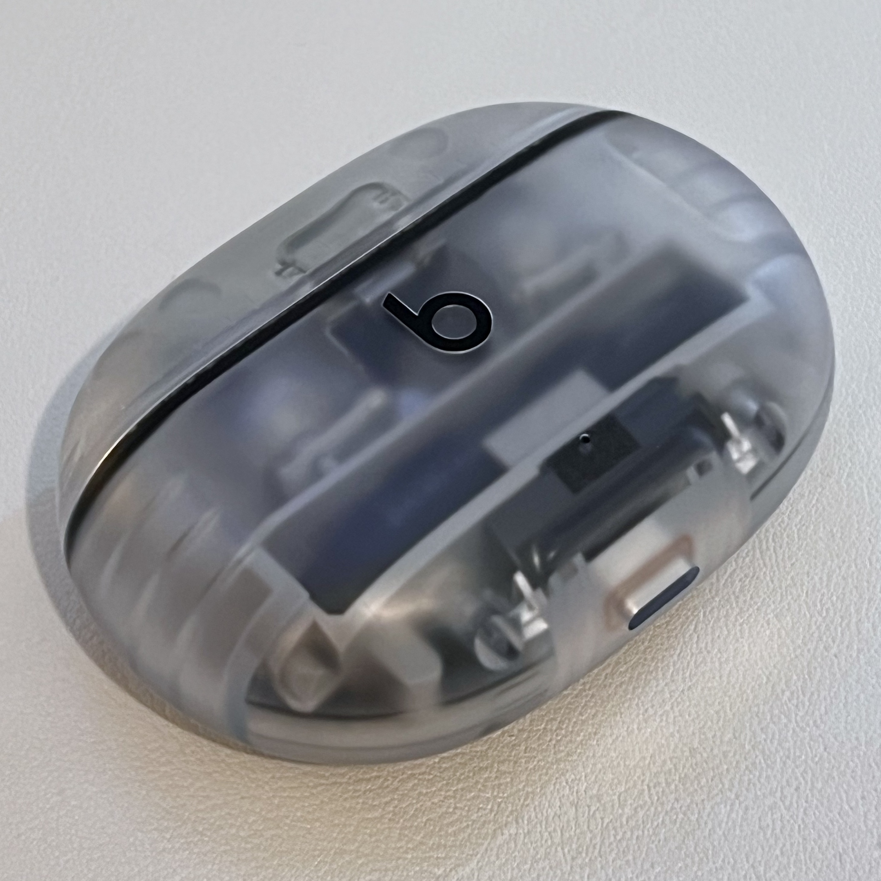
Then, last year, I saw the Beats Studio Buds+ with its transparent 90s iMac plastic case and I was smitten. One of my old bosses, VFX Supervisor Dan Kramer made an app called DropScout for iOS that does Amazon price tracking. He invited me to the TestFlight and I loaded it up with some stuff to monitor, including those transparent Beats Studio Buds+. They retail for $169.99 through Apple or Beats, but they’d been on sale every now and then through other retailers —like almost every other Apple product.
Once DropScout notified me that the buds hit $129.99 the other week I took out a gift card, and decided to treat myself for this craptacular year.
I really like the design of the charging case. The rounded corners make it slipperier than a bar of soap, but I have yet to drop it (knock on wood). The one bummer is that you can see the transparent blobs of glue through the plastic case. We all know from the teardowns of all of these kinds of devices that things are full of glue, but you don’t ordinarily get to look at how unevenly it has been applied. Unfortunately, the most blobs you’ll see the most are the ones on the latch right above the product logo.
Sure, I would love it if it was all perfectly fit together with expertly crafted joinery, but realistically, I’m satisfied that it doesn’t creak or wobble. I don’t stare a the case, but I do know it’s there, so in a sense it will always be a little thing I don’t like about it. I would still rather have the transparent case and buds than solid colors that wouldn’t show the glue.
The other design issue is that the buds are difficult to hold. There are very strong magnets that hold the buds in the case, so you need a firm grip to pull them. However, when you pinch them between your thumb and forefinger they do slide against the teardrop shape of the device. There’s a flat plateau on the teardrop, where the controls are, but it pretty smoothly transitions from that teardrop to the flat side and doesn’t provide much purchase for your fingers.
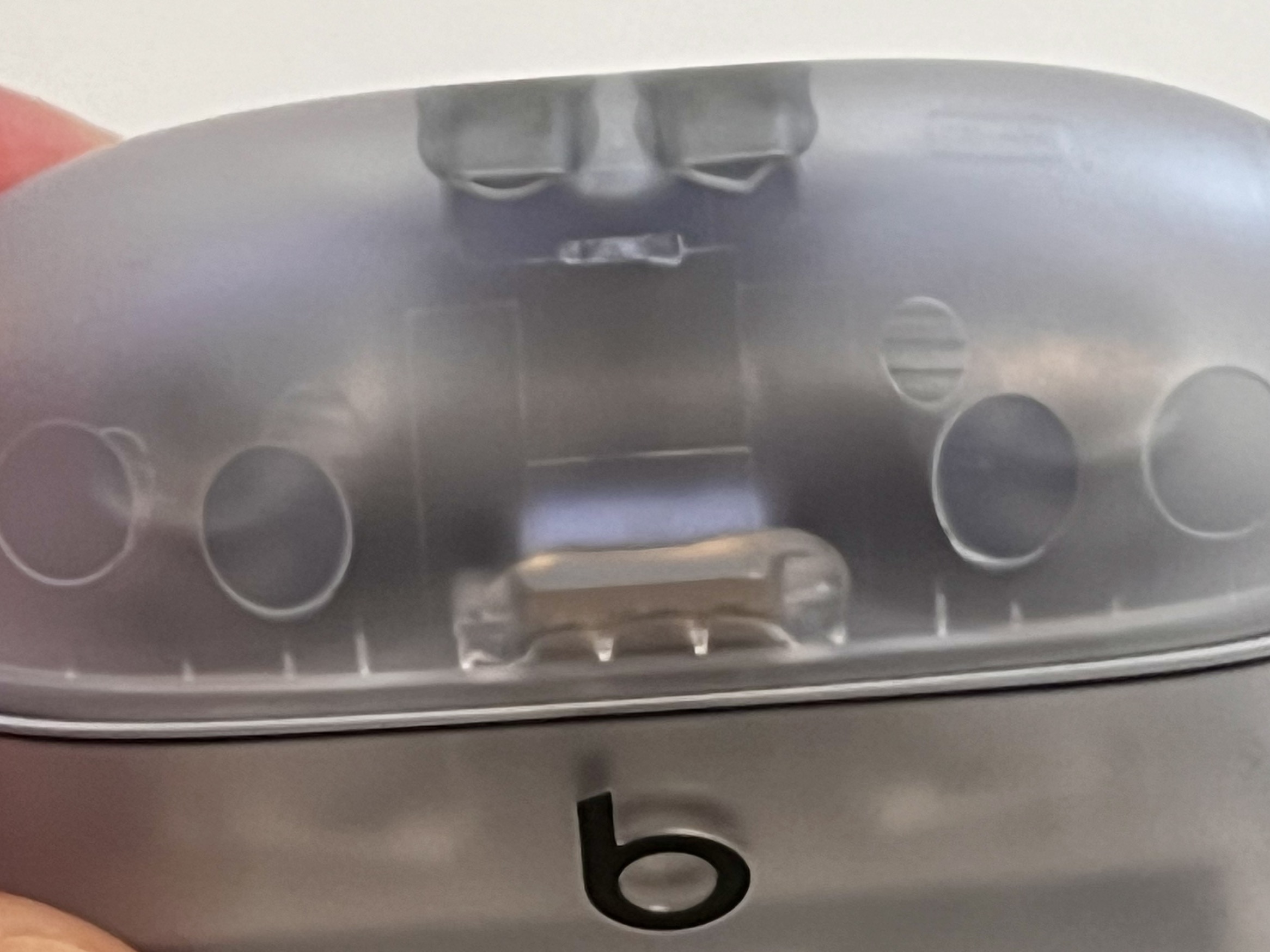
When you’re just getting used to them you’re left wondering if you put them in the correct ear. With AirPods there’s a very clear direction for them because the stem of them needs to point toward your jaw. With these buds the best way to determine orientation is the lightly engraved “b” logo, which looks like a “6” when you’re holding them because they’re supposed to sit in your ear at an angle, and the logo is applied to look straight when it’s at that angle, not when it’s being viewed “straight” in your fingertips.
There is a very faint “L” and “R” on the part of the teardrop face that rests in your ears, but the lettering is applied to the transparent plastic so it blends in with the look of the other lines in low lighting.
The fit, once they’re properly in your ear, is great, which I suppose is the trade-off for the teardrop shape, and no dangling stem. There’s no sense of discomfort or pressure. The ear tip seal is more important on these to make sure they don’t fall out, and provide the appropriate ANC effect. For some reason I needed the medium tip in one ear, and the small tip in the other ear, so now I’m body conscious about my asymmetrical ear canals.
The control scheme is decent, and I have no real complaints about that at all. That flat surface of the bud is a big button, and each bud has one. You don’t do a light, capacitive touch, you do give it a firm press. One push for play/pause, and a longpress for switching between active noise cancellation and transparency mode. The button can be customized to cycle through ANC, transparency, and off, but it doesn’t ship with that as the default and I see no particular reason to change it. You can’t customize each ear independently so the same choice will for both. You can change the behavior on one, or both, to trigger Siri, but I’m not going to ever do that.
There are no volume controls on the buds, or the case, and all volume adjustment needs to happen via the connected device. That’s fine for every context in which I would use these, but it’s certainly not what people might expect, or want to deal with.
Speaking of expectations, there’s no in-ear detection either, so if you take them out they’ll keep playing until they’re dropped into the case. Personal preference will differ on how big of a deal that is, but as someone used to listening with one Beats Flex earbud in it’s not abnormal.
There’s also no head tracking, so there’s no dynamic head tracking spatial audio, just regular spatial audio, but that works fine for me.
The battery life of these things is great. 36 hours of case charge, and up to nine hours of charge for each bud. That’s better than the stated life of the AirPods Pro that retail for more. You do loose out on wireless charging though.
I haven’t found myself struggling with charging, though I do wish there was a way to know what the charge status of the case is. The reported status to the iPhone is just the buds.
When I first set these up I had some flaky connectivity problems and strange behavior, but I’m guessing it received a firmware update or something once it connected and charged because it’s been on its best behavior since then. There’s no real version history or anything in the Settings app, so I couldn’t say for certain.
It connects to my MacBook Pro faster than my Beats Flex, and it handles going back and forth between my devices better than the Beats Flex. There was one time where I tried to connect it to the Apple TV and it decided it didn’t want to do it, but after messing with a couple things it suddenly worked fine. There’s no perceptible lag or latency with anything I’ve tried to play back.
The thing I do really care about is that ANC. My last experience with noise cancellation was with a very old pair of Sony wired earbuds where you had to put a AAA battery in a big plastic box on the cable, and it provided a constant white noise hum under everything. This is, as you might expect, way better.
The ANC has helped when running fans, air filters (which are also fans), air conditioners, the noise of a refrigerator compressor — everything. It’s been great to focus. Sometimes I find that I’ve paused the audio and I’m just using them as earplugs. I like being able to hear the environment around me when I have Beats Flex on, because it’s important to keep me from getting hit by a car, but I don’t need to hear fans —unless those fans are you, dear readers.
As far as the sound goes: I’m not an audiophile, but I’m quite pleased with the sound from these buds for both podcasts and music. Beats has a reputation for being bass heavy, but I haven’t found that to be the case in my own subjective experience. The audio has greater clarity in the Beats Studio Buds+ over the Beats Flex, of course, but I don’t comparison shop things that people put inside of ear canals.
I did consult some YouTuber reviews where they do compare this stuff, but there were a few comparison videos I watched where some people preferred the Buds+ to the AirPods Pro, and some where they did not. Like this one. For the money, I can’t complain.
I do recommend these, if only because they look pretty, have excellent noise canceling, and sound good. Do I care if you buy them? No, I absolutely do not, and I earn no commission if you do. This isn’t a blog where I post about daily deals, or write up when a product reaches the lowest price ever for a second time.
If you are interested in deals, it’s more satisfying to use something like DropScout, Camelcamelcamel, or other price trackers to keep an eye on things you’re pretty sure you’d like to buy. Especially when there isn’t a tremendous amount of innovation in the wireless earbud space in the last couple years.
Now if you’ll excuse me, I’ll put these buds in and go back to having a brat summer.
Dan Moren, and Jason Snell both traveled to the UK for the Relay anniversary event, and each of them spent some time beforehand in Scotland.
I like to compare notes about travel stuff, because some of it is insightful for the next time I plan on going anywhere. A lot of the stuff I do is just the momentum of past decisions that I ultimately won’t research from scratch right before every trip, but I do absorb these sorts of blog posts throughout the year. Here are my own posts about travel tech in late 2023, advocating for a “travel mode”, and another post from this spring.
Both Dan and Jason were tripped up by iMessage abroad when they switched to their eSIMs. Long ago, my boyfriend and I decided that we’re more comfortable trading money for convenience so we do pay the daily flat rate that our carriers offer so we’ve never tried to do this.
The iMessage issues haven’t ruined Dan and Jason’s lives, and they’ll spring right back to normal now that they’re home, soothed by the cash they saved.
A LOT of people have told me that the key to fixing my international iMessage issues is to just disable data roaming for my US plan and switch the Cellular Data to my travel eSIM. I literally had two different people with the same first name and last initial email me back to back. Weird. But something to give a try on my next trip, I guess.
Hilariously, there are replies to that on Mastodon that say it works, and replies that say it doesn’t.
Even checking the official Apple documentation leaves me scratching my head. It explains the mechanics of each operation you can do with an eSIM, but it’s not a “How to Travel Abroad and Tell Verizon and AT&T to Kick Rocks” document.
Like if you just want to know how you’ll get your phone calls from your US number —like in the event of an emergency or simply to when a restaurant wants to confirm a reservation— you can parse the answer from this mess:
You can make and receive phone calls with either phone number.
When you’re on a call, if the carrier for your other phone number supports Wi-Fi calling, you can answer incoming calls on your other number. When you’re on a call using a line that isn’t your designated line for cellular data, you need to turn on Allow Cellular Data Switching to receive calls from your other line. If you ignore the call and you have voicemail set up with your carrier, you’ll get a missed-call notification and the call will go to voicemail. Check with your carrier for Wi-Fi calling availability and find out whether additional fees or data usage applies from your data provider.
If you’re on a call and your other line shows No Service, either your carrier doesn’t support Wi-Fi calling or you don’t have Wi-Fi calling turned on.3 It could also mean Allow Cellular Data Switching is not turned on. When you’re on a call, an incoming call on your other phone number will go to voicemail if you set up voicemail with your carrier.4 However, you won’t get a missed-call notification from your secondary number. Call Waiting works for incoming calls on the same phone number. To avoid missing an important call, you can turn on call forwarding and forward all calls from one number to the other. Check with your carrier for availability and to find out whether additional fees apply.
(Squints.)
Anyway, the iMessage section doesn’t fill me with confidence either mostly because it relies on manual operations to move conversations back and forth between eSIM numbers, and it doesn’t answer what happens with SMS messages. The section on calls at least mentions Wi-Fi Calling, but Wi-Fi Calling is also the setting for SMS over Wi-Fi.
For example, I live in an area with poor coverage from my cellular carrier, and Wi-Fi Calling is essential. It’s also how I can send SMS messages to people that don’t have iPhones. However, if I try to send photos (MMS) it frequently craps out, but if I turn on Airplane Mode, which disables the cellular modem entirely, then the media can go through in an instant over Wi-Fi. So … what the hell happens with dual sims and SMS to my US number when I have Wi-Fi Calling turned on for a data plan abroad? Will I get the messages at all? Will I be charged that day rate fee?
This is so weirdly complicated and fussy! The documentation is murky, and the personal anecdotes can be contradictory, or might only work for certain people, with certain carriers, on certain plans.
My carrier increased the flat rate since my last trip, so I’m always on the lookout for news that dual eSIMs are now completely seamless. If Dan and Jason can’t figure it out then what hope do I have? How many technology bloggers does it take to screw in an eSIM? For now, I’ll stick with with the regrettably expensive flat rate.
We’ve had this concept of files based on physical documents since before there was a GUI. The innovation of the desktop GUI environment is that you could have those files represented in a way that could be manipulated more like those physical documents. That icon of a piece of paper could be dragged and dropped into a folder that represented a way to collect and organize files like their physical counterparts. They weren’t the same, but the visual metaphor made sense to people that still had to deal with physical pieces of paper and tabbed folders.
Fewer and fewer people needed to track physical documents, and the number of digital documents skyrocketed. It was often easier to just dump everything in one big pile of data, and then use search to filter for the data you needed. The hierarchy of neighboring files mattered less and less.
Files still matter though, the GUI for managing files still matters. People get bitten by it all the time. John Siracusa recounted a story about how his son kept all his computer programming work in Desktop and Documents, which were synced by iCloud, and the number of files hosed everything. My pal Dan Sturm is in a perennial fight with his Dropbox accounts because something will get slightly out of whack and then he has to download and upload gigabytes of data as a sacrifice to the syncing gods.
Apple seemingly has tasked multiple groups inside of the company with coming up with solutions to the problems presented by files, which has led to a weird patchwork of policies, services, and OS-level features that differ on each of their platforms, and each of their apps.
Take Final Cut Pro for iPad (a name only a mother could love) where the developers decided that they couldn’t support file workflows on the iPad the same as they can on the Mac, so they dumped everything in a project file, that’s really a folder, which is full of all the files. That meant those projects could be converted to be Final Cut Pro (for Mac) friendly, but not the other way around because things could live outside of the Final Cut Pro library on a Mac. It also meant that all your media for the project needed to be inside that one big blob on your iPad. If you are familiar with editing, you know that editors have a lot of media, which they are constantly moving around and organizing on drives, and media that gets reused between projects.
Final Cut Pro for iPad 2 added support for external drives (yay!) but all the files still need to be inside the enormous library file that acts as a container (boo!) and there still aren’t tools inside Final Cut Pro for iPad 2 to handle things we all take for granted on the desktop. Check out Vjern Pavic’s explanation:
All of your media files have to live within the FCP Library files, and that same library file has to be stored on either the internal or external drive. That means you can’t split your media across multiple drives or cloud storage. One side effect of this method is that it means you’re just constantly duplicating files from one place to another.
And there are other issues that haven’t changed from last year. For example, you still can’t import complete folders into Final Cut Pro, just individual files. And once they’re imported, you still can’t organize the files into separate folders or bins like “A-roll,” “B-roll,” “Music,” or “Graphics.”
I’m highlighting this specific workflow because it’s one that works better with files and folders. It’s a problem because the iPad “solved” files. It is also functionally not the same across Apple’s platforms. All because of decisions made about how iPads don’t do certain things with files.
Federico Viticci has written extensively about his frustrations with the Files app on iOS. My primary exposure to the Files app is through iOS, on my iPhone, where it’s cramped, and the history of bad planning lives on in the cluttered mess of app-specific iCloud Drive folders.
Remember when Apple’s solution to file management was to give every app its own little folder like you never used a file in more than one app? Completely turning the concept of folders and files on its head. They should be based on projects, tasks, media types. Then iOS said it was just so every app had an island of whatever it was the app did. Of course you remember, because you’ve still got the same mess that I do.
While Apple’s iOS and iPadOS riffed on “people don’t like files” the Mac also went on its own adventure. You couldn’t sync all your folders on your Mac between devices, but Apple added an iCloud Drive folder that showed the same stuff you saw on your iPhone or iPad. They added the aforementioned option to sync Desktop & Documents Folders[^1] for all the people that dump their files in those places, but that means everything needs to live in those places to sync, or can’t live in those places if they shouldn’t sync. Again, it’s not a system of organization you’re deploying to keep your projects tidy it’s about sync status, and invisible limitations. The hierarchy is dictated by the limits of the function not their purpose or your tasks.
Then Apple said, “Hey Dropbox, we don’t like your unsafe Finder hacking and abuse of Accessibility privileges. You have to use our File Provider API.” Dropbox converted everyone over to it, and it’s awful. I love it when safety and never-ending frustration can go hand in hand.
The problems are similar to the problems with iCloud Drive. Where you can’t really manage what files are local to your device. You need to trust the process. That also goes for offloading files. The OS will hold onto and discard stuff in a completely illogical way.
Sometimes the only way I can actually get disk space back is to reboot the Mac, because I’m at the upper limits of my 512 GB if internal storage. You know, that’s enough storage for anyone. They should probably continue selling that as the step-up storage tier for many, many more years.
Sequoia betas have the option to keep files downloaded finally and it actually works according to reports, but that’s a feature that was missing for years and it doesn’t make me optimistic about the glacial pace of addressing issues people have with the File Provider API “files”. Like when the Finder window just stops working correctly if I try to click on too many things in iCloud Drive folders and files, or when it doesn’t tag file status correctly.
Yesterday, I was working on an edit in Adobe Audition, and I had it full screen on one monitor, and my finder and other stuff in the other monitor. I dragged the file from the Finder window alllllll the way across to the media pane in Audition. Everything froze for a second and then the icon rubber-banded back to the Finder window, and a little gray circle started filling up as the file downloaded. It finished downloading, and then I could drag it alllllll the way across to the media pane in Audition again.
You see, even though these were files from the night before, the Mac+Dropbox+API didn’t think I needed them. It also didn’t think I wanted to use them in Audition after I had waited for the file to download. There’s no retry, only redo, and I’m the redoer.
That’s when I noticed that none of the files or directories had little cloud icons next to them. That usually means that they’re local, but when I selected another file in the directory I could see in the preview pane that it had the little cloud with a downward arrow. I opened another Finder window and navigated to the same folder and it had the little download icons.
Time was, Dropbox would have its own file decorators for this that indicated the sync status for a file, but now they use the system to handle it, and sometimes it just doesn’t handle it.
People have increasingly balked at Dropbox’s price hikes, and degradation of service in the new Dropbox desktop menu app and File Provider API client. I know a lot of people have switched to iCloud Drive, because if they’re going to be roughly the same amount of bad, then it might as well be the one that people need to pay for to back up their iPhones.
I’m reluctant to make that jump because Dropbox still offers some features that iCloud does not. It also offers me a safety net through Dropbox.com. I know that I always have the temporary file versions stored by Dropbox to fall back on if anything goes awry with a sync or if I just need to see old versions. I can do a lot of stuff on the Dropbox website.
iCloud Drive, on the other hand, lives at iCloud.com, and not to disparage the native-UI-on-the-web hippies that build the site, but it tries too hard to blur the line between being a website and being a quasi-Finder quasi-Files thing that doesn’t work like either one.
Like the Files app for iOS, you only get Grid and List views for the files. That stinks. I have a whole-ass web browser than can be any size on my Mac I want it to be and I can’t have Column view? I’m a huge proponent of Column view because it gives you nested hierarchy, and a preview pane so you can get info without having to Get Info.
You’re plopped down in Recents, which is a good place to start as you are likely wanting to do something with a file you recently did something to, but the date sorting isn’t always accurate. I know I have files in iCloud Drive that were modified this week but don’t appear in Recents.
In Pixelmator Pro on my Mac, I made a quick little joke called “Untitled 7.pxm” it’s still open in Pixelmator Pro, and hasn’t been saved, but the promise of this system is that it saves “Untitled 7.pxm” for me. Sure enough, it’s there on my Mac. It’s also in Recents in the Finder on my Mac. It is not there in Recents in iCloud Drive on the site.
The most recent files are under the “Previous 30 Days” section and it’s only nine files, which is pretty light for me a whole month of using a computer. Included in that section is a Pixelmator file dated “6/10/2024” but that wasn’t created or modified by me on that date.
While it looks like a List view, when I right-click it’s… the stuff you see when you right-click on a web page. I should know better, but why are we dressing this site up like a native app? If you want the stuff you see when you right-click on your Mac, you go all the way to the right of each item in the List view and an ellipsis menu will appear. It’s hidden until you hover over the item because we like to keep things tidy, not functional here at the Ellipsis Menu Factory.
There’s Get Info, which grays out the interface and only lets me see the few things in the modal Get Info pane. That shows me the file modified date (not created, not added, not opened) of “10/30/2023” which is not the date from the List view.
You also can’t see a file history or older versions to piece together why “Untitled 23.pxm” has two different dates that don’t match anything. On my Mac, I can get actual info, and I can see “10/30/2023” as the created, and modified date. “6/10/2024” is the last opened date. That was the day I charged my iPad Pro that also has Pixelmator on it so presumably that’s why, but why is it in Recents and nothing else I’ve done in Pixelmator in the last 30 days is? I even saved a new file and refreshed the browser and nada.
Also if you want to see where a file in “Recents” is you have to go to the ellipsis, Get Info, then at the bottom of the modal click on the blue link right-aligned next to “Where:” and it’ll take you to that enclosing folder.
I won’t spend too much time beating up the website, since I have no idea why anyone would torture themselves using it, but I just want to point out that it doesn’t provide the same safety net as Dropbox’s site does.
Your files do have version history in iCloud Drive just not on the site. It’s only accessible by opening the file and going to the File menu, Revert To, and browsing the file history of when the file was incrementally saved. You can open the folder the file is in from the Finder in Time Machine, and it’ll slowly chunkity-chunk read those files off your spinning disk based on when the folder was backed up, not based on when you changed that selected file. If you’re lucky maybe it won’t crash on you.
Don't complain that I never report this stuff.
Sure seems like the kind of thing Dropbox is better at, for some inexplicable reason. Apple invented easy backups with Time Machine, and no-fuss file versions “for the rest of us” but that has all kind of fallen into disrepair. Because, of course, who needs files? You probably just use Google Docs in Chrome, and let everything sit in a filthy data soup.
A lot of people are banking on cool, hip, Apple Intelligence features to help them find their files (at some point in the future whenever that sort of thing ships). I would like to point out a few problems with searching for files that exist in a big bucket of mixed local and offline storage.
Spotlight doesn’t index what’s not on the device.
If you are trying to search based on the topic you wrote about, or keywords used in the document, you won’t turn up anything if the file isn’t local to your machine. If what you’re searching for is in the name of the file, you might be in luck because the name of the file is represented, but not it’s content, or really much else about the placeholder file. For example, searching for “.pages” will work for offline files, but “Kind: Pages Document” does not. However, “.pdf” and “Kind: PDF Document” both work. Makes total sense.
When the file was originally on disk, Spotlight would have indexed it, but that index is gone when the file is gone. I ran into this when I was searching my markdown files from this blog and then I realized it was because all those hefty text files were offloaded. Saving 10.4 MB did not save me any frustration. Fortunately, that was in Dropbox so I’ve been able to force it to stay on disk before Sequoia ships, but I keep getting tripped up whenever there’s a file somewhere else.
For example, if I search all of the posts I’ve ever done for Six Colors for “Apple TV” the only hit I get is the most recent text file from my interview with the people from Sandwich, which included the words Apple, and TV, but not “Apple TV”.
There were image and movie files with Apple TV in the name that are still on disk from 2022, but thank god we offloaded all that bloated UTF-8!
Forcing all files to be on disk so that they function correctly as files defeats the whole point of a system optimizing storage, and undercuts the argument that the meager SSDs Apple sells are really more than enough.
“That’s just expected behavior,” you puff as you rally to the defense of a company proudly designing their whole AI approach around only what’s on your device. Surely the issue of only indexing local files will never, ever, ever come up again.
Fortunately, in all the instances where I searched for something I “knew was there” I’m able to quickly figure out what files I need to download to get the search to work because I keep my files organized in project based folders that allow me to confidently say that I searched all the Six Colors posts or all the joe-steel.com posts, because they’re in folders labeled as such and can be used to shape and filter the searches.
This is why things like nested folders, and organizing files matter. I can impose a structure that doesn’t just help me, it helps the system help me. Instead of examining my entire drive, and flailing around, I can know what to do. Even if it pisses me off! It’s the kind of pissed-off where I can fix it!
I would greatly appreciate it if we treated files, and users that use files, with a modicum of respect for their processes. When people drag and drop files, they should drag and drop. When people want to access their files on other systems it should mirror what’s actually happening with recent files. Accessing old versions of a file should be something you can do as easily with iCloud as with Dropbox. When people want to search their files, there should be a Spotlight index that’s compatible with offline files.
Despite the nihilism of the anti-file lobby, there’s no denying that we all deal with files at some point or another. No matter what library-project-file blob they’ve been ingested into, or how much space is being saved on our anemic, astronomically-priced drives, improving file handling hurts no one.
[^1]: Just as an aside, a not-so-dissimilar organizational problem exists in Settings. Settings frustrates anyone with its poor orgnaization, and for how parts of the Settings panes don’t even function or look the same. A defense of Bad Mac Settings is that people “just search” which is the same dismissal people give for bad file management. However, if you search in Bad Mac Settings for “Desktop & Documents” it returns zero results. If you search for “iCloud” you get several results, and the one you want is “Apps Using iCloud” (because iCloud Drive is an “app”) and then where it says “iCloud Drive” there’s a right-aligned “On >” You might think that just takes you to a toggle to pick between On or Off, since that’s all the nuance they chose to offer, but it opens a modal dialog that grays-out the settings (not a navigation to another “page” like “>” implies), and then you can see “Desktop & Documents Folders” which has a toggle and explanation. There is a “Sync this Mac” toggle right above that, but that’s for iCloud Drive to have its synced folder on the Mac, it’s not syncing the actual Mac, because why would you do that when you can sync Desktop & Document Folders. But whatever, people just find exactly what they need using search so no need to bother with organization or interface design!
I can’t believe I’ve been doing a podcast with Dan for 10 years. We had a silly idea to “draft” episodes of our podcast, which we only kind of remember, and it made for a fun episode. I hope you’ll listen and enjoy, without worrying too much about whether or not our shoddy recollections are even accurate.
It might be handy to have a link to all the episodes we’ve ever done, since that was really where we pulled from, and a lot of the pull came down to titles that amused us.
Adam Lisagor, Andy Roth, and Dan Sturm at Sandwich were gracious enough to answer my questions about the behind-the-scenes stuff on their stereoscopic livestream to their app. It’s a novel enough endeavor that I really wanted to dig into details about it, and not shy away from nerdy things that don’t get covered if a person doesn’t know what questions to ask. I hope you enjoy it too.