Front Matter Matters
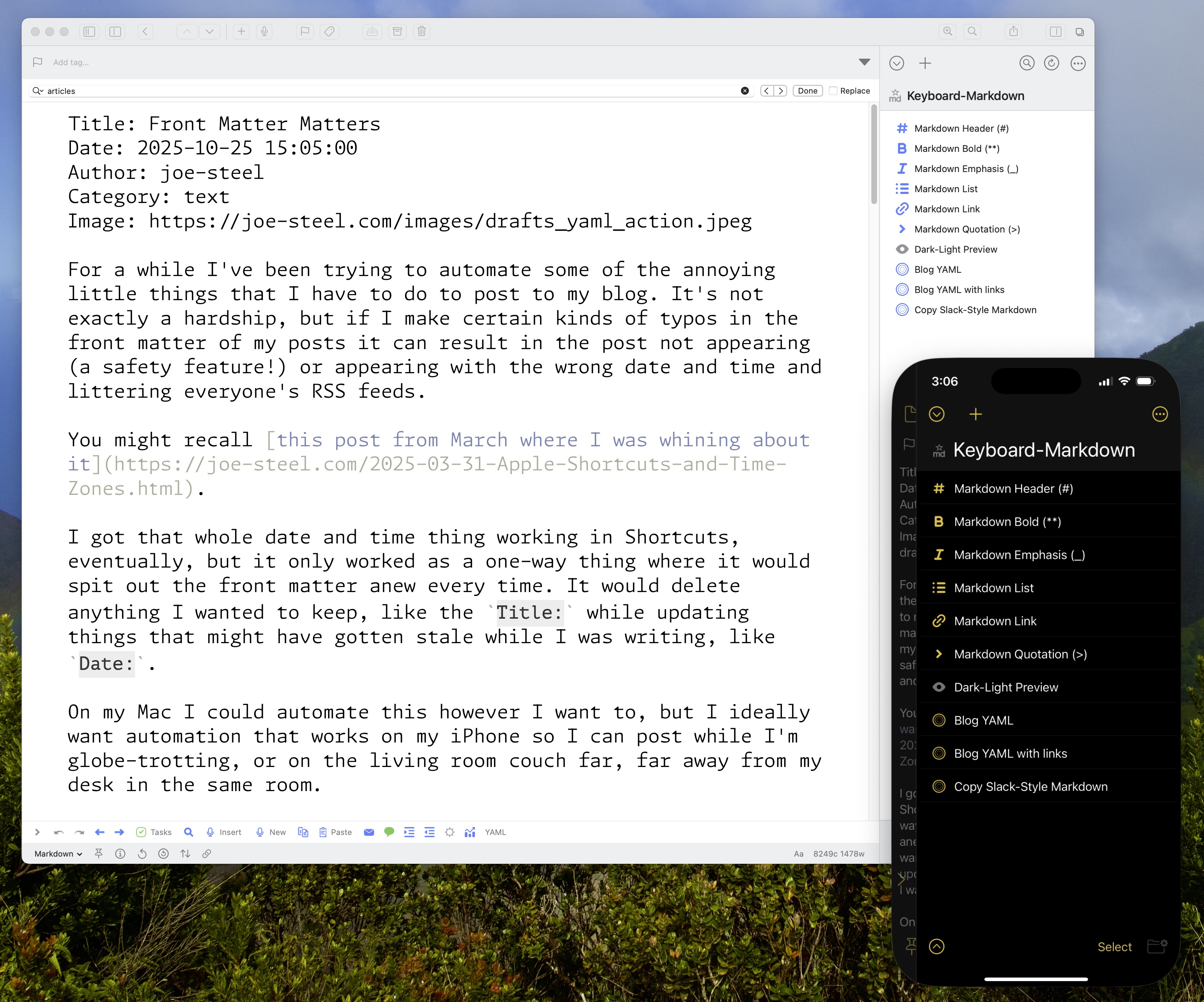
For a while I’ve been trying to automate some of the annoying little things that I have to do to post to my blog. It’s not exactly a hardship, but if I make certain kinds of typos in the front matter of my posts it can result in the post not appearing (a safety feature!) or appearing with the wrong date and time and littering everyone’s RSS feeds.
You might recall this post from March where I was whining about it.
I got that whole date and time thing working in Shortcuts, eventually, but it only worked as a one-way thing where it would spit out the front matter anew every time. It would delete anything I wanted to keep, like the Title: while updating things that might have gotten stale while I was writing, like Date:.
On my Mac I could automate this however I want to, but I ideally want automation that works on my iPhone so I can post while I’m globe-trotting, or on the living room couch far, far away from my desk in the same room.
This meant it was ideal for automation in Drafts.
Drafts is an indispensable app from Greg Pierce with the tagline “Where Text Starts”. That’s very true, but it’s mostly where text stays for me. I do sometimes write in it instead of iA Writer or ByWord because there’s virtually no friction. Friction means something takes time, and then I don’t end up doing it, or getting it done anywhere close to the time it would have been relevant.
The Drafts actions that you can create are really sophisticated, but also intimidating because it’s in JavaScript.
I hate JavaScript –but not as much as I hate Shortcuts!
The nice thing is that unlike Shortcuts, I can search the internet for actual solutions to problems, or ask an LLM, because it’s all just string operations. (Nothing is ever just a string operation.) I can pull apart and reassemble whatever I need to without worrying about a bunch of invisible connections breaking, or drop it into BBEdit or whatever editor I want to, because it’s all just text.
Here’s a gist of what the current action’s JavaScript does. It’s not special, or even useful for anyone else, but I feel like someone’s going to ask to see it.
Six Colors Cross Posts
One point of friction was creating the link posts whenever I have a new post on Six Colors. That’s all set up now where if I have a Six Colors URL in the clipboard it will grab the title from the page, the publish date and time, the first few paragraphs (I can always delete if I made a really long run on post), and then appends a link at the end to continue reading.
That might not sound like a big deal to you, but that kind of formatting and detail leaves a lot of room for error. Now a computer does it, as God intended.
Generic Links
The other nice thing is that I have it set up to accept any other URL on my clipboard and pull out the title for that, and add the link field to make this a link blog post in the blog engine.
I want the date and time for those to be relative to when I post them, because I will be writing additional text, so that’s different from the Six Colors links where it’s only excerpts of what I had written.
Missing Headline Features
The other thing I want to figure out is something to check title casing of what I’m posting so it’s consistent. I’m not great about it and sometimes I will sanity check it. I know that many sites just don’t do titlecase, like Six Colors, but you could say I’ve put too much capital into it in this case.
I don’t want to use some weird JavaScript library for that. I’d rather have something that can deal with natural language. Writing Tools on my iPhone in iOS 18 can’t deal with titlecase, it just capitalizes everything including articles. That might be different with the foundation models in iOS 26, but that wouldn’t help me with my older Mac that can’t run the models.
Something to keep checking on, and in the meantime I get to unreliably do it myself.
Image Problems
I would like to be able to figure out a good workflow for adding images. I want to have a little staging area I can put the images and still have them correctly render. I can do that with iA Writer, but images don’t live in Drafts as elements. That would also really involve changing the Python script on my server that watches the folders to do something with the images in my Dropbox to put them in the correct spot on the server, and to change the paths in my published post to point to those. The way things are going I’ll get to it in 2030.
Sycophantic Scripting Spirals
As for how I got this Drafts action to do what I wanted I have to say that the effort is evenly split between me, Google Gemini, and a smattering of Stack Exchange posts. It definitely isn’t a situation where I put a prompt into Gemini and it spat out exactly what I wanted.
This isn’t vibe coding. If I vibe coded this it wouldn’t do any of the stuff I wanted it to do. This thing really requires babysitting and specific instructions. Even then, it will hallucinate fixes to buggy code which can just be the same exact code with different variable names, or it’ll add another validation variable that doesn’t do anything.
In particular, there was the logic for the Date: YAML where it wouldn’t handle situations with incomplete or invalid field data. Like if I had deleted everything in that field and wanted it to spit out something fresh. It would push that Date: down into the body text and also append a fresh Date: with the date info after it in the YAML.
Pointing this out to Gemini caused it to go into a spiral. It would provide a sycophantic response that I was right, and that the Date: slipping into the body was a sign it wasn’t working, then it would print out a block of code, which it would add a big comment header to. I would tell it that it didn’t work, and it would do it again, and again. I won’t copy and paste the whole exchange, but here are the headers for each “fix” that didn’t fix anything in chronological order:
- CHECK EXISTING YAML (FIXED TO EXCLUDE ALL YAML LINES FROM BODY)
- CHECK EXISTING YAML (FINAL FIX)
- CHECK EXISTING YAML (FINAL, ROBUST VERSION)
This is when it told me, after providing “FINAL, ROBUST VERSION” that this “is becoming too brittle.” Invalidating what it had just output. It then continued:
- CHECK EXISTING YAML (STRICTEST FINAL FIX)
I pointed out that this, and all the code under it, had gotten very convoluted, and reiterated where I thought the problem was (the function that validates the date format passes null which is used for other logic checks).
- CHECK EXISTING YAML (FINAL ROBUST FIX)
It then spat out 1 last attempt at a fix, but didn’t redo the section header, alas, so I just have to imagine that it also called that the final fix. Unfortunately, it didn’t fix anything, so I just made some changes myself until it did what I wanted.
While I wouldn’t have been able to create this automation completely on my own (the REGEX alone, oy vey) I don’t think there’s a being of pure logic, or otherworldly magic, driving this system, and it is instead a very eager (too eager) autocomplete.
Joey Longcuts
Shortcuts defenders would likely point out that nothing in my Drafts action is outside of the realm of possibility in Shortcuts. However, I don’t have a Shortcuts expert on staff here, and I’m not going to read extensively about Shortcuts so I can know how to apply the mostly undocumented functions of Shortcuts actions when there’s simply way more flexibility with text.
If I make a change in Shortcuts sometimes it breaks things that are working. It has almost no debugging assistance whatsoever. There’s no way to temporarily mute or bypass a section of code, which is an absolute travesty when compared to just commenting out a variable to check something.
So that’s that. Insert that XKCD comic about automation saving time here.
Category: text