I acknowledge this is a pretty strange complaint when you think about all the other ways that Shortcuts could be improved (so, so many) but allow me to walk you through my thinking:
I want to do something with Shortcuts because it is Apple’s only cross-platform automation tool.
I can’t easily search the internet for exactly what to use because the terms are often too generic to produce useful search results.
I can’t use LLMs even though they can handily generate simple code snippets, because Shortcuts are not text-based code, so they frequently describe many steps to create a Shortcut in the Shortcuts app that unfortunately involve hallucinating other terms because they’re used in the english words surrounding descriptions of things.
I can’t use any other editor to make changes to Shortcuts, like I could with literally any other kind of automation software or code.
The problem is that the Shortcuts are binary blobs, but they should be text of some variety. When I started learning computer animation at school we used Maya, and Maya had two kinds of scene descriptions: Maya Binary (.mb) and Maya ASCII (.ma).
Our instructors were very specific in telling us that there was no good reason for us to use .mb files. If something went wrong with the binary file while it was being saved, and it was corrupted in some way, that they couldn’t help us recover data or fix the file.
The .ma format, on the other hand, is just text, that uses a simple subset of Maya’s MEL scripting language. You didn’t even need to be an expert in the language if you just needed to nudge some stuff, or ask someone else to help you recover data, or identify a problem. Most importantly: If you don’t want, or need, to hand-edit the text you never, ever, ever have to.
Every compositing package I have worked with, from Shake, to Bonsai, to Katana, to Nuke has been in a format that you can open and edit in any text editor to recover data, or automate scene file creation.
Here’s a neat blog post where someone walks through the anatomy a Nuke script. Knowing the anatomy of a Nuke script has never been part of my job description as a Nuke compositor, but whenever I’ve needed to delete an errant Viewer node, or remove a reference to a malfunctioning plug-in, I can do it without having to use the GUI that might not be happy with the evaluating the buggy file.
You can diff these files, you can do find-and-replace because you changed file paths, you can duplicate complicated script logic more easily than in the GUI. Have you ever made a for loop in Shortcuts? Did you want to throw something across the room afterward?
Of course, I’m sure the Shortcuts team would prefer for you to edit your Shortcuts in Shortcuts, but it should not be the only place. Undoubtedly they don’t want to make something that’s as obtuse as AppleScript, but people are still using AppleScript in 2025 to fill in the gaps. In 2025 LLMs can capably produce AppleScript, ironically negating much of AppleScript’s difficulty.
It would also be incredibly beneficial to Apple to produce text files because then they could train their Foundation models to understand and build the Shortcuts.
I’m sure Apple wants to maintain the signed, and relatively safe, status of Shortcuts — which is totally a thing they should do — but they can quarantine Shortcuts files with Gatekeeper until a user inspects them and approves them in Shortcuts.
Say you don’t need to generate one with LLM assistance at all, you just want to write it in BBedit, Coda, VSCode, Emacs (weirdo). You do that too, and it prompts you to check it in the app before you can run it.
That seems far more reasonable to me than expecting the Shortcuts app to be able to service all automation use cases, and experience levels by generating binary blobs of limited scope and complexity. What’s so wrong with text? Let’s do things the write way.
Joanna Stern might be the best person to interview Apple executives. She doesn’t lob insults, or fiery condemnation, that would end the interview, but she doesn’t avoid asking serious questions about the unfulfilled promises. Remember when she interviewed Craig seven months ago about Siri and Apple Intelligence? Go back and listen to that spin.
Her questions are often so brief and direct, that you notice how much more Craig is speaking to try and spin his responses. Craig and Joz don’t come off super great here, and its entirely their own words that are responsible for that and not some elaborate trick questions, or editorial slight of hand.
The excuses are more transparent than Liquid Glass.
I wasn’t satisfied with Apple, and Tim Cook, going into WWDC this year, and I remain dissatisfied after the fact. I don’t have the warm fuzzies when I see Craig on screen. There’s a distinct lack of new ideas in how the event is put together, and in many things in the event itself, despite all prior criticism about these very tame presentations lacking an air of sincerity and feeling incredibly “produced”. At least Apple didn’t fall into the same trap they did last year by promising us a magical AI assistant that didn’t exist. Everything they demoed feels within the range of their power, which is also why much of it doesn’t feel powerful.
The skits they do are more for them than they are for me, that’s for sure. I would argue that these sorts of skits work better when it’s reminding us of an Apple TV+ show we’ve already seen and liked, rather than forward promotion. F1: The Movie would make more sense at a later event —if the movie’s good and does well. It just feels indulgent here and doesn’t connect.
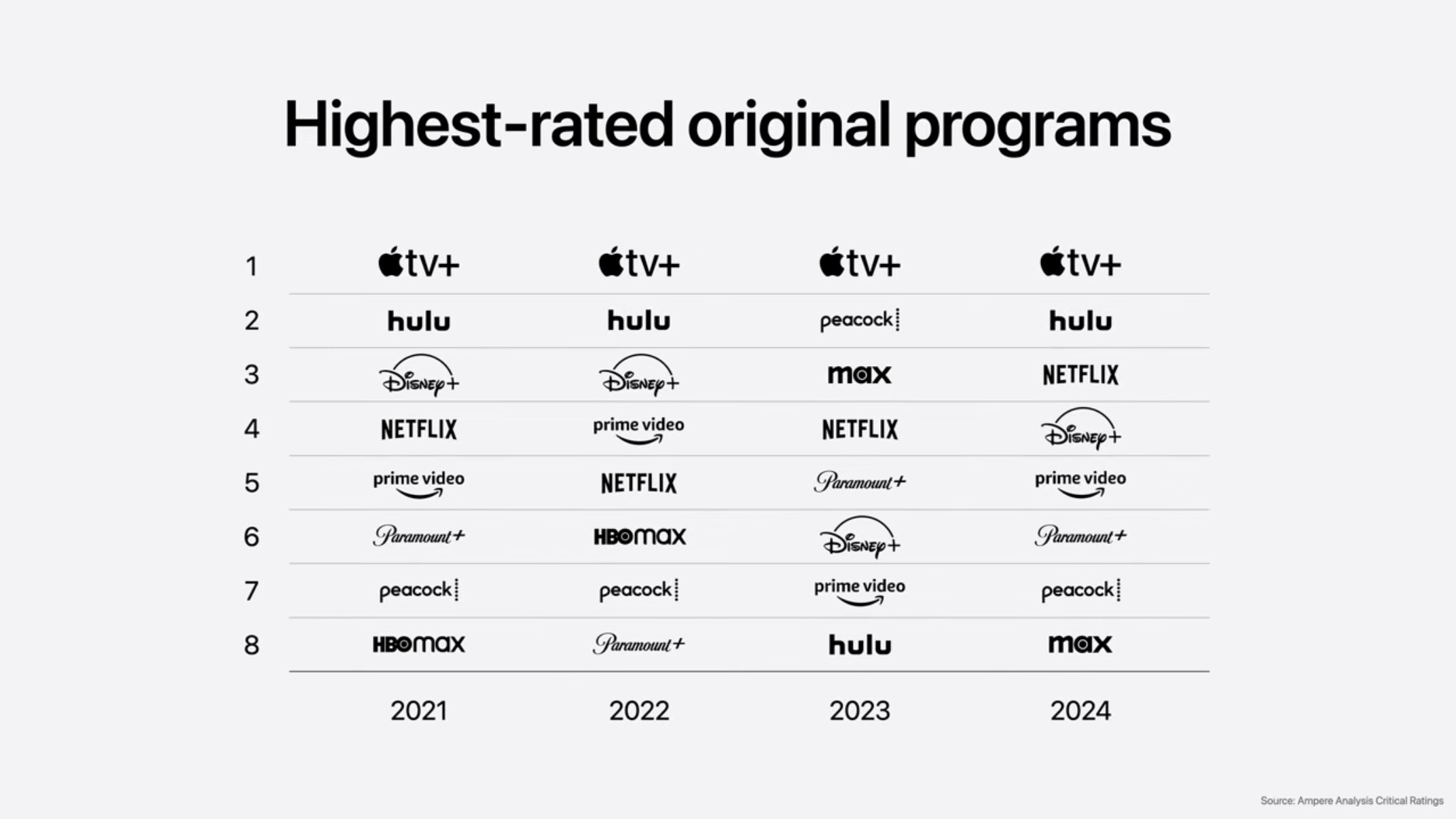
The best way to convince everyone you're cool is with a chart about how cool you are.
Then Tim Cook proceeds to talk about how great Apple TV+ quality (subjective) according to Ampere. You really can’t argue with it, except to point out that talking about how your shows at good at your software event isn’t going to do move the needle. I know that the general press is there, and they might write a sentence about it, but buy some commercials, fellas. Pay for air time with CBS to show Shrinking. The F1 sketch, and Ampere chart about your quality isn’t converting people.
This isn’t much of a mea culpa. In fact, it largely consisted of Craig Federighi talking about all the great stuff they did ship, which is basically a lie if you’ve used the features in their shipped state. He even highlighted the notorious notification summaries, a feature where they had to add a carve out for news and entertainment apps.
Unfortunately, I strongly disagree with the design choices that Alan Dye, and his team, have made with Liquid Glass. Some of it is the material quality of the elements, but a large part of my disagreement is the construction and arrangement of the elements themselves.
If you follow me on Mastodon you’ll notice I didn’t say anything about the rumors for the redesign, or any theoretical renderings. There’s no point in saying anything about a design until you can see it. I don’t need to be pre-mad about anything.
I happen to like transparency and translucency. The Beats Studio Buds+ were purchased specifically for their translucent plastic. I wouldn’t want to make all the UI elements see-through. There’s a time and a place.
In terms of the design language, I don’t like how everything needs to float above the content as discreet elements which all require padding and all have their own distinct shading effects. The top nav bar is gone in apps and replaced by 2-3 circular objects floating at the top of the screen, and 2-3 circular or pill-shaped objects floating at the bottom of the screen. They take up more space because they’re set farther from the edge, and from each other, creating areas of the screen where you see things behind that are not what you’re interacting with.
This means information density is seriously reduced. Here’s an example from Casey Liss running his Callsheet app in the beta. Above the keyboard, he has the floating search bar, and it’s applying a progressive blur to everything underneath. This means there is a single row of movies that are visible in the app. It’s not exclusive to his app.
There’s less room for what’s in the app because so much space needs to be taken up by things floating over the app. These are very similar problems to the much maligned Safari redesign a few years ago. They also applied this design to Safari and made it worse, again, too.
The appeal of the design choice is that things feel light, and your content feels like it expands beyond the borders, but its a useless feeling.
It’s certainly possible that the design will be reigned in before it ships, but the degree to which it will be reigned in is dependent on feedback, so … don’t be timid.
Of course it’s possible that none of this will matter because everyone will keep making web view apps and react apps. lol.
Other than the design issues, the thing that stuck out the most for me was the Camera app. Apple has never done more to sell third party camera apps. The current Camera app does have a lot of complex interactions, but this doesn’t resolve them. It just hides more things. I’ll have to see how it feels to use —and if they did anything with Camera Settings that mitigates or alters these UI changes.
At a surface level, the phone features, if not the interface, sound like improvements. Messages seems like even more of an interface mess now that there are ugly backgrounds, but people love that shit. Weird that Apple is so set against people personalizing their devices but adopting the most hideous WhatsApp feature that exists.
Image Playgrounds continues to be an abomination. It’s whole sales pitch was that it was safe and private — even if it sucked — and now they’re like, “sure whatever send your loved ones to ChatGPT and make slop of them there”. I don’t respect the decision at all, even if I do understand it. Apple has put “or ChatGPT” in a lot of places where Apple’s models are failures, but “or ChatGPT” is not a success either because what’s the incentive to go into one of these apps and use one of these features that’s just middleware for another service that has its own app? Apple’s incredibly weak and unconvincing here.
If Apple wanted to lean into IP safe image generation they could work with Adobe which has their Firefly model, but that would probably cost money, and ChatGPT doesn’t cost them any money.
Live translation feels like it’s more than a step behind Google here as well. The examples had a lot of lag and the results felt clumsy — but it’s better than nothing.
Maps learning your common routes is good, but Maps has “learned” my patterns for years and is actually very bad at it. For example, I just moved recently, and I changed my address in Contacts, and edited Home in Maps (why are these separate?) and the Maps widget is still recommending that I drive to the old address every day because I had spent so much time there. It’s things like this that don’t give me much confidence in Maps learning anything.
Visual Intelligence is a middleware wrapper on a screenshot utility. It can do some OCR and use data detectors to figure out if there’s an event in a screenshot, or an address, or now pass images on to other apps that can do image-based searches. This is incredibly weak, and still requires multiple steps. It also sends your whole screen, Messages conversations and all. There’s no smart selection, or magic wand. This has all the whimsy of command+shift+3.
I don’t understand why they went through all the trouble of launching CarPlay Ultra last month when they had an updated design and widgets to unveil for CarPlay this month. The instrument cluster in the Aston Martin didn’t have the liquid glass design language, just the center stack, so it felt a little strange. We know Liquid Glass requires a lot of Metal 4 rendering magic, so is part of the reason for this because of the car’s local OpenGL rendering? If so … why the hell did we design a system like that?
Weird that the instrument cluster doesn't have the liquid glass effects.
The Tapbacks feel unsafe. I’m pretty puzzled by their inclusion. There should be a better way to communicate Tapbacks with, oh I don’t know, a voice assistant maybe?
And Alexander wept, seeing as he had no more worlds to conquer.
If you ask me, and you are because you’re still reading, the software features of watchOS peaked a few years ago. That’s great because they can polish what’s there. The wrist flick is probably going to be pretty good —until I accidentally flick something away and it disappears because there’s no concept of a dismissed notifications folder.
I am the singular person that dislikes the Smart Stack. It gets in the way of my complications. I’ll live with them continuing to push it.
Workout Buddy is a robot voice that tells you several numbers are good numbers and you’re doing great with numbers. I would never in a million years find such a feature appealing. If people want encouragement from a chat assistant, they probably expect a chatbot that they can converse with and develop one of those incredibly problematic social relationships with. Workout Buddy is Clippy for workouts.
What tvOS needs is a comprehensive overhaul of the concept of the home screen. For years there have been two competing home screens: the original app-based home screen, and the newer Apple TV+ content-based TV app. Real nerds, like me, know the TV app sucks and use the app-based home screen. The TV app has not been improved in terms of personalization or customization at all.
The sign-on feature once again requires adoption by streaming apps in order to work, and it’s tied to your Apple ID. Good luck with that getting widely adopted over QR codes and authorization URLs.
The user profile picker that’s presented at start-up is also another miss. As I’ve written about before, profiles are an imperfect mechanism for viewing behavior for several reasons, including the fact that most households share services, and those services have profiles, and those profiles aren’t using Apple’s system but their own cross-platform profile systems.
Of all the features to focus on for tvOS — like where the hell is a live TV guide — Apple’s going to bug people about user profiles and talk about yet another sign-in method? What the hell?
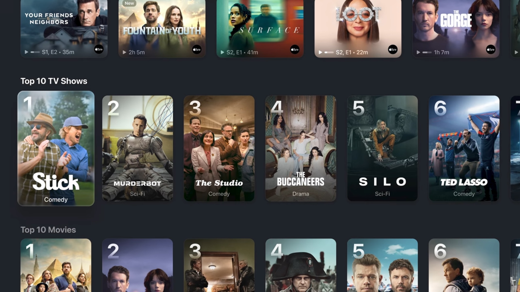
You can only see one complete row of movie poster tiles now. What an innovation in information density.
For some reason Apple decided to buck industry trends and all the show art tiles are movie posters now. I get it, it seems cinematic to evoke movie posters, but the interface is on a 16:9 screen. Use your noodles. This means that you get to see one row clearly. To make up for that, the show text is overlaid on top of the poster art with stylized fonts, like Photos Memories, making the shows harder to read. This change needs to be reverted.
I have nothing to say about the karaoke, which apparently requires the latest Apple TV 4K, and all your friends to have iPhones. I apologize in advance that I will quickly forget this exists.
The only positive thing I can say about how tvOS is being managed is that they still support the 2015 Apple TV 4th generation a.k.a. the Apple TV HD. It’s too underpowered for liquid glass shaders that refract the video you’re watching through the thin playback timeline bar, but something tells me that’s not a major concern Apple TV HD users have in 2025. Kudos for not dropping them.
Bill Atkinson, who invented the menu bar, died this weekend, so it just happens to be especially poor timing to try and kill the menu bar again. Apple has tried to reduce the menu bar before and walked it back so I hope there’s some way to do that here. This is not a matter of tradition, but usability. Having places on the screen where things go, and are styled in particular ways, to having meaning is important.
I understand the desire to reduce the heaviness of the menu bar, especially on MacBooks where the menu bar has grown to match the notch — but that’s a notch problem, not an ‘eliminate the concept of the menu bar’ problem.
The Finder window decorations are a real travesty. A bunch of lumpy circles and drop shadows with strange tangents. The Finder windows feel like less of a window and more of a second grader’s button and glue collage.
This isn’t the time and place for another rant on how editing and creating Shortcuts is bad, but it remains bad. The automation triggers seem like a theoretical good thing, as does access to various models, but Apple still isn’t providing any assistance on the composition and creation of those automations.
This might be the best part of the keynote. Apple delivered on longstanding gripes that iPad power users have had about the platform when it comes to window management, background processes, menu bar (lol), and audio routing. I wonder how well it all works in practice, but on the surface it seems like someone at Apple was finally receptive to years and years of complaints.
It was absolutely hilarious that after all that fuss, and all the failures of trying to rethink windowing, they just did it the Mac way, tiny traffic lights and all.
Unfortunately, there’s still a Files app, and despite the announcements I don’t consider it an improvement. I look forward to WWDC 2035 where iPadOS 36 gets the Finder, which by then will be a mobile of buttons suspended by invisible physics.
Ending with a song about an app store review felt pretty tone deaf (ha) because of the antagonistic relationship Apple has developed with app developers over the App Store. There was no contrition in the keynote itself over their policies and the things that have come out of court proceedings, it was all, “look at what our greatness provides”.
This WWDC definitely felt more grounded by what was possible, but like I said earlier, that’s also why much of it just met expectations. Hopefully people press Apple on the wild design choices and Apple reels them back in, but I don’t expect Apple to do the reeling all by itself. Try not to shush critics on behalf of Apple.
Unlike Reel 2 Real, I do not like to move it, move it. I moved a lot when I was a kid and I hate everything about it. I’m generally a pretty anxious person so telling me I have to go through everything I own and squeeze it into a smaller space, or get rid of it isn’t going to relax me.
Jason and I have been together for nearly 16 years. In 2020 we each ditched our one bed, one bath apartments and moved into a large single-family home. It certainly had pros and cons, and one of those pros was that there was ample square footage to store things. I did eliminate almost all of my 2005 furniture (microfiber isn’t quite the fabric of the future that they made it out to be at the time,) but I did retain most of my other possessions. They were boxed up and then most of them were never unpacked. When we moved again this month, it made it pretty easy to determine what things I didn’t really need. However, that didn’t mean that everything was going in the trash or being donated.
I did keep some things, and those things went into a small storage unit. I don’t want to maintain a gargantuan storage unit full of junk. I’m not running a museum for retail decisions I made 20 years ago. I also didn’t want to part with every sentimental thing that I would otherwise like to have in a larger home, assuming that happens again.
This meant unpacking boxes from nearly five years ago, and sifting through them with a more discerning eye than I had originally. All the while I was working 10 hour days on a project. Do not recommend.
I couldn’t exclusively listen to tech podcasts, read about tech, and follow social media about tech. There’s not a lot of great news happening in the world of tech at the moment! In my search for good vibes I went back to something that I had used to calm my nerves back in 2020: Total Party Kill.
Ironically, I had stopped listening to TPK because I fell far behind in 2020 and couldn’t figure out the last episode I had listened to due to mixing back and forth between the edited releases and the bootleg recordings which are nowhere near each other in terms of sync. I was a little less concerned about hearing funny puns too many times. I needed puns, stat! I needed to hear someone say, “44” and for Steve Lutz to say, “4 d4!”
Oh, also I guess my “tech angle” for this post is that just like the other items you own, you should also inventory the gadgets and gizmos because you don’t need aplenty. I had whos-its and whats-its galore. The new place was smaller, and had different lighting requirements, so the smart bulbs were retired. The old smart switches that worked — iHome switches, which were discontinued — were dumped and now everything is an Eve switch. There’s only one Apple TV acting as the Home Hub.
Hilariously, Apple makes it very annoying to remove devices in the Home app. Especially grouped devices — like if you have a lamp that takes two smart bulbs. You must ungroup the devices, then edit each individually to remove them. As a matter of cosmic history it has always been easier to destroy than to create — unless it’s in the Home app.
So that’s my big moving advice. Listen to something funny because the rest of the process is grueling and you need to replenish those endorphins so you don’t crumple to the ground. Throw out and donate what you can, but don’t keep something because you feel guilty about it, or you might still be able to use that discontinued smart device. You’ll continue to roll through life collecting more junk.
Here’s the problem with CarPlay Ultra: It’s still CarPlay.
Based on what we’ve seen of CarPlay Ultra, Apple believes that if it controls the appearance of the displays in cars, then using the car will be a good experience. I’m not sure that’s an assumption I’d make, especially when styling isn’t directly connected to function—as is the case with most of what distinguishes CarPlay Ultra from CarPlay.
There’s so much more Apple needs to do with CarPlay, fixes that would also benefit CarPlay Ultra. I use CarPlay all the time, and there are plenty of issues that don’t seem to be on Apple’s roadmap. If Apple improves CarPlay, it also improves CarPlay Ultra. That being said, here are some of my biggest outstanding issues with CarPlay today.
The first one is an Apple MacBook with all-day battery life. The second is the revolutionary iPhone. And the third is a breakthrough AI communications device. So, three things: a MacBook with all-day battery life; the revolutionary iPhone; and a breakthrough AI communications device. A MacBook, an iPhone, and an AI communicator. A MacBook, an iPhone … are you getting it? These are three separate devices, this is not one device, and we are calling it Tech Bro Desk. Today, OpenAI is going to reinvent desktop clutter, and here it is.
Featuring a tapestry of rainbow stripes that vary in shape and size, each Pride Edition Sport Band is assembled by hand from individual stripes of vibrant color that are compression-molded together, creating subtle yet striking variations. No two bands are exactly alike, reflecting the individuality of all members of the LGBTQ+ community.
The result is a very abstract approach to Pride where you would not necessarily know what it is you are looking at when you see a band. The Watch face, is easier to clock (wink) but it’s a very busy watch face, and I never use those because they never have enough complications.
iPhone, and iPad wallpapers also have a more recognizable grouping of colored stripes, but there’s no animated Mac wallpaper animated wallpaper to go with them.
Nothing’s been done to address concerns about the consumerism of selling Pride-themed products while the company, and notably its homosexual CEO, doesn’t really behave in a Pride-like way.
For anyone that might ask, “Why focus on Tim?” I would point you toward the Why Focus On Tim? subsection of my blog post critiquing the disparity between Tim’s words and his actions.
This administration has done harm, from day one, and continues to do harm with glee. This is a festering wound and Apple has a band-aid for us to feel better by buying something, just like always.
I would also point people toward Apple’s bold comittment to LGBTQ+ people on May 5, 2025 with this:
Apple is proud to financially support organizations that serve LGBTQ+ communities.
What does it mean, exactly, to support organizations that serve communities? It doesn’t guarantee a percentage of these band sales go toward organizations. It doesn’t say what percentage of the $24 billion in profit Apple made just last quarter go to these organizations. It doesn’t spell out who the organizations are and what kind of support work they do. Is Apple including donation matching from their employees when they say this?
Through this Pride Collection, Apple is proud to continue its support of LGBTQ+ advocacy organizations whose efforts are bringing about positive change, including ILGA World, a global federation committed to advancing the rights of LGBTQ+ people worldwide; and the Human Rights Campaign, a global advocacy group working to ensure all LGBTQ+ people are treated as full and equal citizens. Additional advocacy organizations Apple supports include Encircle, Equality North Carolina, Equality Texas, GLSEN, Equality Federation, the National Center for Transgender Equality, PFLAG, SMYAL, and The Trevor Project.
As I said before: You are better off giving to any or all of those organizations directly in 2025 –you were always better off giving directly, but people also wanted a fun watch band. I don’t see how a new Pride Collection will provide the necessary fascist-neutral offset for Tim Cook.
Apple doesn’t even bother to spell out anything as meager as what it said last year. What’s changed? Oh right, the thing that changed is an administration threatening LGBTQ+ people. That’s definitely the time to do less when pedalling Pride merch.
Whatever Apple is donating, it is not going to offset the damage being done. Plant some more eucalyptus.
If there was a way people could buy digital Apple Watch faces with 100% of the proceeds going toward an organization then that might be an interesting twist on all of this. Buy the 2025 Trevor Project watch face, the GLSEN one, etc. Buy them all. That’s just not Apple’s business model where they control the watch faces, you get one a year, and they sell a strip of molded plastic that allegedly pairs with it.
Tim Cook is very active in steering Trump away from tariffs and other policies that threaten Apple’s finances directly, but he’s not active in steering Trump away from policies that threaten his LGBTQ+ employees and customers. I would argue that indirect threat will have an effect over time on consumer sentiment, and on employee morale.
Make sure to buy your Pride merch and wave to Tim Cook at the Pride parade. There’s no shame in being who you are, especially if you can insulate yourself with wealth.
It’s puzzling why it would appear for public consumption in the state that it’s in. It’s already being indexed by search engines, so if they didn’t mean to release it, they might want to change their robots.txt file.
First of all, it’s a grid of pre-populated celebrities that slowly translates right to left. You can’t scroll it faster, filter, or reshuffle it. More importantly, there’s no search feature at all. So I hope you like Sabrina Carpenter and Austin Butler, because they’re the most prominently displayed celebs. Maybe Apple will reshuffle these every Tuesday like they reshuffle the TV app Home tab.
The snapshots themselves are very abbreviated artist bios that provide virtually no information about the celebrities as people. You’re better off using literally any other method to look up information on these people. Apple doesn’t even link out to Wikipedia or IMdB. Why would they? You wanted to know where Austin Butler was born and he was born in “US”. Asked and answered!
All the media that’s collected on the snapshot pages is Apple-centric. It’s a funnel to the TV app, Apple Music app, and the Podcasts app. That funnel has very limited utility to people who are not Apple executives.
For instance: Austin Butler has a movie coming soon called Eddington. A title card is displayed for it, and “Coming 17 July”. Tapping it takes you to the TV app where you can watch the trailer. That’s it. There’s no way to go from this to advanced ticket sales, or the movie’s web site, or any social media about the movie. Just that one trailer. That’s all Apple offers.
If you wait more than 30 seconds to get to Cate Blanchett, you can see that her “Newest Release” is promoted — Black Bag. For some reason it took three taps, but I eventually got the Black Bag page to load in the TV app to buy or rent it from Apple.
The Movies & TV shows are not sorted chronologically, and there’s no way to filter or force them to be, either here in the web app or in the TV app.
The same goes for Podcasts, which is even worse because it also doesn’t include podcasts that I know the celebrity was on. Cate Blanchett, for example, did a whole slew of podcasts to promote Borderlands and Black Bag but you wouldn’t know it from what’s listed on her snapshot. Searching the Podcasts app will turn up some of those more recent podcasts, but it doesn’t do it chronologically either. I can’t tell if its weighting some of the results by the popularity of the podcast, or the number of downloads of an episode perhaps?
Are they doing some kind of processing to determine whether or not a celebrity has appeared in a podcast, or merely someone is discussing the celebrity? Tagging? It would be too clumsy to just match against the text of a celebrity’s name.
In any case, Las Culturistas had Cate Blanchett on for a March 19, 2025 episode titled “Huge Fornicators” and it’s not there but episodes of other podcasts from 2020, 2023, and two from 2022. Tapping “More on Apple Podcasts” takes you to a confusing page topped by shows that have had her on, and then a bunch of those stale episodes in the episodes section below.
Curiously, a podcast that you will see come up a lot in the Podcasts section of Snapshot is WTF with Marc Maron, but Apple has no Snapshot of Marc Maron. Is that just because there are so few snapshot pages in total, or because he’s an interviewer of celebrities, but is not worthy of being a celebrity?
Where’s News+ in all of this? I don’t like News+, but I’m pretty sure some people have written about these celebrities at some point. That has a direct connection to an Apple Service, but it’s absent. Wouldn’t it be a good way to surface content locked inside of the magazines?
Beyond Apple, there’s no way to incorporate useful content that isn’t aligned with Apple’s commercial interests. Many of these celebrities have documentaries, or movies, on Netflix. They don’t get mentioned because they’re not aligned with the TV app. Then the question becomes: is the value of Snapshots to users complete information, or is the value of Snapshots merely for the benefit of Apple?
This is all reeks of the half-baked delusions of marketing execs, and the ensuing web app demo that was whipped up to please them. I don’t fault the developers that did the work as much as I fault the vision for the product.
The vision I would like to see, and hopefully what this evolves into, is a more fully featured component that can be used inside of apps. Like if I’m listening to a podcast in the Podcasts app that has Cate Blanchett on it, maybe I can tap through on Cate Blanchett’s name to see a snapshot. If she’s promoting a new movie in theaters I can watch the trailer or tap through to purchase advanced tickets from a ticketing app (like a partnership with Fandango, or better yet, apps can register that they sell tickets and can all be displayed).
That would also be helpful for music artists who maybe want you to buy tickets to their performances. Maybe the music artists have web sites that have additional information and merchandise.
We should also be able to see if the featured celebrity is also in other current podcasts as part of this press tour, meaning that it shows me chronologically what she’s in, not just old episodes where she’s discussing a different movie.
However, having said all of that, it’s still never going to fill the niche of celebrities and artists communicating to their fans that social networks fill. Why would anyone look at a celebrity snapshot when they can follow the celebrity —or general pop culture accounts— on social media?
Did I mention that the URLs for this incredibly unfriendly for celebrities to use elsewhere? Every person is a number at the end of a URL. It’s not their name, or a user name, or anything human. Taylor Swift is person/6667119979 which she is totally going to plug the next time she makes a public appearance.
Apple half-assed their social network, Ping, which was supposed to be a way to keep tabs on celebrities. Then it tried it again with music artist updates in Apple Music —that also died a quick death.
Apple just never wants to do the work to make the platform for common folk. It seems that the thinking is that if they have Lady Gaga posting then people will visit whatever liminal space Apple creates to host that. They also don’t really have a good way to demarcate who is and is not a celebrity. Celebrity is seemingly a person involved with a commercial endeavor on a platform where Apple financially benefits.
There are a lot of celebrities on YouTube, TikTok, and other fandom groups that have small, but intense followings. Apple has no financial stake in these things. Hot Ones, the show with hot questions and even hotter wings, is going to do more for celebrities than Snapshot ever will. Same goes for Chicken Shop Date, etc.
Apple should clearly delineate how all this works. How people can register and control their online image represented and hosted on Apple’s servers. What possible value could it have to known celebrities or relative unknowns?
Barring major revisions to functionality, and a huge expansion in who qualifies as worthy of Snapshot treatment, I don’t see how this will ever be anything more than another dead-end demo. I’ve probably written more about it in this blog post than will ever be written about it in the lifetime of Snapshots before it scrolls offscreen into the sunset.
Last week, Roku held a press event in New York where they unveiled their latest streaming devices, wireless cameras, and minor adjustments to their existing, content-driven interface. If you were hoping for a dramatic update to Roku OS, Lucas Manfredi has the disappointing details over at The Wrap:
The platform introduced a “Coming Soon to Theaters” row and personalized sports highlights. It also launched short-form content rows in the All Things Food and All Things Home destinations for users to easily find smaller curated clips, from recipe tutorials to home organization hacks. It also unveiled badges to help users differentiate between free, paid, new and award-winning content.
If you have used Roku devices or TVs recently these announcements seem disproportionate to the scale of the event where Masaharu Morimoto served sushi, and puppies were available for adoption.
For the US, the recommendation garnering the most attention is one calling for a 5 percent levy on UK subscriber revenue from streaming video on demand services, such as Netflix. That’s because if streaming services face higher taxes in the UK, costs could be passed onto consumers, resulting in more streaming price hikes. The CMS committee wants money from the levy to support HETV production in the UK and wrote in its report:
The industry should establish this fund on a voluntary basis; however, if it does not do so within 12 months, or if there is not full compliance, the Government should introduce a statutory levy.
Calls for a streaming tax in the UK come after 2024’s 25 percent decrease in spending for UK-produced high-end TV productions and 27 percent decline in productions overall, per the report. Companies like the BBC have said that they lack funds to keep making premium dramas.
This is all very ironic if you have been following the generous tax rebates that the UK provided to lure global production to the UK for pre-production, filming, post-production, etc. They are very generous subsidies that have all kinds of little rules and loopholes that get updated over time.
Instead of lowering those hefty rebates for international productions in the UK they want to tax subscriptions of international streaming services.
In a statement, the CMS committee called for streamers, “such as Netflix, Amazon, Apple TV+, and Disney+, which benefit from the creativity of British producers [Joe: and our enormous tax rebates], to put their money where their mouth is by committing to pay 5 percent of their UK subscriber revenue into a cultural fund to help finance drama with a specific interest to British audiences.[Joe: Unlike the content that they are paying to subscribe to which is definitely of no interest whatsoever to British audiences.]” The committee’s report argues that public service broadcasters and independent movie producers are “at risk,” due to how the industry currently works [Joe: We’re all trying to find the guy who did this!]. More investment into such programming would also benefit streaming companies by providing “a healthier supply of [public service broadcaster]-made shows that they can license for their platforms [Joe: Is there a term when something goes beyond double-dipping?],” the report says.
As Scharon notes, the same applies to Canada, which has eye-watering tax rebates in Montreal and Vancouver, but at the federal level, Canada wants to slap a 5% levy on streaming services. It’s just wild.
I know it’s rich for me, a guy in a country that turned tariffs on and off like a child playing with a light switch, to comment on the affairs of other countries, but I do feel at least a little affected by it.
It’s been one year since I was laid off from my VFX studio job after being furloughed for six months due to the dual labor strikes in the US, and a possible third. What production has resumed has mostly resumed abroad. Sound stages in LA are only at 63% capacity. Post production is even easier to do outside of the US, with my former employer exclusively hiring in other countries for positions like the one I did –but I did it in LA. This is a little less like trying to bring back coal mining jobs. I’m talking about jobs that were there 18-24 months ago.
It’s darkly funny (to me, anyway) to distort a market through tax rebates on foreign productions, then swoop in and demand money from subscriptions to foster locally-owned production. If a government wants to fund the production of local culture then they should funnel their money there to begin with by appropriately taxing foreign productions instead of trying to capture the revenue, after the fact, of the foreign system they’re supporting.