Unauthoritative Pronouncements

Subscribe
About

2025 Reading

As I have written about previously, I have been trying to read more often to avoid filling my time entirely with social media, or entirely with the deluge of awful news that makes my anxiety spike. I suppose if those weren’t things that concerned you then you could just read for “fun” or something.

Scott McNulty does an excellent monthly round-up of books he’s read, and I like to refer to it for some guidance on books I might like to pick up. This is sort of like that.

  • On Vicious Worlds (The Kindom Trilogy #2) by Bethany Jacobs ★★★★★ (Read on Jan 02, 2025) — This is an exceptionally weird space opera. Not weird because of sci-fi stuff, but weird because of the interpersonal relationships. I read These Burning Stars last November, and the third book comes out this December. I’m definitely onboard for it but I’m not sure it’s everyone’s cup of tea.
  • The Mercy of Gods (The Captive’s War #1) by James S.A. Corey ★★★★☆ (Read on Feb 05, 2025) — I was on the fence about this one because everyone in The Incomparable book club said it was kind of a downer, but it’s an interesting downer. I don’t care about any of the characters except The Swarm. The alienness of everything makes it interesting. Obviously the title “(Captive’s War #1)” gives away that there won’t be a satisfying end to the book, and I can confirm that after having read it.
  • Architects of Memory (The Memory War #1) by Karen Osborne ★★★★☆ (Read on March 1, 2025) — The Company situation borders on parody -if not for the reality we already live in that also borders on parody. The Vai are interesting, but implausible. Fortunately, most of the story is about these greedy, needy humans. It’s worth mentioned that I tried to pick up the second book in the series, but I did not like point of view character and stopped.
  • The Left Hand of Darkness by Ursula K. Le Guin ★★★★★ (Read on Feb 22, 2025) — I got around to reading a classic, and what can I say? It’s a classic. We get a real sense of an alien world that is distinctly human. Sure, the way gender is used in language is not really how we use gender in language today, but you can map it to what we would say these days and it is very modern.
  • Moonbound by Robin Sloan ★★★★★ (Read on March 5, 2025) — I couldn’t put this book down. I’m glad I also got to go on a podcast to talk about how much I like it, because it’s my favorite book that I’ve read so far this year, just as Service Model was my favorite book I read last year. They are very different books. Moonbound is much more of a fairy tale with a far-future framework and Service Model is satire. I don’t love how Moonbound concludes, but the journey is certainly worth taking. It’s like Thundarr the Barbarian meets Ursula K. Le Guin.
  • The Dispossessed: An Ambiguous Utopia by Ursula K. Le Guin ★★★★☆ (Read on April 16, 2025) — This is a very provocative book, but several sections were difficult for me to read because I dislike the protagonist (notably the party when the stuff happened that I won’t get into). I do appreciate that “utopia” is “ambiguous” but that also means the end of the book just kind sputters out after many dramatic situations have occurred. There is nothing to say about the outcome of the decisions, just that they have occurred.
  • Not Till We Are Lost (Bobiverse #5) by Dennis Taylor ★★★☆☆ (Read on Jul 09, 2025) — These are very light, easy-to-read books where Dennis Taylor just spins out some weird idea and puts a lot of cringeworthy nerd humor around it. This was not a particularly strong entry.
  • The Fourth Consort by Edward Ashton ★★★★☆ (Read on Jul 19, 2025) — This is a solid book with a lot of interesting things going on. Our main character doesn’t seem very… bright, but he does have his moments. I like the politics and world/universe building that we witness here.
  • Shroud by Adrian Tchaikovsky ★★★☆☆ (Read on Aug 18, 2025) — Unfortunately, this isn’t my favorite. The alien planet is innovative and intriguing, but the protagonist’s internal monologue is dull. So much of the book is taken up with it. The “Darkness” sections and the “Interludes” deflate some of the tension, because they turn it into a comedy of errors. Misunderstood communications in a farce, but farce isn’t the tone. This doesn’t possess the satirical humor of Service Model, despite how cartoonish The Concern is. It would make it more alien to not have access to Darkness and Interlude sections. Though, that would sadly leave us with more of the main character. This just isn’t my favorite Tchaikovsky novel.
  • Human Resources by Adrian Tchaikovsky ★★★★★ (Read Jul 20, 2025) — This is thin, and light. Nothing will shock or surprise, but it was a good palette cleanser when it became available on Libby right after finishing Shroud.
  • In the Lives of Puppets by T.J. Klune ★★★★☆ (Read on Jul 27, 2025) — There are some things you just have to go with because they are poetic - not because they really make sense. If you’re going to get hung up on wooden, mechanical hearts, or the function of blood and memory, you’re not going to enjoy the witty banter between the robots, or the touching and tender moments between Vic and those around him. The overall plot does fall apart about 80% of the way into the book when a plan is revealed during a dramatic moment and that reveal really comes out of nowhere. It all came from “off screen” events we should have been witness to.
  • Recursion by Blake Crouch ★★★★★ (Read on Aug 6, 2025) — Brilliantly plotted with rich, sorrowful, hopeful characters. The less you know about the book before you read it the better. It’s a twisty thriller with great characters, and that’s all you need to know.
  • Murder by Memory (Dorothy Gentleman #1) by Olivia Waite ★★★★★ (Read on Aug 11, 2025) — This was a fun, little detective story on a spaceship.
  • Finder (Finder Chronicles #1) by Suzanne Palmer ★★★★★ (Read on Aug 24, 2025) — I loved this fun sort of detective/heist story with the implausibly named Fergus Ferguson. The world/universe building is rich, and also funny. Having just recently read all of them in the series, I would say that the first book remains my favorite.
  • Driving the Deep (Finder Chronicles #2) by Suzanne Palmer ★★★★★ (Read on Aug 20, 2025) — If you need all the characters to carry forward from the previous book to the next, this is not the book series for you. Fergus Ferguson is back for another detective/heist story in a very isolated setting.
  • The Scavenger Door (Finder Chronicles #3) by Suzanne Palmer ★★★★☆ (Read on Sep 6, 2025) — The previous book was a very isolated, narrow environment for Fergus to operate in, and this book is expansive with a series of ingenious mini-heists. Once all the heists are over the story is less interesting, despite the scale of the problem facing Fergus.
  • Ghostdrift (Finder Chronicles #4) by Suzanne Palmer ★★★★☆ (Read on Sep 9, 2025) — More trouble for the trouble magnet. This book has a slow start, and space pirates that talk like the stereotypical seafaring variety are not the most interesting to me, but there’s a shift in locale that makes everything pretty interesting. Particularly the last third of this book. The final resolution doesn’t feel particularly final. I hope there’s more.

I’m currently catching up on some of Dan Moren’s Galactic Cold War short stories that I had bought and downloaded, but somehow never read. Shame on me. Then I got sidetracked when 1984 by George Orwell became available in Libby and now I get to wind down from the stress of the day by reading about that wacky Winston.

2025-09-16 15:10:00

Category: text


Every New Apple TV Feature in tvOS 26 ►

Stephen Robles has a good run through of all the new features in tvOS 26 on YouTube. I don’t have the energy, or enthusiasm to detail these features, so please refer to his fine work.

I will never, ever, ever have as much to say about the Apple TV Sing app as Stephen Robles. That’s a promise. It’s a specific piece of nerdy corporate synergy (singergy?) I’m not even sure people will remember the app exists in a few years.

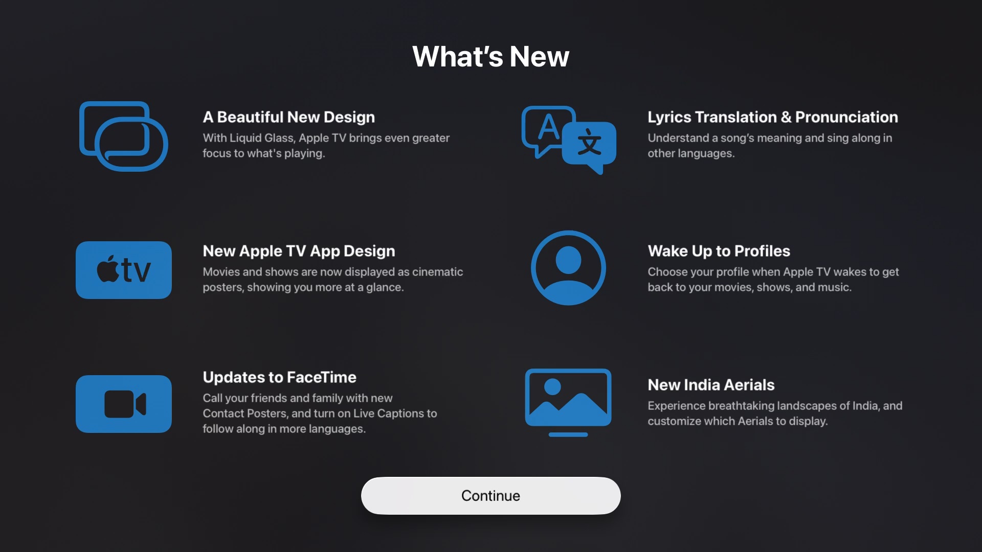
However, astute Apple TV owners will notice this screen when they start up their newly-updated tvOS 26 boxes:

A screenshot of the tvOS 26 splash screen showing new features. 'A beautiful new design. Lyrics Translation & Pronunciation. New Apple TV App Design. Wake Up to Profiles. Updates to FaceTime. New India Aerials.'

These features are not about improving the TV and movie viewing experience. The “Liquid Glass” updates to design were initially awful, but have been pulled back to the point where you wouldn’t really even register anything beyond some drawn-on highlight edges to things. Strangely, this “did they change anything?” is actually a good thing compared to the first stab Apple took.

The “New” Apple TV App Design doesn’t do anything to fix any of the problems with the “old” TV app design. They made the thumbnails into “cinematic” movie posters, which have lower information density and clarity when compared to the thumbnails that had separate text.

The Profiles don’t do anything useful because how can they? No apps tie into them, and as Dan Moren pointed out they don’t even do anything for siloing off parental controls.

For me, Apple TV is first and foremost a platform for viewing TV and movies. We just passed the 10th anniversary of tvOS, which I will probably write about in another post if I feel motivated enough. A lot of stuff has changed with tvOS, but not the mechanics of how you watch TV.

This is particularly irritating when how we view TV isn’t even the same as it was 10 years ago. There are a lot of FAST channels, and other linear and live TV streams, but tvOS has no awareness of them beyond sporting events.

The strengths of the Apple TV, and tvOS, are that there isn’t generic advertising in the interface. Apple does a ton of irritating self promotion, but it’s very different from what Amazon and Roku do.

It’s still the box I recomend for anyone that wants to stream TV (which is almost everyone) but it’s hard to sell people on the virtues of the Apple TV, especially when it seems like such a listless product.

None of the changes that Apple actually shipped with tvOS 26 (with the exception of the posters) worsened tvOS over the previous version, but they were also a lot of work expended on things that are not the primary focus of the device.

Of course major changes to tvOS seem to align with new models shipping, and if the Apple rumor sites are to be believed a new Apple TV model is right around the corner (or at least they post about it being right around the corner every month so they’ll inevitably get it right). Perhaps the “good” TV app will ship with new hardware, or we’ll get a more integrated live TV experience then?

I’m not going to hold my breath. I’m too busy singing.

2025-09-15 15:55:00

Category: text


Apple Is Finally a Carmaker

I had a thought while I was watching the latest iPhone launch event—other than, “This is what I’m doing with my free time?”—and it’s that iPhones are basically cars. It finally did it. The real Project Titan was the iPhones Apple made along the way.

Continue reading on Six Colors ►

2025-09-11 13:30:00

Category: text


A Better Camera App? Reflections on Adobe’s Project Indigo ►

I appreciate what Adobe is doing with Project Indigo. It’s a free iOS camera app, but it is heavily disclaimed as being experimental with unique features you can’t find in other apps. But Adobe also says they’re targeting “casual” photographers, which seems misguided.

A few people I know have even been evangelizing Project Indigo because they love it so much, especially when they compare it to photos from Apple’s Camera app. My enthusiasm for this product doesn’t match their own. It’s neat but it’s not great.

It isn’t all-purpose (it can only take still photos), and it can’t do panoramas or portrait mode. It doesn’t have the compressed storage of the editable HEIC files Apple introduced with the iPhone 16 Pro, or the new photographic styles pipeline that lets a user control tone mapping and certain processing, both before the photo is taken and after the fact.

There are still a few noteworthy tricks it pulls off that are worth a look.

Continue reading on Six Colors ►

2025-08-28 10:00:00

Category: text


Michelin Mess: How Apple Maps Fumbles Location Details ►

Apple Maps navigation might be on par with Google’s these days, but Apple’s location data is not. Google offers broad coverage for many points of interest, while Apple’s data has mostly relied on knitting together bits from competing business partners. This attempts to mimic Google’s comprehensive coverage without Apple having to do the foundational work itself.

Apple recently announced it would integrate data from Michelin Guide (prestigious/exacting), The Infatuation (trendy/young), and Golf Digest (retirees/executives/awful world leaders). While initial partnerships seemed shrewd for bootstrapping Maps data, Apple now appears content to make the entire platform out of boot straps.

This approach layers on top of existing partners like Yelp, OpenTable, TripAdvisor, and Foursquare, not to mention numerous international partners. Let’s focus on restaurants, the core of the Michelin Guide’s focus.

Continue reading on Six Colors ►

2025-07-22 08:30:00

Category: text


Shortcuts Files Should Be Text

I acknowledge this is a pretty strange complaint when you think about all the other ways that Shortcuts could be improved (so, so many) but allow me to walk you through my thinking:

  1. I want to do something with Shortcuts because it is Apple’s only cross-platform automation tool.
  2. I don’t know how to do it in Shortcuts because the actions are poorly documented and often use oddball names that the incredibly basic search won’t help you connect to.
  3. I can’t easily search the internet for exactly what to use because the terms are often too generic to produce useful search results.
  4. I can’t use LLMs even though they can handily generate simple code snippets, because Shortcuts are not text-based code, so they frequently describe many steps to create a Shortcut in the Shortcuts app that unfortunately involve hallucinating other terms because they’re used in the english words surrounding descriptions of things.
  5. I can’t use any other editor to make changes to Shortcuts, like I could with literally any other kind of automation software or code.

The problem is that the Shortcuts are binary blobs, but they should be text of some variety. When I started learning computer animation at school we used Maya, and Maya had two kinds of scene descriptions: Maya Binary (.mb) and Maya ASCII (.ma).

Our instructors were very specific in telling us that there was no good reason for us to use .mb files. If something went wrong with the binary file while it was being saved, and it was corrupted in some way, that they couldn’t help us recover data or fix the file.

The .ma format, on the other hand, is just text, that uses a simple subset of Maya’s MEL scripting language. You didn’t even need to be an expert in the language if you just needed to nudge some stuff, or ask someone else to help you recover data, or identify a problem. Most importantly: If you don’t want, or need, to hand-edit the text you never, ever, ever have to.

Every compositing package I have worked with, from Shake, to Bonsai, to Katana, to Nuke has been in a format that you can open and edit in any text editor to recover data, or automate scene file creation.

Here’s a neat blog post where someone walks through the anatomy a Nuke script. Knowing the anatomy of a Nuke script has never been part of my job description as a Nuke compositor, but whenever I’ve needed to delete an errant Viewer node, or remove a reference to a malfunctioning plug-in, I can do it without having to use the GUI that might not be happy with the evaluating the buggy file.

You can diff these files, you can do find-and-replace because you changed file paths, you can duplicate complicated script logic more easily than in the GUI. Have you ever made a for loop in Shortcuts? Did you want to throw something across the room afterward?

Of course, I’m sure the Shortcuts team would prefer for you to edit your Shortcuts in Shortcuts, but it should not be the only place. Undoubtedly they don’t want to make something that’s as obtuse as AppleScript, but people are still using AppleScript in 2025 to fill in the gaps. In 2025 LLMs can capably produce AppleScript, ironically negating much of AppleScript’s difficulty.

It would also be incredibly beneficial to Apple to produce text files because then they could train their Foundation models to understand and build the Shortcuts.

Users could tell the LLM of your choice that you want a Shortcut to generate some YAML headers for a blog post, or to convert a Google Maps point of interest URL into an Apple Maps one. Whatever it is you can describe in plain words but can’t easily map to Shortcuts functions without going to Shortcuts Night School for six years.

I’m sure Apple wants to maintain the signed, and relatively safe, status of Shortcuts — which is totally a thing they should do — but they can quarantine Shortcuts files with Gatekeeper until a user inspects them and approves them in Shortcuts.

Say you don’t need to generate one with LLM assistance at all, you just want to write it in BBedit, Coda, VSCode, Emacs (weirdo). You do that too, and it prompts you to check it in the app before you can run it.

That seems far more reasonable to me than expecting the Shortcuts app to be able to service all automation use cases, and experience levels by generating binary blobs of limited scope and complexity. What’s so wrong with text? Let’s do things the write way.

2025-06-17 17:00:00

Category: text


Apple Execs Defend Siri Delays, AI Plan and Apple Intelligence ►

Joanna Stern might be the best person to interview Apple executives. She doesn’t lob insults, or fiery condemnation, that would end the interview, but she doesn’t avoid asking serious questions about the unfulfilled promises. Remember when she interviewed Craig seven months ago about Siri and Apple Intelligence? Go back and listen to that spin.

Her questions are often so brief and direct, that you notice how much more Craig is speaking to try and spin his responses. Craig and Joz don’t come off super great here, and its entirely their own words that are responsible for that and not some elaborate trick questions, or editorial slight of hand.

The excuses are more transparent than Liquid Glass.

2025-06-11 10:20:00

Category: text


WWDC 2025 Keynote

I wasn’t satisfied with Apple, and Tim Cook, going into WWDC this year, and I remain dissatisfied after the fact. I don’t have the warm fuzzies when I see Craig on screen. There’s a distinct lack of new ideas in how the event is put together, and in many things in the event itself, despite all prior criticism about these very tame presentations lacking an air of sincerity and feeling incredibly “produced”. At least Apple didn’t fall into the same trap they did last year by promising us a magical AI assistant that didn’t exist. Everything they demoed feels within the range of their power, which is also why much of it doesn’t feel powerful.

F1 and Apple TV+

The skits they do are more for them than they are for me, that’s for sure. I would argue that these sorts of skits work better when it’s reminding us of an Apple TV+ show we’ve already seen and liked, rather than forward promotion. F1: The Movie would make more sense at a later event —if the movie’s good and does well. It just feels indulgent here and doesn’t connect.

A screenshot of the Ampere chart from the keynote showing Apple TV+ on top of the chart for quality
The best way to convince everyone you're cool is with a chart about how cool you are.

Then Tim Cook proceeds to talk about how great Apple TV+ quality (subjective) according to Ampere. You really can’t argue with it, except to point out that talking about how your shows at good at your software event isn’t going to do move the needle. I know that the general press is there, and they might write a sentence about it, but buy some commercials, fellas. Pay for air time with CBS to show Shrinking. The F1 sketch, and Ampere chart about your quality isn’t converting people.

Apple Intelligence

This isn’t much of a mea culpa. In fact, it largely consisted of Craig Federighi talking about all the great stuff they did ship, which is basically a lie if you’ve used the features in their shipped state. He even highlighted the notorious notification summaries, a feature where they had to add a carve out for news and entertainment apps.

Liquid Glass

Unfortunately, I strongly disagree with the design choices that Alan Dye, and his team, have made with Liquid Glass. Some of it is the material quality of the elements, but a large part of my disagreement is the construction and arrangement of the elements themselves.

If you follow me on Mastodon you’ll notice I didn’t say anything about the rumors for the redesign, or any theoretical renderings. There’s no point in saying anything about a design until you can see it. I don’t need to be pre-mad about anything.

Material quality is mostly fine with a glossy bevel around certain buttons. However, there is an intense refraction effect that occurs where something with a the bevel of a glass slide somehow has the light-bending abilities of a Coca-Cola bottle. Whatever you scroll, or whatever video is playing back, behind these elements causes huge variations in the refracted image passed through the button or toolbar element. Bright things get diffused and seemingly brighter (scattered light should reduce the intensity) but none of this is physically accurate, it’s about the slick appearance of something.

I happen to like transparency and translucency. The Beats Studio Buds+ were purchased specifically for their translucent plastic. I wouldn’t want to make all the UI elements see-through. There’s a time and a place.

In terms of the design language, I don’t like how everything needs to float above the content as discreet elements which all require padding and all have their own distinct shading effects. The top nav bar is gone in apps and replaced by 2-3 circular objects floating at the top of the screen, and 2-3 circular or pill-shaped objects floating at the bottom of the screen. They take up more space because they’re set farther from the edge, and from each other, creating areas of the screen where you see things behind that are not what you’re interacting with.

This means information density is seriously reduced. Here’s an example from Casey Liss running his Callsheet app in the beta. Above the keyboard, he has the floating search bar, and it’s applying a progressive blur to everything underneath. This means there is a single row of movies that are visible in the app. It’s not exclusive to his app.

There’s less room for what’s in the app because so much space needs to be taken up by things floating over the app. These are very similar problems to the much maligned Safari redesign a few years ago. They also applied this design to Safari and made it worse, again, too.

The appeal of the design choice is that things feel light, and your content feels like it expands beyond the borders, but its a useless feeling.

It’s certainly possible that the design will be reigned in before it ships, but the degree to which it will be reigned in is dependent on feedback, so … don’t be timid.

Of course it’s possible that none of this will matter because everyone will keep making web view apps and react apps. lol.

iOS

Other than the design issues, the thing that stuck out the most for me was the Camera app. Apple has never done more to sell third party camera apps. The current Camera app does have a lot of complex interactions, but this doesn’t resolve them. It just hides more things. I’ll have to see how it feels to use —and if they did anything with Camera Settings that mitigates or alters these UI changes.

At a surface level, the phone features, if not the interface, sound like improvements. Messages seems like even more of an interface mess now that there are ugly backgrounds, but people love that shit. Weird that Apple is so set against people personalizing their devices but adopting the most hideous WhatsApp feature that exists.

Image Playgrounds continues to be an abomination. It’s whole sales pitch was that it was safe and private — even if it sucked — and now they’re like, “sure whatever send your loved ones to ChatGPT and make slop of them there”. I don’t respect the decision at all, even if I do understand it. Apple has put “or ChatGPT” in a lot of places where Apple’s models are failures, but “or ChatGPT” is not a success either because what’s the incentive to go into one of these apps and use one of these features that’s just middleware for another service that has its own app? Apple’s incredibly weak and unconvincing here.

If Apple wanted to lean into IP safe image generation they could work with Adobe which has their Firefly model, but that would probably cost money, and ChatGPT doesn’t cost them any money.

Live translation feels like it’s more than a step behind Google here as well. The examples had a lot of lag and the results felt clumsy — but it’s better than nothing.

Maps learning your common routes is good, but Maps has “learned” my patterns for years and is actually very bad at it. For example, I just moved recently, and I changed my address in Contacts, and edited Home in Maps (why are these separate?) and the Maps widget is still recommending that I drive to the old address every day because I had spent so much time there. It’s things like this that don’t give me much confidence in Maps learning anything.

Visual Intelligence is a middleware wrapper on a screenshot utility. It can do some OCR and use data detectors to figure out if there’s an event in a screenshot, or an address, or now pass images on to other apps that can do image-based searches. This is incredibly weak, and still requires multiple steps. It also sends your whole screen, Messages conversations and all. There’s no smart selection, or magic wand. This has all the whimsy of command+shift+3.

CarPlay

I don’t understand why they went through all the trouble of launching CarPlay Ultra last month when they had an updated design and widgets to unveil for CarPlay this month. The instrument cluster in the Aston Martin didn’t have the liquid glass design language, just the center stack, so it felt a little strange. We know Liquid Glass requires a lot of Metal 4 rendering magic, so is part of the reason for this because of the car’s local OpenGL rendering? If so … why the hell did we design a system like that?

A screenshot from an Aston Martin showing the instrument cluster and the center stack in CarPlay Ultra with the center having the liquid bevel look and the instrument cluster having the previous flat look.
Weird that the instrument cluster doesn't have the liquid glass effects.

The Tapbacks feel unsafe. I’m pretty puzzled by their inclusion. There should be a better way to communicate Tapbacks with, oh I don’t know, a voice assistant maybe?

watchOS

And Alexander wept, seeing as he had no more worlds to conquer.

If you ask me, and you are because you’re still reading, the software features of watchOS peaked a few years ago. That’s great because they can polish what’s there. The wrist flick is probably going to be pretty good —until I accidentally flick something away and it disappears because there’s no concept of a dismissed notifications folder.

I am the singular person that dislikes the Smart Stack. It gets in the way of my complications. I’ll live with them continuing to push it.

Workout Buddy is a robot voice that tells you several numbers are good numbers and you’re doing great with numbers. I would never in a million years find such a feature appealing. If people want encouragement from a chat assistant, they probably expect a chatbot that they can converse with and develop one of those incredibly problematic social relationships with. Workout Buddy is Clippy for workouts.

tvOS

What tvOS needs is a comprehensive overhaul of the concept of the home screen. For years there have been two competing home screens: the original app-based home screen, and the newer Apple TV+ content-based TV app. Real nerds, like me, know the TV app sucks and use the app-based home screen. The TV app has not been improved in terms of personalization or customization at all.

The sign-on feature once again requires adoption by streaming apps in order to work, and it’s tied to your Apple ID. Good luck with that getting widely adopted over QR codes and authorization URLs.

The user profile picker that’s presented at start-up is also another miss. As I’ve written about before, profiles are an imperfect mechanism for viewing behavior for several reasons, including the fact that most households share services, and those services have profiles, and those profiles aren’t using Apple’s system but their own cross-platform profile systems.

Of all the features to focus on for tvOS — like where the hell is a live TV guide — Apple’s going to bug people about user profiles and talk about yet another sign-in method? What the hell?

A screenshot of the Apple TV's TV app interface showing rows of movie posters with only the middle row completely readable. Text for the show and movie is overlaid on the poster element instead of below it like it was previously with the 16:9 aspect tiles.
You can only see one complete row of movie poster tiles now. What an innovation in information density.

For some reason Apple decided to buck industry trends and all the show art tiles are movie posters now. I get it, it seems cinematic to evoke movie posters, but the interface is on a 16:9 screen. Use your noodles. This means that you get to see one row clearly. To make up for that, the show text is overlaid on top of the poster art with stylized fonts, like Photos Memories, making the shows harder to read. This change needs to be reverted.

I have nothing to say about the karaoke, which apparently requires the latest Apple TV 4K, and all your friends to have iPhones. I apologize in advance that I will quickly forget this exists.

The only positive thing I can say about how tvOS is being managed is that they still support the 2015 Apple TV 4th generation a.k.a. the Apple TV HD. It’s too underpowered for liquid glass shaders that refract the video you’re watching through the thin playback timeline bar, but something tells me that’s not a major concern Apple TV HD users have in 2025. Kudos for not dropping them.

macOS

Bill Atkinson, who invented the menu bar, died this weekend, so it just happens to be especially poor timing to try and kill the menu bar again. Apple has tried to reduce the menu bar before and walked it back so I hope there’s some way to do that here. This is not a matter of tradition, but usability. Having places on the screen where things go, and are styled in particular ways, to having meaning is important.

I understand the desire to reduce the heaviness of the menu bar, especially on MacBooks where the menu bar has grown to match the notch — but that’s a notch problem, not an ‘eliminate the concept of the menu bar’ problem.

The Finder window decorations are a real travesty. A bunch of lumpy circles and drop shadows with strange tangents. The Finder windows feel like less of a window and more of a second grader’s button and glue collage.

Shortcuts and Spotlight

This isn’t the time and place for another rant on how editing and creating Shortcuts is bad, but it remains bad. The automation triggers seem like a theoretical good thing, as does access to various models, but Apple still isn’t providing any assistance on the composition and creation of those automations.

The changes to Spotlight are great. RIP Alfred. I’m disappointed that the actions aren’t natural language actions, because the syntax of things seems clumsy. This is in essence what I was complaining about in this Six Colors post but that was Spotlight for iOS.

visionOS

Well, it looks like people are still working hard. So… uh… keep going for another decade and I’ll check back.

iPadOS

This might be the best part of the keynote. Apple delivered on longstanding gripes that iPad power users have had about the platform when it comes to window management, background processes, menu bar (lol), and audio routing. I wonder how well it all works in practice, but on the surface it seems like someone at Apple was finally receptive to years and years of complaints.

It was absolutely hilarious that after all that fuss, and all the failures of trying to rethink windowing, they just did it the Mac way, tiny traffic lights and all.

Unfortunately, there’s still a Files app, and despite the announcements I don’t consider it an improvement. I look forward to WWDC 2035 where iPadOS 36 gets the Finder, which by then will be a mobile of buttons suspended by invisible physics.

Not Six Out of Five Stars

Ending with a song about an app store review felt pretty tone deaf (ha) because of the antagonistic relationship Apple has developed with app developers over the App Store. There was no contrition in the keynote itself over their policies and the things that have come out of court proceedings, it was all, “look at what our greatness provides”.

This WWDC definitely felt more grounded by what was possible, but like I said earlier, that’s also why much of it just met expectations. Hopefully people press Apple on the wild design choices and Apple reels them back in, but I don’t expect Apple to do the reeling all by itself. Try not to shush critics on behalf of Apple.

2025-06-10 10:45:00

Category: text


Move and Take an Action

Unlike Reel 2 Real, I do not like to move it, move it. I moved a lot when I was a kid and I hate everything about it. I’m generally a pretty anxious person so telling me I have to go through everything I own and squeeze it into a smaller space, or get rid of it isn’t going to relax me.

Jason and I have been together for nearly 16 years. In 2020 we each ditched our one bed, one bath apartments and moved into a large single-family home. It certainly had pros and cons, and one of those pros was that there was ample square footage to store things. I did eliminate almost all of my 2005 furniture (microfiber isn’t quite the fabric of the future that they made it out to be at the time,) but I did retain most of my other possessions. They were boxed up and then most of them were never unpacked. When we moved again this month, it made it pretty easy to determine what things I didn’t really need. However, that didn’t mean that everything was going in the trash or being donated.

I did keep some things, and those things went into a small storage unit. I don’t want to maintain a gargantuan storage unit full of junk. I’m not running a museum for retail decisions I made 20 years ago. I also didn’t want to part with every sentimental thing that I would otherwise like to have in a larger home, assuming that happens again.

This meant unpacking boxes from nearly five years ago, and sifting through them with a more discerning eye than I had originally. All the while I was working 10 hour days on a project. Do not recommend.

Strangely enough, The Verge has a whole slew of articles about moving that they published the week I moved. I have absolutely no idea why they did that, but it didn’t help me in the slightest. Even when I was lying in bed at 4 AM unable to sleep, the posts weren’t what I was looking for.

I couldn’t exclusively listen to tech podcasts, read about tech, and follow social media about tech. There’s not a lot of great news happening in the world of tech at the moment! In my search for good vibes I went back to something that I had used to calm my nerves back in 2020: Total Party Kill.

Ironically, I had stopped listening to TPK because I fell far behind in 2020 and couldn’t figure out the last episode I had listened to due to mixing back and forth between the edited releases and the bootleg recordings which are nowhere near each other in terms of sync. I was a little less concerned about hearing funny puns too many times. I needed puns, stat! I needed to hear someone say, “44” and for Steve Lutz to say, “4 d4!”

Oh, also I guess my “tech angle” for this post is that just like the other items you own, you should also inventory the gadgets and gizmos because you don’t need aplenty. I had whos-its and whats-its galore. The new place was smaller, and had different lighting requirements, so the smart bulbs were retired. The old smart switches that worked — iHome switches, which were discontinued — were dumped and now everything is an Eve switch. There’s only one Apple TV acting as the Home Hub.

Hilariously, Apple makes it very annoying to remove devices in the Home app. Especially grouped devices — like if you have a lamp that takes two smart bulbs. You must ungroup the devices, then edit each individually to remove them. As a matter of cosmic history it has always been easier to destroy than to create — unless it’s in the Home app.

So that’s my big moving advice. Listen to something funny because the rest of the process is grueling and you need to replenish those endorphins so you don’t crumple to the ground. Throw out and donate what you can, but don’t keep something because you feel guilty about it, or you might still be able to use that discontinued smart device. You’ll continue to roll through life collecting more junk.

2025-06-05 17:00:00

Category: text


To Improve CarPlay Ultra, Apple Needs to Fix CarPlay ►

Here’s the problem with CarPlay Ultra: It’s still CarPlay.

Based on what we’ve seen of CarPlay Ultra, Apple believes that if it controls the appearance of the displays in cars, then using the car will be a good experience. I’m not sure that’s an assumption I’d make, especially when styling isn’t directly connected to function—as is the case with most of what distinguishes CarPlay Ultra from CarPlay.

There’s so much more Apple needs to do with CarPlay, fixes that would also benefit CarPlay Ultra. I use CarPlay all the time, and there are plenty of issues that don’t seem to be on Apple’s roadmap. If Apple improves CarPlay, it also improves CarPlay Ultra. That being said, here are some of my biggest outstanding issues with CarPlay today.

Continue reading on Six Colors ►

2025-05-22 09:50:00

Category: text