From LA to Tokyo
For Jason’s birthday we traveled to Japan for 10 days. It was my first time anywhere in Asia, and it had been a long time since Jason was last in Japan, so we had some experiences that were continuations of what I wrote up last Fall from our trips to Europe, and also things that were quite different.
Planning Ahead
Google Sheets
Just like before, Jason dumped all the trains, flights, hotels, and dinner reservations into Google Sheets. I still have a hard time quickly accessing that data when we’re “in the field” so I’ve made some adjustments.
TableCheck and Omakase
In America, almost everything is OpenTable, Resy, or Tock for reservations. In Japan, the dominant players seem to be TableCheck and Omakase. The real fancy places tended to use Omakase for reservations. Jason handled booking all the reservations because he was in charge of planning out the schedule for what he wanted to do. For weeks he’d message me, or mention in passing, his frustration at trying to score these reservations. According to his experience (and briefly verified when I went to try to book a few things as a test) the sites are not great. Neither worked for me in desktop Safari on my Mac, with TableCheck only rendering a blank page, and Omakase showing all of the possible menu dropdowns that are hidden by JavaScript, but none of the dropdowns worked. They all worked fine in mobile Safari, and in desktop Chrome. I’m not using an ad blocker or anything.
However, just loading doesn’t mean the site works. For one restaurant using Omakase, the one we went to for Jason’s birthday dinner, dates show in pink that are available for an “instant reservation” but that’s not actually true, and you’ll get “Please choose a different date” so you just need to keep clicking until you find one of the ones labeled to work that actually works. Then you need to select your party size, but SURPRISE, you can get a “Request for this number are not allowed” error because they only have seating for one, not two.
It’s all this weird game of whack-a-mole until you get a working reservation. It is absolutely not how reservation systems in the US work. It would be better if could handle these reservations through another intermediary, like Apple Maps or Google Maps which both have reservations capabilities.
Oh but they do show you a reservation button in Apple Maps for some of these restaurants, like this Omakase one. However it’s OpenTable, not Omakase. The OpenTable sheet errors and says there’s no table found for [date here] and says “Try another date or party size.” However, even if I select exactly the same date and party size that works on the Omakase website the OpenTable one always shows the same error. It’s the same error for any day I tried. It would seem that OpenTable doesn’t actually have the ability to book anything, but instead of not listing the restaurant, they’ve created some sort of psyop against would-be diners.
Google Maps, doesn’t pretend that you can reserve a table for that restaurant in the app. It has “Find a table” lower down in the location listing. That offers up opentable.jp (all in Japanese, and just as non-functional as the embedded OpenTable sheet in Apple Maps), omakase.com (exactly the same function as the mobile site), tablelog.com (all in Japanese, and says to call the restaurant to reserve). So there’s a needle in the haystack here, and that’s the Omakase site with it’s whack-a-mole reservation system, but it’s silly. For a company that gets all its data from scraping the internet, it should be able to see what the restaurant web site actually uses for reservations.
In another example, a less fussy restaurant (Bills Ginza), has a “Reserve” button in Apple Maps that doesn’t work. It does nothing if you press it. In Google Maps the reserve button (up top instead of just the “Find a table” button lower down in the previous example which seems to indicate that there’s an in-app interface to use) brings up a sheet that plausibly shows party size, and times in partnership with Ikyu. The restaurant’s website wants you to use TableCheck, which neither Apple Maps nor Google Maps directs you to.
Variations on this go for every restaurant Jason booked on our trip to Japan. It is entirely possible to book reservations, because Jason managed to do that with grit and perseverance, but there’s room for improvement here from everyone.
Drafts
Jason was interested in watching a lot of YouTube videos about people currently visiting Japan, since he hasn’t been in many years. We’d get a sense of what was popular, and also the vibes. While we were watching the videos, I entered names of coffee shops, camera stores, or sites to visit, into Drafts tagged with “Tokyo” or “Kyoto” so that while we were watching over the last few months I could add to the running document and reorder things without cluttering the more rigid schedule. You hear that, Greg? I actually used a feature and didn’t just dump text in!
These were all things that would be nice to do, but not requirements. In fact, we weren’t able to go to most of them, but at least I have them saved if there’s a future trip to Japan.
Google Maps Lists
Before, and during, our trip I took all the locations we would be traveling to from the Google Sheets document, and my Drafts lists of possible places to visit, and I created Google Maps lists for each city. It’s very easy. You search for the place, hit the bookmark icon to save it, and pick the list (or create it). You can enter an emoji for each list so that when you’re looking at Google Maps you’ll see that little emoji dotted everywhere. Also you can browse the list, or just start typing the name, and the saved item will come up first.
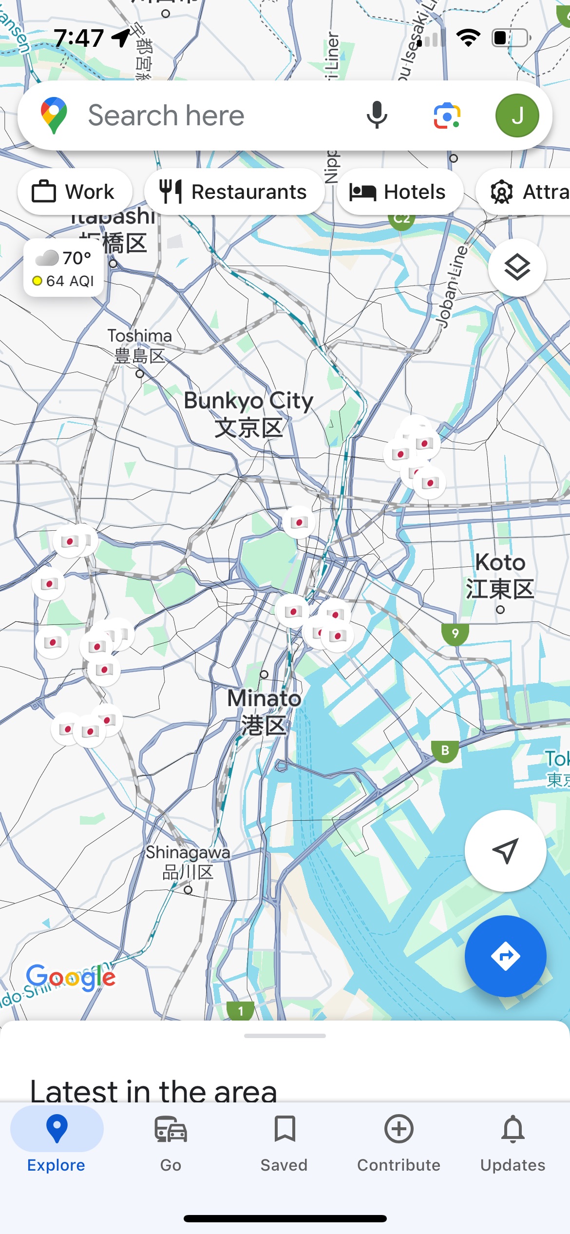
This is not a revolutionary new technology, but it was something I deployed to great effect on this trip. Jason didn’t hate it!
I’m an Apple Maps apologist in our household. When Jason drives, he uses Google Maps with CarPlay, and when I drive I use Apple Maps. My default is to use Apple Maps. However, when traveling, that’s not the case.
There is a similar “guides” feature in Apple Maps, but it’s not as good. Google Maps lists have a notes field, which is helpful for remembering why the place is saved. Apple Maps guides do not. Lists put that emoji on the map, while guides use the default business type icon (the purple hotel icon, for instance) and places a tiny little white circle badge with a star on it over the upper right corner of the business type icon. It’s visually cluttered, and makes a map that is not glanceable from a high-level.
When searching for a business, like your hotel which is part of a very large hotel chain, Google will show the one saved in your list as the first search result when you start typing. Apple Maps will show you the search results in the same order you’d see them otherwise, but it will write “in your guide” under the hotel that could be further down the list. Thanks?
Most importantly, guides can only be shared one way, like a published document, from me to Jason. Lists can be shared and jointly edited, so Jason is able to add what he wants to the list without me needing to act as a go-between. If he came across something he wanted to stop at, he could just add it to the list and there it was for the two of us.
No, Really, Apple Maps Is Bad For Planning
Apple Maps is also bad if you move the map to an area and want to search within that area. It’ll snap back to where you are and search that area first. Don’t you want to find coffee shops near you? No! I moved the whole view over there! Search there!
Then you have to move the view back to where you wanted to look, and hopefully it will trigger the “search this area” button to appear. Sometimes it doesn’t! This is not an international problem, it’s a global problem, but it’s especially frustrating when planning ahead of the area you’re currently occupying.
Also, if you’re planning weeks before your trip, you’ll be surprised to find an error message when you connect your iPhone to your car that “Directions are not available between these locations.” Not to contradict Charli XCX, but there’s no fast lane from LA to Tokyo, so why would this ever be something I would want? It corrupts both my planning experience, and my current experience, because it’s goofy as hell. I don’t want to keep using the app to plan if it’s going to do that.
I’m Not Kidding About Apple Maps
After we got back, I updated to the latest version of iOS, and I was greeted to this error message:
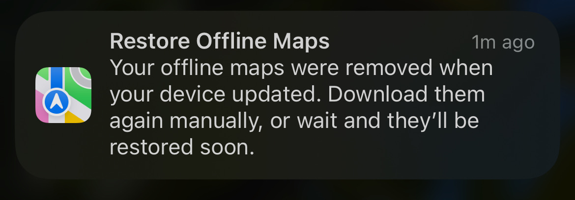
What?
No, seriously, what?
The whole point of having offline maps is so that I am not at the mercy of a network connection. That’s its raison d’être! It’s downloaded.
If I had upgraded from 14.4.0 to 14.4.1 while I was traveling I would need to catch this error with enough time to re-download my offline maps, especially the offline maps for the city I was in.
Google Maps doesn’t do this! Why? Because it’s bonkers as fuck, that’s why! Why am I even getting an error message about this? Why aren’t people just fixing this?
Mercury Weather
This is still working exactly the same as my other trips. Before the trip I could keep an eye on what the weather would be like for what clothes I needed to pack, and during the trip I could see if there were any drastic changes coming up as we moved through the country. Which days it would rain kept shifting during the trip.
I’d still like something more granular for days with multiple cities, and I would love a system-level trip mode that could understand I’m not a persistent, stationary object when it comes to upcoming calendar events and weather forecasts.
Up In the Air
For this trip I planned a little better and downloaded some things ahead of time. I had assigned myself some homework —watching Lost in Translation— so I had that downloaded to the TV app. I had downloaded some music too, unlike last time.
Flighty
This was a new addition to my life after I had written up about my trips to Europe, but this wasn’t the first trip I used it on. United’s live activities offer a very similar live activity experience to Flighty, but not all air carriers have a live activity, and Flighty’s flight timing info is more extensive if you’re curious about how often a flight is on time, or delayed. Both of them nonsensically show seconds in their countdowns, which not only shifts all the text based on the character width of each number changing every second, but it’s also absolutely useless to know.
Watch
It still bums me out that the Watch just thinks I’m in my home time zone through the whole trip until that moment we can activate cell service and then it snaps across the globe.
The Face ID mask+watch combo doesn’t work when your iPhone and Watch are in Sleep focus mode. Which is still annoying. You can drop your mask to get the iPhone to unlock, or you can exit Sleep mode and get pinged by notifications when you do fall asleep. I understand there are security concerns about someone using Face ID while I am sleeping, but I could be asleep when it wasn’t in focus mode too, obviously. The mode doesn’t dictate if I’m conscious.
All Roads Lead to Roam
Roaming is still the way to go for me. Japan has more ubiquitous free public wifi than I’ve seen anywhere else I’ve traveled, and sims are supposedly easy, but I’m there for 10 days. I just want everything to be with my phone number, and for things to work as expected when I need them. Sometimes iCloud Public Relay gets into a fight with Wi-Fi. It’s worth it to just make it easy with a fixed, daily rate.
Apple Maps and Google Maps
Like I said above in the section on lists vs. guides, Google Maps is more glanceable if you pre-populate a map with your unique emoji. The Apple business icons are generally too small, and low contrast for my liking. For some reason the ones that always visually stick out in dark mode are the bright pink icons for salons. Salon glanceability really has a time and a place, and it’s generally not on a ten day vacation.
Reviews
Apple Maps is not very good for English-speaking tourists in Japan. Apple Maps Japanese data is from its partnerships with local Japanese companies. That’s great for locals, but that means things like restaurant reviews are in Japanese. Again, this is helpful if you speak Japanese, and very relevant to the residents of Japan, but far less accessible to me, an English-speaking traveler.
You can tap on the review source, which will open the partner company’s web site, and show the reviews. Then you can tap the “ᴀA” in the upper right corner, and pick “Translate Page”, to have the translated version of the web page. Apple doesn’t offer to translate anything within Maps. The text in the Maps app is not selectable so you can’t use the context menu to translate. You can’t tell it to always translate non-English web site pages.
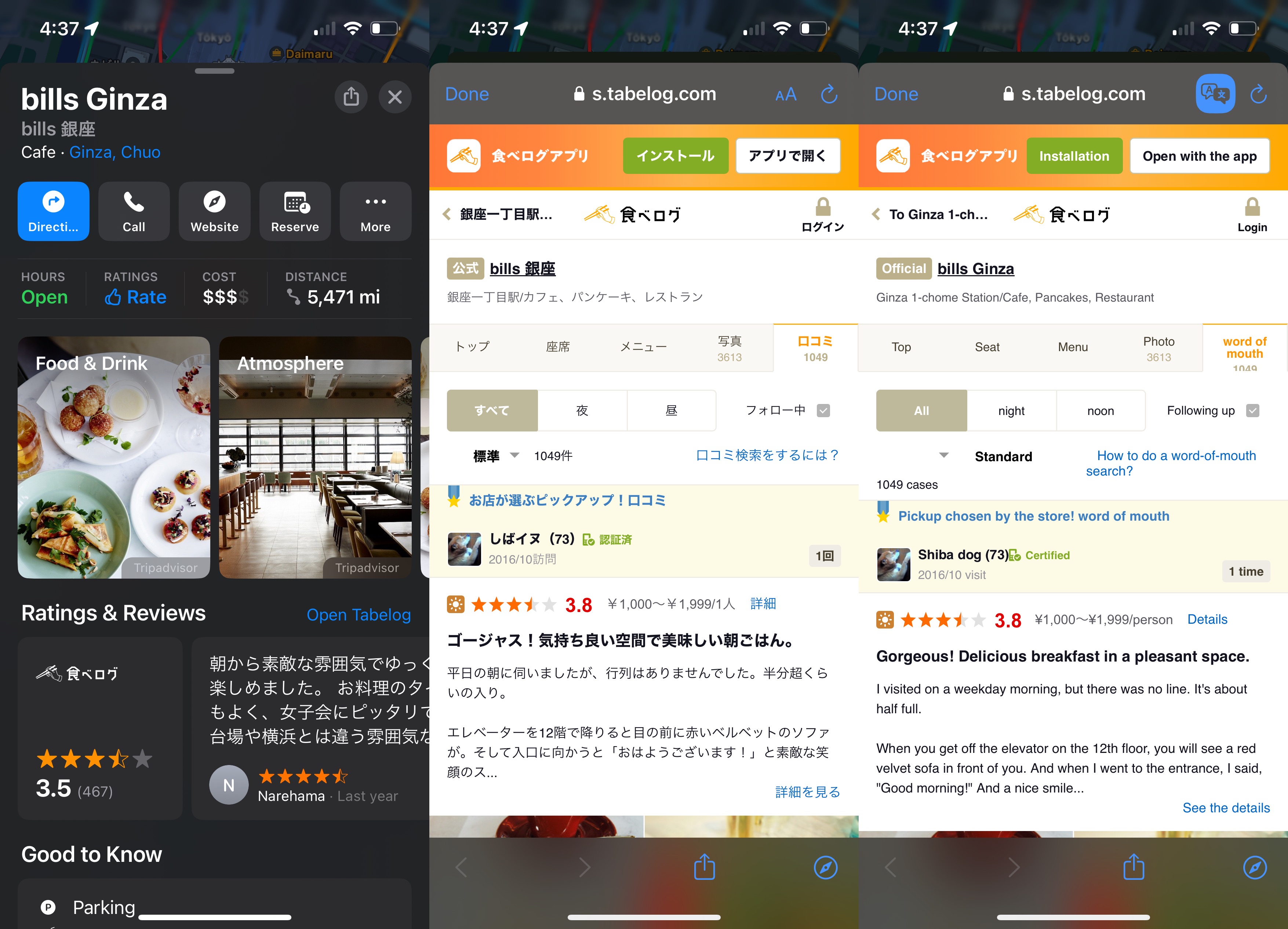
You need to do all those steps each time you want to consult reviews.
If you’re trying to compare several restaurants around you, quickly, you’re better off not using Apple Maps.
This is different from Apple Maps in Europe, where the reviews shown to travelers are all from TripAdvisor. I hate TripAdvisor, and don’t find it’s data to be reliable because it’s something that can be easily gamed to provide mediocre places with excessively high scores. It is, however, 100% more readable.
The reviews that Google shows you in Google Maps are all from Google Maps user submissions, not partner sites, and it knows I’m not Japanese so it shows me reviews from other travelers, like TripAdvisor reviews, but for some reason the ratings seem to be more closely aligned with my perceptions than the inflated TripAdvisor scores of Europe. (Google Maps reviews are also better in Europe than TripAdvisor.)
Transit
It goes without saying that Japan has a very developed, and robust transit system with multiple rail lines and rail companies. Bustling, massive stations connect these lines. Apple Maps and Google Maps still fall flat on their faces when it comes to mixing walking turn-by-turn directions with transit directions.
The apps will provide the written direction “Walk to Shibuya station”. That’s it. Simply walk to Shibuya station. Here’s a dotted line if you want to look at it. It says “2” for the entrance. Good luck inside! It’s not a sprawling world unto itself!
Both apps really, truly, needs to provide the same level of care that they provide for walking directions to the transit directions.
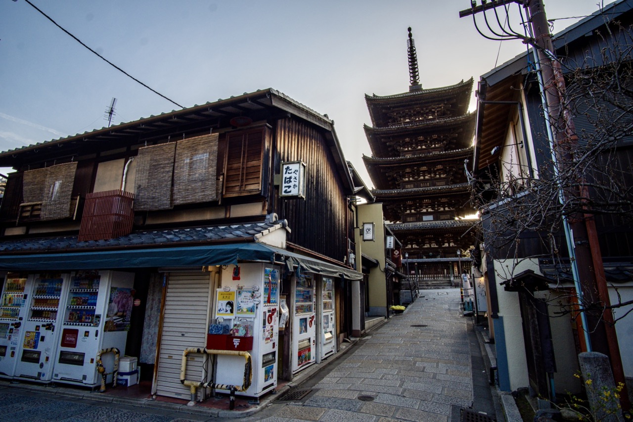
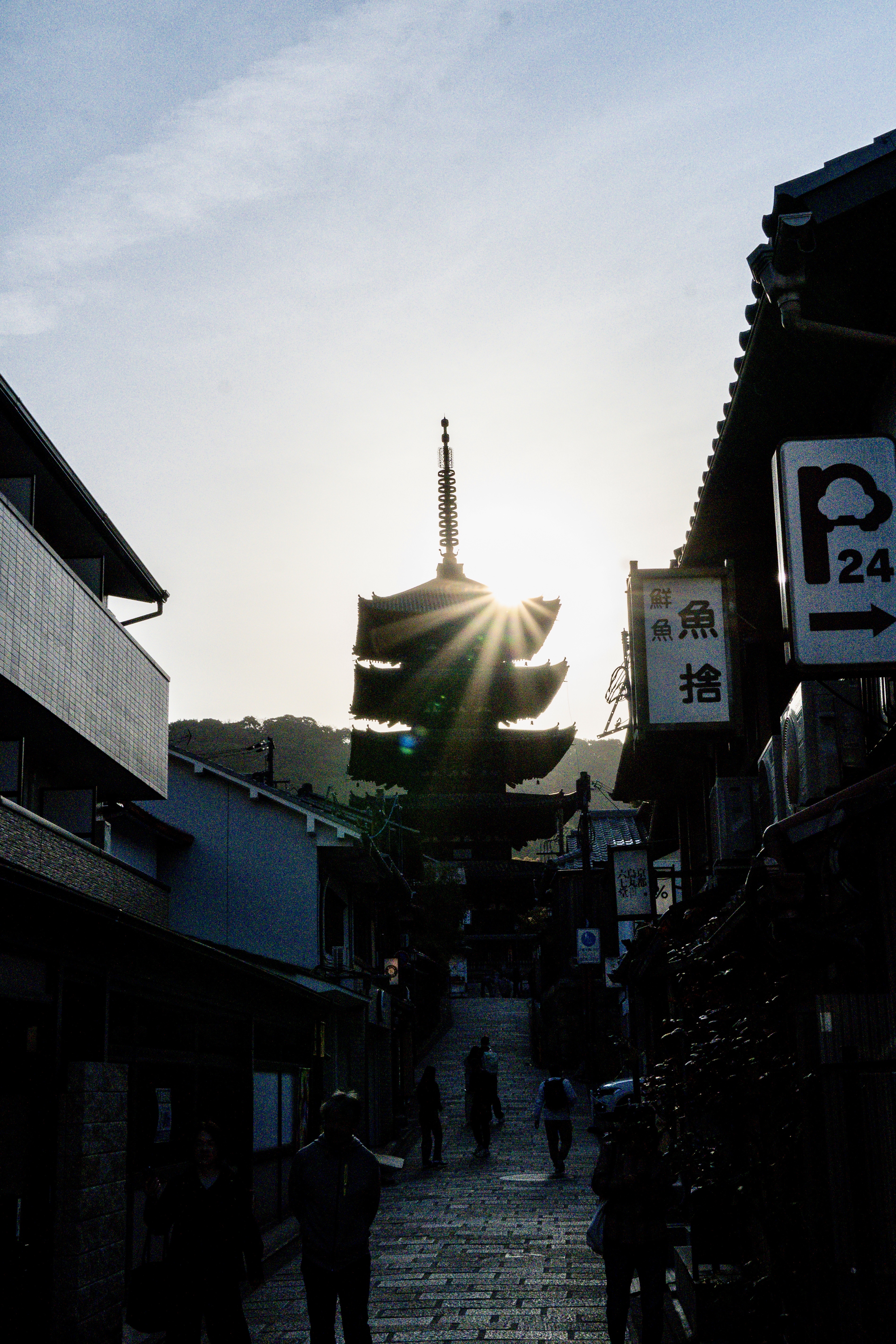
We had some confusion on one trip in Kyoto because we couldn’t find a line we were supposed to take, but it was a JR line, not a city line, and that wasn’t marked in the apps. We had to look at a laminated piece of paper taped to a column to get the clue. That meant exiting ticket gates, and entering other ticket gates inside the same station because they were different lines. Neither Maps app helped.
Google and Apple both provide diagrams for the train cars, and highlight specific cars. Google says “Boarding position for fastest transfer” or “fastest exit”. Apple just says “Board” without qualifiers. If you’re someone who’s not used to rail you see that and wonder for a second what happens if you get on the wrong car?
I don’t like the ambiguity of why you’re doing a step. Explain it. Does the train car decouple? Is the train too long for the destination platform? Or is it just an ideal I can fail to meet like so many others?
I do appreciate that both apps have accurate calculations for fares. Japan uses IC cards that are pre-paid transit cards where money can only go in. Apple Maps has an edge on Google Maps because it has access to your IC card balance in your Apple Wallet and will warn you if your trip will exceed your balance. Google doesn’t have that integration on iOS, naturally.
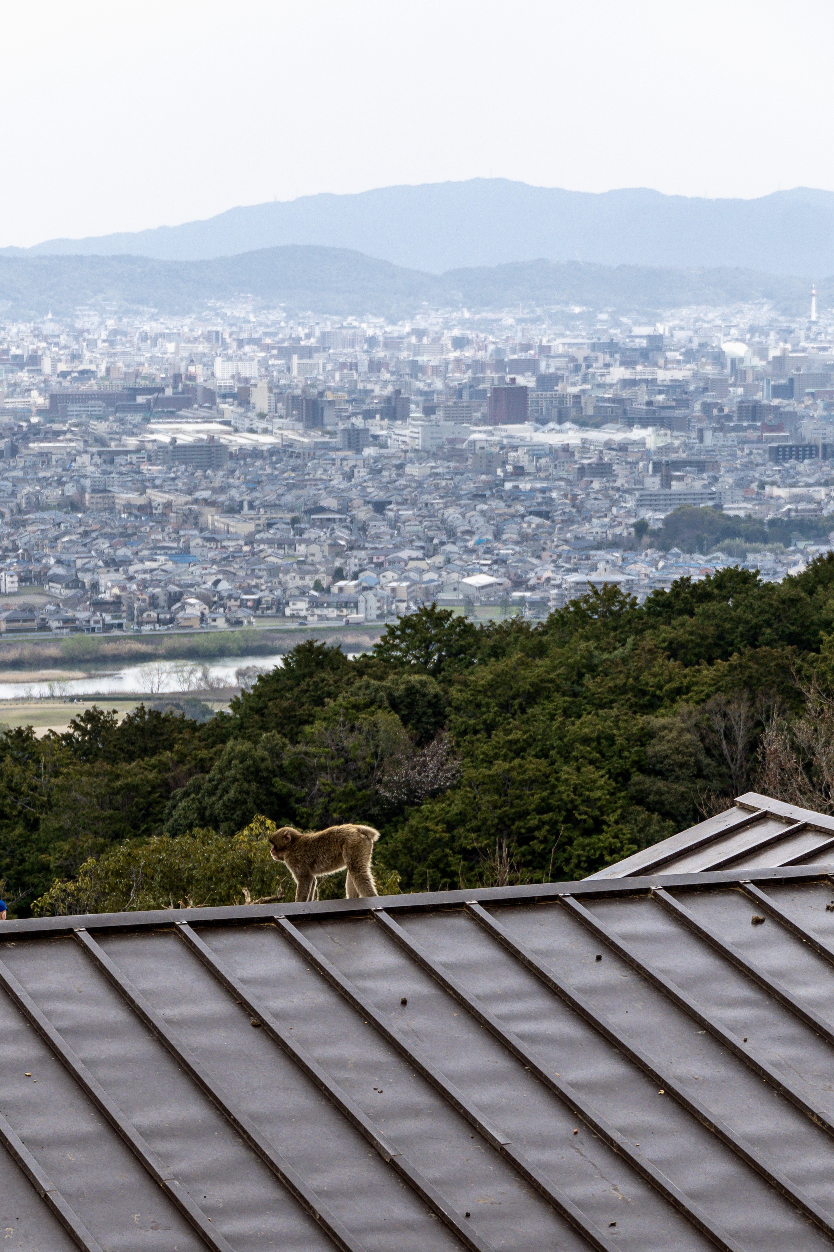
Crowds
The crowds in some of these places in Japan are no joke. Google Maps has had the ability to show a little bar graph for every location for how busy a place is throughout the day, in addition to how busy it currently is. It’s had this feature since 2016.
Not much in Japan is open before 10 or 11 AM, but any culturally important site, like a temple or a shrine will be swamped by tour groups starting around 9 AM. It’s not always the case, and things fluctuate based on rain.
Google also does that for train and subway rides where it will inform you the train will be “Crowded” and you can mentally prepare yourself to be very close and personal with strangers before you get to the train.
Apple Maps has never offered any guidance for how busy a location is. The elastic shield of security and privacy offers Apple no cover here. Apple brags about how it uses anonymized data for real time car traffic. They can anonymize data for busy businesses, and packed-solid subways. No excuses.
Uber
We’re a divided household. I say Lyft, he says Uber, let’s call the whole thing off.
In Japan, they don’t have Lyft, but they do have Uber. It’s really a taxi-hailing app. This worked very well for us. We never really had problems hailing a cab anywhere in Tokyo, but we would have a kind of a back and forth about our requested destination that left us unsure if we correctly relayed the info. Uber alleviated that because it the destination was provided to the driver. Also we’d know, roughly, the fare range for our taxi trip.
There are other Japanese taxi apps, but we weren’t moving to Japan so we stuck with the one that already had all the account info, Uber.
Payment was a non-issue. Sure, it was nice that the Uber app took care of the financial transaction so you didn’t have that awkward pause at the end of every cab ride, but it wasn’t like America, or Europe, where you fretted the cab driver telling you his credit card reader you were looking at for the whole cab ride “wasn’t working” at the end of the trip.
When we hailed a cab the old fashioned way, they all took credit cards. Even the old men driving very old Toyota Crowns with lace seat covers had a credit card reader. They’d take more than credit cards, but that varied by cab. There seem to be a profusion of payment apps in Asia, and you’d see a cluster of them on a sticker on the door to every cab. Some indicated that they took IC cards, but we stuck to credit cards so we wouldn’t blow through our Suica card balances and need to reload.
The real downsides to Uber were that you had to meet the cab at a specified pickup point. It couldn’t be an arbitrary pickup. This meant that sometimes we’d have to walk up, or down, the block, or cross the street, and the pickup location had very little to do with the direction the driver was traveling, as no drivers had agreed to the trip yet, so we’d have a 50/50 shot that we were on the wrong side of the street for the pickup.
Estimated pickup times were also… ambitious. Pickups were generally 10-25 minutes and the app would quote you 4-8 minutes. Also some journeys the cab drivers just wouldn’t want to do, like if it was a pickup from a particularly congested part of town. When we left Kiyomizu-dera, the narrow roads were so congested with pedestrians no one accepted Jason’s ride request. We hiked back up to the taxi line and hailed a taxi there.
We did end up using Ubers and Taxis more often in Kyoto than in Tokyo (or our brief, one evening stint in Osaka). Kyoto’s public transit is definitely not as robust.
I wouldn’t say that I would expect to exclusively do a trip to Japan using Uber, but don’t be intimidated or fearful of using it, or having it as a backup.
Apple Wallet and Apple Pay
Speaking of IC cards, Apple Wallet let’s you hit a “+” button in the Wallet, and pick a transit card. It doesn’t explain anything about the cards all being functionally identical, so you need to do that research yourself, but once you pick a card it’s good to go and you can top it off with Apple Pay transactions. The money on the card can be used for transit, or anywhere you see the IC logo, Suica, Passmo, etc.
It’s handy because it uses the express mode, where you don’t need to unlock or authorize the transaction (you can change the mode if you want to). This makes it very easy to swipe when entering and exiting the ticket gates. It also shows that you’ve started a journey, or completed one with your new balance. Because you’re billed based on your entrance and exit points, it’s important to know before your trip how much it will cost. It’s not a flat fare. I managed to get it down to ¥63 (42¢) so I consider that a minor victory.
Also, just like other transit cards it can only exist on either your iPhone (where you probably set it up) or your Apple Watch, not both. It can be transferred between the two.
I’ve never understood this limitation with the transit cards. We do way more complicated things with credit and debit cards, but a prepaid transit card is somehow harder to use and needs to be gingerly passed back and forth between devices.
Tokyo Disney Resort App
I’m not a Disney blogger, but we did go to DisneySea for one day with some of Jason’s friends. They had small children so we mostly did rides for small children. Also the app was just generally broken the entire day. As bad as the Disneyland (California) and Disney World apps are, the Tokyo Disney Resort app is worse. I don’t measure a lot of things in life by their iOS App Store rating, but 2.8 stars seems like there’s room for improvement (especially when the five star ratings seem weirdly astro-turfy!)
When you open the app, there’s an animated intro with clouds that reveal the two parks, Disneyland and DisneySea. However, the animation wasn’t animating so I hit the “skip” button, thinking I was just skipping the unnecessary animation. However, the animation is part of a data loading process, so you immediately get an error that because you skipped the intro you need to hit a button to manually refresh the data.
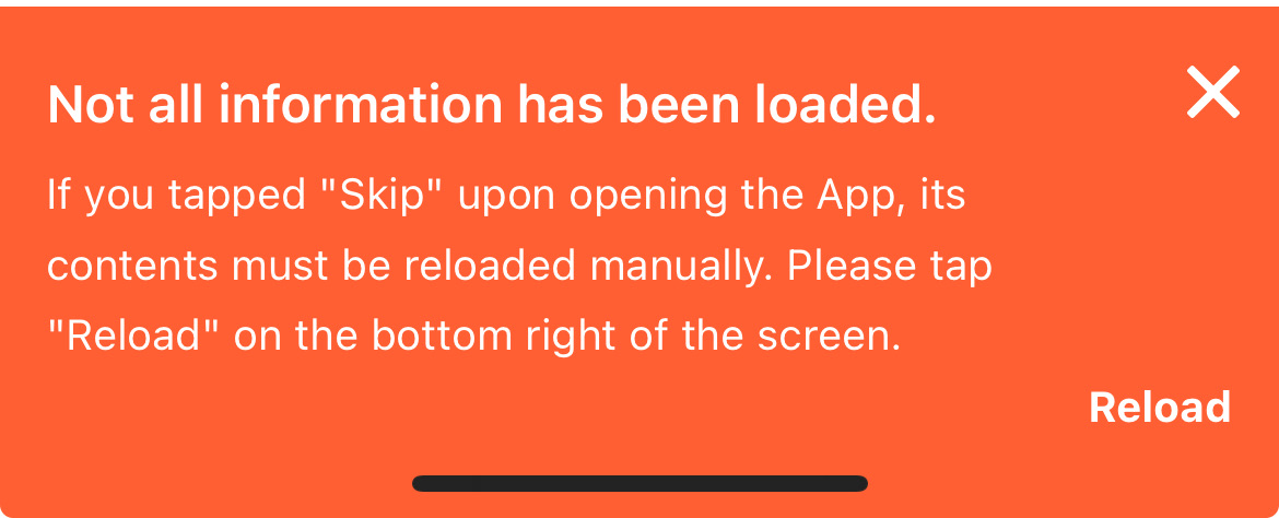
Exasperated sigh.
Surely, if you know that I have skipped the intro, and are providing me with this error message, then you could just load the data instead of telling me I need to do it. What’s this app for if it doesn’t load data?
We tried to book a lunch, but the reservation system wasn’t working. We went and waited in line for the restaurant and then the reservation finally went through so we were able to leave the line and come back later. Presumably the 486DX that handles the reservation system was overloaded by the totally predictable and known quantity of daily park guests.
I also tried to scan my ticket in to the app, but it crashed the app. Seriously. Then when I tried to scan the ticket again it told me that the ticket had already been scanned. However, attempting to do anything like order snacks and drinks with the online order, failed because it said I needed to be in the park. I could not be more in the park.
The only thing I could reliably use the app for was to see ride wait times. Which is not as helpful as you might think without the ability to book rides with Priority Access or Premier Access because it never thought I was in the park.
I don’t know if the boondoggle of an app is the fault of The Oriental Land Company (which is listed as the owner on the iOS App Store, and owns the parks themselves), or The Walt Disney Corporation which seemingly licenses at least the app assets to them, but they should both be motivated to at least bring it up to par with the other bad Disney apps.
It’s a fun park though, with an incredible attention to detail, in all aspects that don’t involve the app you need to use.
Lost in Translation
No, not the movie. If only Bob Harris had access to Google and Apple’s Translation features he’d probably have been in a better mood.
Google continues to be my preferred translator, especially when using the Google app and the camera to do live translation. It’s just kind of clunkier to use Apple’s Translate app? I can’t explain it. I’m sure someone that’s an expert on user interaction models could articulate it better than I can but everything seems to be more taps than it should be, and also it seems marginally slower at the actual translation process.
Some of that seems to be where the buttons are located in the interface, but also some of it is Apple’s lack of auto-detect for translation so you always need to pick a language and a direction to translate. It can be good to have those explicit overrides, especially when languages have similar words using the same alphabet, but Kanji, Katakana, and Hiragana are very obviously Japanese.
Also each tab in the Translate apps interface needs you to enter the to and from languages. It’s not something you set once in the app. That means Translation, Camera, and Conversation can all have different languages selected making it take more time if you’re switching translation contexts, but not languages.
Because why wouldn’t I want to translate text from english to spanish, from japanese to english, and from french to english all depending on the mode of the app? WHO WOULD NOT WANT THAT, I ASK?
The camera translation in Apple’s app is slower than the camera translation in Google’s —at least on the Japanese product labels I was translating. You’d want to rotate the curved label to get the text as flat to the lens as possible for the best translation.
I wouldn’t say that Google trounces Apple in the quality of the translation, but Apple does tend to be a little more awkward and less helpful. Take this bag of Kit Kats, for example.
Apple translated the Kit Kat logo, which is just Roman characters in an ellipse, to “Kitkao” which is … unhelpful. Apple failed to translate the vertically oriented characters and instead just transcribed them.
Google translated it as “increase in revenue”. Based on context, it seems there’s an extra Kit Kat in the bag? Apple also translated the description as “The sweetness of adults” and Google translated it as “Adult sweetness”. Both sound bizarre, but I know from Rie McClenny, that Google is the literal translation, and it means the flavor is for an adult palette.
This is just one example, you can do your own research here and figure out how you feel about it, but I don’t see any reason to use the Apple app over the Google one in Japan, just as I don’t see any reason to use the Apple app over Google in France. It’s mostly an exercise with seeing what minimum viable translation you can conceivably get away with when you use Apple’s Translate app, and that’s never what I’m aiming for in any context.
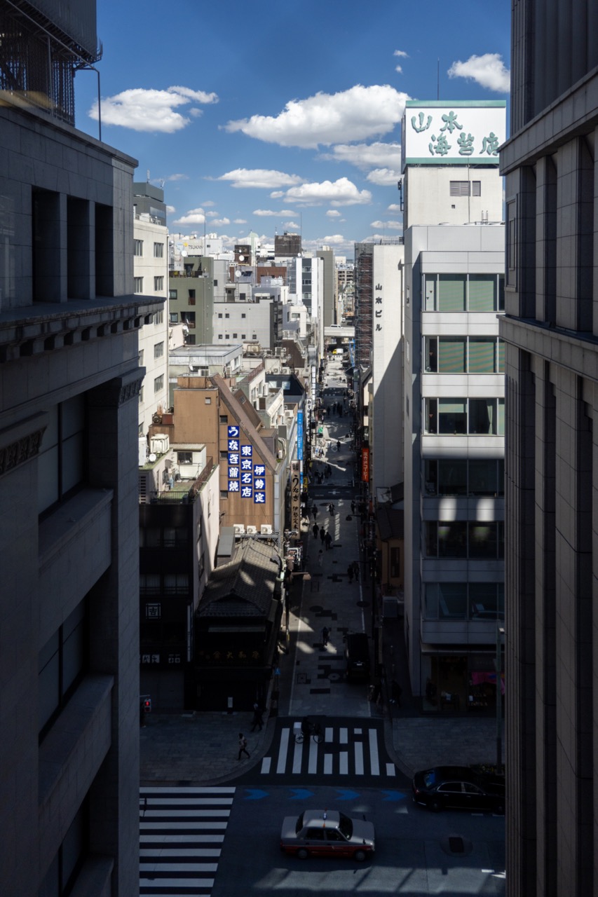
Travel Photos
I knew I would need to limit what I was taking, again. That meant my Peak Design 3L sling, that fits my Sony a6400 camera with a lens attached, and one more lens. I put another lens in my carry-on.
When I was in Tokyo, I almost exclusively used my 18-50mm Sigma F2.8 mostly with a circular polarizer. My 18-135mm Sony F3.5-5.6 was my secondary lens, but it stayed in the bag. It’s not as good as the sigma at it’s widest and it is a slightly larger, heavier lens than the Sigma.

In Kyoto I switched to 18-135mm and Rokinnon 12mm F2 as my backup. I knew that I would need the extra reach from the 135mm, and I would also find myself in landscape and architecture settings that would benefit from the wider 12mm lens. It’s a completely manual lens, which is why I didn’t want to use it in Tokyo.

Every night I would take the SD card and use the Lightning to SD adapter. The photos were imported into Lightroom mobile. I’d edit and use the flag (quick swipe up or down) to decide if I liked something enough to export it, or if it was something I’d never want to see again (like a shot that missed focus). I’d filter by flag, then select the photos -> Save to my camera roll as JPEG.
The Lightroom HDR editing workflow is, in my opinion as a hobbyist photographer, shit. It can’t export to HEIC/HEIF, DNG, or my original Sony ARW files so you can’t round-trip. The results don’t always look right, and you have no real sense of how they’ll look on an SDR screen. There is an SDR preview, but it makes everything look like trash, and the editing controls for augmenting the SDR preview never align to what the image looks like if I was just working in SDR the entire time.
I know that it can make things look less impressive because highlights, and sunlight, won’t pop, but I’d rather have a more predictable output. If you have an Instagram gallery that mixes HDR iPhone shots and non-iPhone shots and you want to convert the iPhone ones, just slide the brightness slider in Instagram’s editor one percent. Instagram hasn’t updated their editing tools in years so changing anything will convert the photo to SDR.
The iOS Photos app does a better job with HDR, because it handles HDR images from the iPhone’s cameras. It’s just a significantly worse photo editor, and organizer, than Lightroom.
There was dust on my lens in a few shots I needed to touch up, and Lightroom is the best place to do it. Retouch, an app I’ve used for iOS for years, has a resolution limit so I only ever use it for iPhone shots, and it bakes in changes when you use it. Pixelmator can touch up photos too, but it also bakes in changes. If I decide to revisit something about the photo I can do it as much as I want to in an app like Lightroom. Photos for iOS has no retouching tool, even though one exists on the Mac (it sucks ass, but it’s there).
I didn’t end up using any new apps on this trip. Things were going by fast so I either got the shot with my Sony a6400, or my iPhone’s Camera app.
Back Again
I’m still grateful I can travel, and that Jason drags me unwillingly to places that I end up enjoying. I can only imagine my trip would have been a little more difficult without an IC card in my Apple Wallet, or Google Maps to help me organize navigating the immense metropolis of Tokyo.
I absolutely want to go back to see, and experience more. If the apps all stagnated and stayed exactly the same, I’d be perfectly comfortable (except for the Tokyo Disney Resort app!) Ideally, things will keep improving, and maybe someday we’ll have AirPods that translate like Star Trek’s Universal Translator, and augmented reality glasses that do text translation when we’re looking at something. I would generally settle for things being 10% better next time.
Category: text